
Introduction to Mystery Meat Navigation Wikipedia's defilnition (partial): MMN is very seductive — it looks cool and it's used on sites that win design awards. Because there's no long strings of text, MMN makes the page look "cleaner" because there's more white space. Why MMN is really bad. I hope that the above image demonstration makes it perfectly clear why MMN sucks more than a Kirby vacuum cleaner. Off Canvas Content-First/Navigation Second Lorem ipsum dolor sit amet, consectetur adipiscing elit. Nulla eget nulla massa. Sed ultricies posuere tincidunt. Morbi dolor est, aliquet quis egestas eu, consectetur nec neque. Etiam velit libero, congue eu accumsan sit amet, eleifend et sem. Mauris consectetur elementum massa nec convallis. Quisque lacinia est a libero tempor quis gravida nibh luctus.
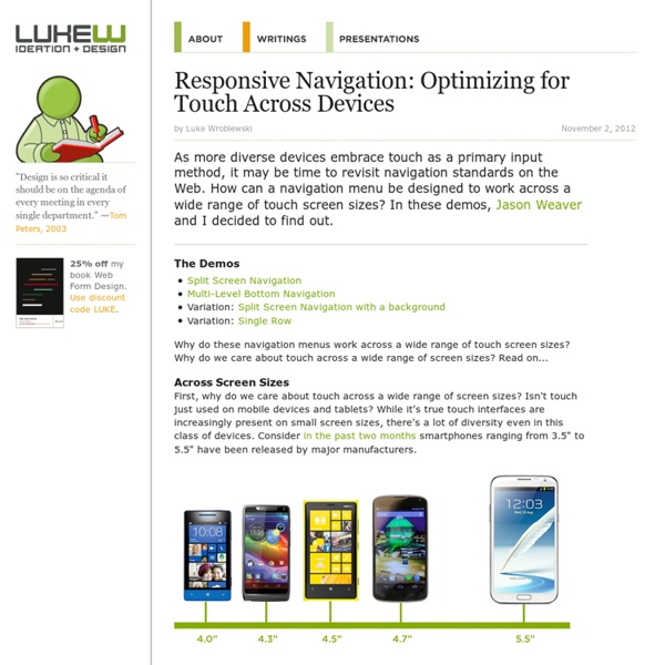
Touch Target Sizes People interact with touch-based user interfaces with their fingers. So user interface controls have to be big enough to capture fingertip actions without frustrating users with erroneous actions and tiny targets. Ok, so how big? In the iPhone Human Interface Guidelines, Apple recommends a minimum target size of 44 pixels wide 44 pixels tall. In the Windows Phone UI Design and Interaction Guide (PDF), Microsoft goes further and suggests: a recommended touch target size of 9mm/34px; a minimum touch target size of 7mm/26px; a minimum spacing between elements of 2mm/8px; and the visual size of a UI control to be 60-100% of the touch target size. They also suggest touch targets can be larger than 9mm if: the UI element is frequently touched; the result of a touch error is severe or really frustrating; the UI element is located toward edge of the screen or difficult to hit; or when the UI element is part of a sequential task –like using the dial pad.
Starting your first business in France? Here are the steps, and some great tips! | Cole Street Starting a business in France is an adventure. Ever heard the horror stories of Italian bureaucracy? Well – France has it too! When you go through this adventure you will encounter stamp-fetishism, physical paper obsessions, snooty bank employees, and stamp-wielding government employees. Company creation – the statuts When you start a company in France, you must write what are called ‘Statuts’ – the basic laws of your company. What’s in them? So how does one obtain these statuts? Choosing the address – choose wisely! In France, each business has a ‘siege social’ – their official company address. You can use your home address – if you rent, you’ll have to inform your owner, but they cannot say no. The social capital – what money the founders put in The social capital is part of the company creation – it’s what all the shareholders put in as the starting capital of the company. Step one: find a bank! Step two – more stamps, this time from the tax office Step three – the real deal Conclusion
Bootstrap Need reasons to love Bootstrap? Look no further. By nerds, for nerds. Built at Twitter by @mdo and @fat, Bootstrap utilizes LESS CSS, is compiled via Node, and is managed through GitHub to help nerds do awesome stuff on the web. Made for everyone. Bootstrap was made to not only look and behave great in the latest desktop browsers (as well as IE7!) Les lois de la Gestalt : Comment améliorer l'UX ? (Partie 1) Une bonne expérience utilisateur globale est un aspect essentiel de la création d’un site Web réussi. Le terme d’expérience utilisateur semble être populaire ces derniers temps, mais comment pouvons-nous décrire l’expérience utilisateur et comment pouvons-nous nous assurer d’en offrir assez sur nos sites ? Pour faire simple, l’expérience utilisateur décrit la manière dont les utilisateurs perçoivent un site, quel type d’émotions ils ressentent lors de la visite d’un site web, et si oui ou non ils sont motivés pour revenir. Les lois de Gestalt sont des principes simples ou des suggestions sur la manière dont les différents éléments sont perçus lorsqu’ils sont combinés dans un certain agencement ou un certain ordre. Nous allons donner un aperçu des lois communes de Gestalt, leurs effets possibles, et présenter des exemples de la manière exacte dont les différentes lois s’appliquent dans le contexte d’un site web. La loi de proximité La loi de similitude Source
Off Canvas Content-First/Navigation Second Lorem ipsum dolor sit amet, consectetur adipiscing elit. Nulla eget nulla massa. Sed ultricies posuere tincidunt. Morbi dolor est, aliquet quis egestas eu, consectetur nec neque. Etiam velit libero, congue eu accumsan sit amet, eleifend et sem. Donec ac felis sed sapien placerat venenatis. Mauris consectetur elementum massa nec convallis. Quisque lacinia est a libero tempor quis gravida nibh luctus. How Do Users Really Hold Mobile Devices? For years, I’ve been referring to my own research and observations on mobile device use, which indicate that people grasp their mobile phones in many ways—not always one handed. But some of my data was getting very old, so included a lot of information about hardware input methods using keyboard- and keypad-driven devices that accommodate the limited reach of fingers or thumbs. These old mobile phones differ greatly from the touchscreen devices that many are now using. Modern Mobile Phones Are Different Everything changes with touchscreens. So, I’ve carried out a fresh study of the way people naturally hold and interact with their mobile devices. What My Data Does Not Tell You Before I get too far, I want to emphasize what the data from this study is not. Most important, there is no count of the total number of people that we encountered. Since we made our observations in public, we encountered very few tablets, so these are not part of the data set. What We Do Know One-Handed Use
How Marketing Will Change In 2013: The Strategic Forecast In Part One of our 2013 marketing forecast, we asked a number of high-level creative types for their educated predictions on how their jobs and the marketing landscape would change in 2013. Now, we’re passing the mic to the strategists. These are the people who are said to represent the consumer in the marketing process--they’re the masters of research, the experts in media and culture that are responsible for generating brand insights and opportunities. As they’re steeped in knowledge of consumer behavior, we wanted to add their big-picture perspective to our look at what the near future of advertising may hold. We asked them what were the big shifts in consumer and media trends that would impact marketing and the wider cultural trends feeding these changes. What sorts of consumer behavior or media trends do you think will have an impact on marketing in 2013? Jim Stengel, marketing consultant and educator, author, former CMO of P&G: This will be the year of The Drop.
Responsive web design: key tips and approaches Some time ago, designers knew the exact dimensions of work they were commissioned to do whether it be a book cover, poster, newspaper, etc. However, with the emergence of smart phones, iPads and other monitors with different sizes, aspect ratios and resolutions, we’ve lost control of our visual borders. It’s not surprising that responsive web design (RWD) has become the new buzz. This emerging trend is not about fashion or aesthetics; it is rather an attempt to solve usability problems that arise due to the various devices used to browse the Internet. In this article, I’ll describe the approaches used when designing for different devices, what screen sizes and resolutions should be taken into account, and how RWD works from a designer’s point of view. Responsive web design approaches When creating a website that is fit for all monitor screens, the most common approach is designing within the standard screen width and height. There are dozens of graphics display resolutions. In conclusion