
Visual.ly. Content alone does not make a great video; you need a great video design that make a visual statement combining design and data visualization to deliver a story.

Designers often get a little excited and put too much fancy design to fill in the space. The best content marketing brands are the ones that know how use content to drive conversions and pushing the boundaries. Keep in mind, quality = attention span. “Bosch Envision 360 VR” – Bosch Auto Parts The new Bosch Envision windshield wiper blade sharpens night visibility and offers extreme weather safety. “Morton Salt Girl’s 100th Birthday” – Morton Salt For 100 years, we’ve celebrated life’s moments with the Morton Salt Girl — from birthdays to holidays to the everyday. “Autodesk Forge” – Autodesk Autodesk came to Visually to help translate the features of their new Forge platform into vignettes with fantasy machinery... keep reading. How to Make Bubble Charts in Photoshop. 22 outils gratuits. Vous avez des données à explorer ?
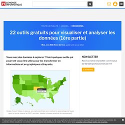
Voici quelques outils qui pourront vous être utiles pour les transformer en informations et en graphiques attrayants. Pour faire parler des données, rien ne vaut une panoplie d'outils de visualisation graphique. Il en existe de nombreux, notamment destinés aux professionnels versés dans l'analyse statistique.
Mais leur prix, généralement élevé, ne convient pas aux utilisateurs moins spécialisés qui n'ont besoin qu'occasionnellement d'afficher des données sous une forme graphique. Or, il existe, pour ceux dont le budget est limité, un nombre surprenant d'outils très intéressants pour la visualisation et l'analyse de données, accessibles gratuitement. Computerworld souligne que la correction des textes se fait simplement. DataWrangler (cliquer ici pour agrandir l'image) Refine intègre plusieurs algorithmes retrouvant les mots orthographiés différemment mais qui devraient en fait être regroupés.
Google Refine (cliquer ici pour agrandir l'image) Knight Digital Media Center. Data journalism Handbook. 75-tools-for-visualizing-your-data. Rating: 0.0/ (0 votes cast) TRIPWIRE MAGAZINE – By LARS Most people would agree that the old adage “A picture is worth a thousand words” is also true for web based solutions. There should be no discussion – Charts and Graphs are ideal to visualize data in order to quickly deliver an overview and communicate key messages. Whatever type of data presentation you prefer or suits you data (pie charts, bubble charts, bar graphs, network diagrams etc.), there are many different options but how do you get started and what is technologically possible?
In this article tripwire magazine present more than 75 Tools for Visualizing your data on a website and most of the options available will be covered. Images says more than a thousands words. The article has been organised into the following sections. Section 1: How to visualize you data using Javascript-based solutions Section 2: How to visualize you data using CSS Section 3: How to visualize you data using Server-side Solutions.
Ressources Presse. Traiter un événement en direct sur le webavec CoverItLive CoverItLive est un service en ligne permettant de couvrir un événement en temps réel sur le web.

Il nécessite une prise en main attentive pour l’exploiter pleinement… mais le traitement en live qu’il permet devient vite grisant ! Traiter une image pour le web Insérer directement un visuel dans votre éditeur web… est le meilleur moyen de faire planter son site ! Chaque photo, dessin ou infographie doit être traitée pour le web. Traiter un son pour le web avec Audacity Traiter un son – pratiquer des coupes et faire un montage – est à la portée de tous grâce aux logiciels d’édition actuels comme Audacity, gratuit et téléchargeable directement sur Internet.
Insérer une vidéo dans un site web Insérer une vidéo dans un site web est aujourd’hui une opération relativement simple. Créer un diaporama avec Soundslides Soundslides est un logiciel permettant de créer des diaporamas avec ou sans légende, avec ou sans son.