

Responsive Design with Mockups. 50 инструментов для адаптивного дизайна. Адаптивный дизайн с каждым днем становится все более популярным.

Такие сайты нацелены на широкую аудиторию, поскольку пользователи могут просматривать такие веб-сайты из различных устройств. Сегодня в этой подборке мы будем рассматривать полезные инструменты для создания адаптивных сайтов. A Cross-browser Responsive Design Helper. Flexible Foundations. Responsive or not, there’s no reason why we shouldn’t all be designing and building sites on flexible foundations.
This concept is nothing new, having been prophetically outlined in Jon Allsopp’s 2000 article, A Dao of Web Design. Sadly, I’m able to count myself among the many who, until recently, have failed to see the benefits of embracing the inherent flexibility of the web. Mail.ru Визуализация закладки. Responsive design is the process of arranging the layout in a way that all the important information is presented in a user readable way in any kind of device or screen size.

Most designers will choose a grid based layout since it’s easier to handle grid based layouts in different kind of devices. Images in a responsive web – Tyson Matanich. Fluid content and any screen size are foundational notions of responsive Web design.
However, figuring out how to best implement images in a responsive Web site is a problem with as many questions as answers. As the viewport changes size and different media queries are applied to adjust the layout of the content, images often change size from small to large and anywhere in between. Additionally, pixel dense displays, which look best when images of twice the width and height are served, are becoming increasingly more common.
To account for this change in size and pixel density, some sites have begun to serve files with different dimensions to different users. But therein lays the problem: who should get which image? To solve for this void with standard HTML several people have come together to propose the picture element. 10 basic tips about responsive design. Turning a Static Website Responsive. In part 2 (coming soon) I’ll go over converting this site from static to responsive.
So stay tuned for that. First thing to do is duplicate your homepage html file and your main css file. Just rename it test.html and test.css or whatever you feel is easiest. You don’t want to mess up your website’s static layout while you’re working on the new breakpoints. Also, don’t forget to update the link to your new css file (test.css) in your test.html file. Now all you need to do is add in the Meta Tag in between your Header tags. By default most smartphones will pick a view that would be look best, so it tends to zoom out to capture the whole page. Finding Breakpoints. 30 CSS-фреймворков для адаптивного веб-дизайна. Заметил, в последнее время на любое упоминание Twitter Bootstrap, минимум один человек отмечает, что «слишком много его стало».
Yellow Pencil - Responsive Web Design Process. 1.
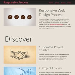
Kickoff & Project Charter First things first: let’s meet up and get to know each other. From our early meetings and research, we'll establish communication protocols, milestones and timelines, deliverables and scope, roles and expectations. 2. Project Analysis. Rwdgrid.com / Responsive Grid System for your next Project. CSS3 Media Queries Test on your browser. Viewport resizer - responsive design bookmarklet - device screen size check. Display and present responsive web designs. 15 Elegant Responsive HTML and CSS Templates.
Responsive HTML and CSS website templates are very much in demand nowadays because of the fact that they are responsive, flexible and fluid.

With the right great looking responsive CSS and HTML templates in your toolbox you will be able to deliver awesome and future proof web designs to your clients at high speed. If you finding the cool responsive CSS & HTML templates foe your website then you are on the right site post. Here today I have compiled a list of some of the best free and premium user-friendly responsive CSS and HTML templates.
Zen Grids: A Responsive Grid System Built on Sass. Building grids was moderately complicated before responsive design, these days they can be downright intimidating.
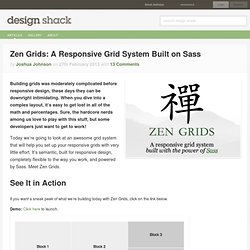
When you dive into a complex layout, it’s easy to get lost in all of the math and percentages. Sure, the hardcore nerds among us love to play with this stuff, but some developers just want to get to work! Today we’re going to look at an awesome grid system that will help you set up your responsive grids with very little effort. It’s semantic, built for responsive design, completely flexible to the way you work, and powered by Sass. Meet Zen Grids. How to Use Responsive Web Design to Support Old Browsers. In my previous article, Is Internet Explorer Development Really a Waste of Time?

, I hinted that it’s possible to support older browsers without significant development effort. In this tutorial, we’re going to create a simple web page which works in all modern browsers as well as IE8, IE7, IE6 and possibly earlier versions. Before we start, please note that we’re not aiming for pixel perfection or identical functionality. That will never be possible, so don’t even bother. However, we’re NOT going spend any time testing, fixing or hacking IE bugs and the page will still work. The Objective. Overview of Breakpoints in Responsive Web Design. Last time, we went over media queries. This is an important aspect to know of Responsive Web Design (RWD from now on) because it is this CSS declaration that allows for the different layouts to appear at different screen sizes. Hmm, now what about different screen sizes? To make it easy to understand, lets look at this using an analogy. So, imagine that RWD is a blueprint for a wonderfully new house.
The foundation, which the rest of the house depends on, would be media queries. What are Break Points. Responsive Web Development as a Standard, Step-by-Step. For each and every new client, and new project, it seems that the request for compatibility among mobile devices is rising. Smartphones are at their peak in popularity, and the popularity of devices like iPads, Kindles, and other medium-sized handheld devices are nearly there too. We don't need to stress the importance of mobile-friendly websites, and how responsive design can help solve the problem anymore; that's a given. In Grid Builder. Gridset · Payment Options. Design Process In The Responsive Age. Advertisement You cannot plan for and design a responsive1, content-focused2, mobile-first3 website the same way you’ve been creating websites for years—you just can’t.
If your goal is to produce something that is not fixed-width and serves smaller devices just the styles they require, why would you use a dated process that contradicts those goals? I’d like to walk you through some problems caused by using old processes with responsive design. Deciding what Responsive Breakpoints to use. Let’s start off by discussing a rather common mindset when it comes to responsive development – it’s the wrong mindset to take on (in my opinion of course) but it seems to be the default thought-process for many.
It’s understandable, but we’ll be explaining why in reality, it’s pretty daft. The Wrong Mindset! Okay, so let’s pretend we’ve made a nice, fluid layout in CSS, but alas, it starts to break as we drag the edge of our browser window to test. Responsive Design’s Dirty Little Secret. The truth is that fluid grids are broken. Well… perhaps just cracked a bit. Responsive Web design, as Ethan Marcotte defines it, is simply a fluid grid, fluid images and media queries. But fluid grids have a dirty little secret: rounding errors. As we lay out our columns in percentages, browsers have to translate that into actual device pixels to fit in the viewport. And Chrome, Safari, other WebKit browsers, Opera, and the usual suspects (IE 6 and 7) all produce “errors”. I put errors in quotes, because the issue actually has to do with the CSS spec.
IE 6 and 7 took the former strategy, which meant layouts often broke completely as the final grid item in a row ran out of room in its parent container and was forced to the next row. Test responsive design » responsivedesigntest.net. CSS Sleeping Columns in Responsive Layouts. Fluid CSS grids are great because they give us a way to align content into a grid that responds to the width of the browser or device screen. However, as the underlying grid gets narrower we usually want to rearrange the columns so as to retain a comfortable amount of space for the content.
Sometimes, of course, this means splitting a column into two new columns as it drops down into a new position. Sleeping, nested columns. There was a table set out under a tree in front of the house, and the March Hare and the Hatter were having tea at it: a Dormouse was sitting between them, fast asleep, and the other two were using it as a cushion, resting their elbows on it, and the talking over its head.
`Very uncomfortable for the Dormouse,' thought Alice; `only, as it's asleep, I suppose it doesn't mind.' Html - How to auto resize the image for responsive design with pure css. Responsive Web Layouts for Mobile Screens: Intro, Tips and Examples. Designers have it tougher now than before. Gettin' Flexy with Uncle Dave. BaseDemo - HorizontalNav. The Responsive Wireframe Boilerplate. Wirefy was created as a tool to help web designers and developers create fast, manageable wireframes.
It helps to speed up the journey between sketches and final deliverables. Like the web, it is in constant iteration. This requires a simple workflow and a well-defined collection of atomic elements so that new UIs can be quickly pulled together. It is our belief that we aren't building pages but rather systems of components. Creating a Mobile-First Responsive Web Design. Introduction. Proportional Grids. » The EMs have it: Proportional Media Queries FTW! Cloud Four Blog. Hay, I wrote this in 2012! I still like the notion of the metaphorical connection between content-based sizing units (e.g. ems) and layout definitions (e.g. breakpoints).
5 Useful CSS Tricks for Responsive Design. A non-responsive approach to building cross-device webapps. Media queries are great, but... Media Query Snippets - list of media queries. Responsive Web Design Sketch Sheets. Responsive design device resolution reference. Responsivepx - find that tricky breakpoint. Understanding-viewport – A set of simple HTML pages with various viewport and media query settings. Themes. SelectNav.js - responsive drop-down menu - pure JavaScript. Working with media queries and min-width. Responsive images using CSS3. Browser Sandbox - Run any browser instantly from the web. Responsify - A responsive template generator. Responsive workflow. Quickly build a prototype to test on any device. Yet another boilerplate for responsive (mobile) web design. YAMB. Оптимальная стратегия создания адаптивного сайта.