

The customizable HTML5 spinner control for touch devices like smartphones and tablets. Mobiscroll works with multiple javascript frameworks, libraries, MVVM frameworks and datasources.
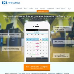
Including jQuery, jQuery Mobile, Zepto.JS, Kendo UI, Angular.JS, Backbone JS ... and the list goes on. We basically fill the gap of the missing UI controls you were searching for. Bedrock. We now recommend the Bedrock influenced Extra Strength Responsive Grids.
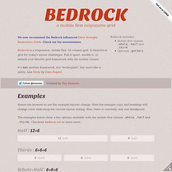
Check out the awesomeness. Bedrock is a responsive, mobile first 18 column grid. A theoretical grid for today's layout challenges. Pull it apart, modify it, or extend your favorite grid framework with the mobile classes. CSS Techniques for Retina Displays. As many people use their highly portable devices for work and play, device manufacturers seek to enhance their user experience, making their devices simultaneously more powerful and easier to use.

Apple gave us a completely new line-up of products that introduced double density pixel screens, creating sharper images on smaller screens. Other device manufacturers are following suit with their own version of high pixel density screens. Touch-web: Swipe / Блог компании Mail.Ru Group. Feature Overview - AppThwack. Mockups To Go - All Projects. Free Mobile Performance Testing with Akamai's Mobitest. Responsive Navigation: Optimizing for Touch Across Devices. As more diverse devices embrace touch as a primary input method, it may be time to revisit navigation standards on the Web.
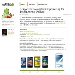
How can a navigation menu be designed to work across a wide range of touch screen sizes? In these demos, Jason Weaver and I decided to find out. The Demos. Responsive Menu Concepts. The following is a guest post by Tim Pietrusky.
I know Tim from his prolific work on CodePen and from being a helpful community member there. He wrote to me with this guest post about responsive menus which I'm more than happy to share with you below. Not only is it a timely concept, but one of the concepts improves upon a clever CSS trick we've covered here in the past. 300 Icons for Web & User Interface Design. NinjaMock - Design your apps online! Adaptive Vs. Responsive Layouts And Optimal Form Field Labels. Advertisement Editor’s note: Welcome to a new column in the UX Design section on Smashing Magazine!

Each month we’ll pick a handful of popular questions asked by our readers around good practices in designing smart and usable experiences. They will be answered by Christian Holst1, a regular author here on Smashing and founder of Baymard Institute2. Prior to co-founding Baymard Institute in 2009, he worked as a usability engineer in the hearing aid, credit card and consulting industries. Adaptive Layout Vs. “In which kinds of sites/projects is it better to use an adaptive layout (fixed break points)? A Better Android Emulator - Manymo. A full vendor stack for targeting High Resolution 'retina' devices - benfrain.com - blog of technology writer and web designer Ben Frain. If you want to target CSS at different device densities, you’ll need a full vendor stack.
This should also future proof your rules when non-prefixed versions are finally approved. Below, are the different versions needed to target different vendors: Sadly, to make a future-proof vendor-prefixed stack of rules to target Webkit (Chrome/Safari), Mozilla (Firefox), & Opera is a bit of a hassle. As far as I can tell, there is no specific way to target Microsoft (IE10) so I presume one of the W3C ready versions will suit when IE10 is released (somebody let me know if they know otherwise!). Here’s each one and where it will apply, a full stack is at the end: Wireframing and Prototyping a Mobile App. Hurray!
We’ve made it to the fifth part of our wireframing and documenting design course. I hope the previous chapters provided all the basic knowledge and now you’re ready to go deeper into practice. Fluid UI - iPhone & Android Mobile Mockups. Disable android orange outline higlight on focus. Responsive images: what's the problem, and how do we fix it? By Matt Wilcox Introduction Responsive images is a surprisingly complicated topic, and one that's been steadily gaining attention over the last year as more developers discover they need them and then discover there's no good solution yet.
This article aims to give an overview of the problem itself, and show the different proposals in the works to address it. Mobile-First Design: Pros and Cons. Traditionally, web development professionals and clients focus on the desktop part of the project first and leave the mobile side as a secondary goal.
Even with the availability of responsive design techniques, we tend to begin with the “full-size” version first and work our way down. However, there is now a growing trend among Web designers to start from smaller form factor. What's new in Android 4.1 Jellybean. Google revealed the latest version of its Android OS this week - known as Jellybean, the newest version of Android focuses on improving system performance, as well as adding a few highly requested features to the platform.
Announced alongside the Nexus 7 tablet, Jellybean is set to power the next wave of Android smartphones, and will make its way to older handsets starting this July. View all Under the hood. Cordova. About Apache Cordova™ Apache Cordova is a set of device APIs that allow a mobile app developer to access native device function such as the camera or accelerometer from JavaScript.
Combined with a UI framework such as jQuery Mobile or Dojo Mobile or Sencha Touch, this allows a smartphone app to be developed with just HTML, CSS, and JavaScript. When using the Cordova APIs, an app can be built without any native code (Java, Objective-C, etc) from the app developer. Instead, web technologies are used, and they are hosted in the app itself locally (generally not on a remote http server). And because these JavaScript APIs are consistent across multiple device platforms and built on web standards, the app should be portable to other device platforms with minimal to no changes. Apps using Cordova are still packaged as apps using the platform SDKs, and can be made available for installation from each device's app store. Want to Contribute? Detect Orientation Change. Unless your mobile application allows for only portrait or only landscape views, there's a good chance you will need to adjust a few things. Even if you've built your layouts in a fluid fashion, you may need to programmatically make some changes.
There are a few strategies for knowing when pages have changed, so let's check out how we can detect orientation changes on mobile devices. orientationchange Event This method is what you would expect from a mobile API; a simple orientationchange event on the window: window.addEventListener("orientationchange", function() { alert(window.orientation);}, false); During these changes, the window.orientation property may change. Resize Event Some devices haven't provided the orientationchange event, but do fire the window's resize event: window.addEventListener("resize", function() { }, false); A bit less obvious than the orientationchange event, but works very well.
18 PSDs For Mobile Phones UI Design. Interaction Design and Design Strategy. Off Canvas What Now? If you've used Facebook's iPhone app (or Path, or any number of apps that now follow this convention) then you've seen an off canvas panel in a native app. You hit a button and a panel slides in from the left (or depending on how you look at it, the main panel slides out of the way). Luke Wroblewski, author of Mobile First, mentioned this style of layout in his roundup of mobile layout patterns. Nolimits4web/Swiper. What The Heck Is Responsive Web Design? What The Heck Is. PSU Web: Building University Websites with Responsive Design. 11 Multi-touch and Touch events Javascript libraries. Touch screen devices are ruling the mobile platform nowadays.
Most of the smart phones have it, tablet and based on the trend, it's slowly come to our desktop as well. To develop a touch screen compatible web applications or website, you can use the existing touch events of the browsers or the platforms. The IE Mobile Viewport on Windows Phone 7 - IE for Windows Phone Team Weblog. One of the main challenges involved with mobile Web development is getting content to lay out correctly on screens of varying sizes. Optimising for High Pixel Density Displays. Optimising for High Pixel Density Displays. Recent mobile device releases have raised the bar in terms of display pixel density.
The iPhone4 326PPI ‘Retina display’ is getting a lot of (deserved) attention in this respect. This trend and the concurrent surge in tablet popularity means we're now designing for an extremely wide range of display specifications. C mobileOK Checker. Windows mobile media queries. Featured designs. Creating a Mobile Web Application with Meta Tags. Advancing trends for the mobile web are slowly blurring the line between Internet websites and native applications.