
Mind Your En And Em Dashes: Typographic Etiquette. Advertisement An understanding of typographic etiquette separates the master designers from the novices.

A well-trained designer can tell within moments of viewing a design whether its creator knows how to work with typography. Typographic details aren’t just inside jokes among designers. They have been built up from thousands of years of written language, and applying them holds in place long-established principles that enable typography to communicate with efficiency and beauty. Handling these typographic details on the Web brings new challenges and restrictions that need to be considered. Setting Body Copy Good typography comes down to communicating information, and the basis of information is good old-fashioned body copy – simple blocks of text.
Indentation or Space After a Paragraph? When signalling the end of a paragraph and the beginning of another, you can generally either indent or insert a space between the paragraphs. But there is no hyphenation control in CSS. The Hyphen (al) A lesson on typography. 18 Useful Cheat Sheets For Web Developers & Designers.
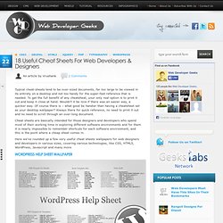
Nov222011 Typical cheat-sheets tend to be over-sized documents, far too large to be viewed in its entirety on a desktop and not too handy for the super-fast reference that is needed.

To get the full benefit of any cheatsheat, your only real option is to print it out and keep it close at hand. Wouldn’t it be nice if there was an easier way, a quicker way. Of course there is – what good be handier than having a cheatsheet set as your desktop wallpaper? Always there for quick reference, no need to print it out and no need to scroll through an over-long document. Cheat sheets are basically intended for those designers and developers who spend most of their working time in exploring different software environments and for them it is nearly impossible to remember shortcuts for each software environment, and this is the point where a cheap sheet comes in. Did you enjoy this article? About the Author: Vrushank Brahmakshatriya. Designing a Typeface, With Illustrator and FontLab, from Start to Finish – Part 1.
Lets get one thing straight, there is a difference between 'lettering' and 'type design', this can be some serious stuff.

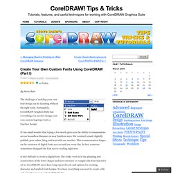
There are people who strictly design letter-forms for their entire lives. They live, breath, eat, sleep, drink and pee typography - I truly admire them. In my personal work I lean towards lettering and don't want to step on any toes by saying this is 'THE' way to design type. This is a way to go about designing a typeface using Ai. Create Your Own Custom Fonts Using CorelDRAW (Part I) By Steve Bain The challenge of tackling your own font design can be daunting without the right tools.

Fortunately, CorelDRAW Graphics Suite has everything you need to design your own custom logotype font or typeface design. It’s no small wonder that typing a few words gives you the ability to communicate across boundless distances in near limitless ways. We routinely email, digitally publish, post online, blog, and text with one another. This communication hinges on the existence of digital fonts you see and use every day. It isn’t difficult to create a digital font. In this two-part tutorial, I’ll explore how you can benefit from creating your own font. The Sofia Open Content Initiative - Creative Typography. Typographer's Glossary. Fonts In Use – Type at work in the real world. Hermann Zapf. Specimens of typefaces by Hermann Zapf. Hermann Zapf (born November 8, 1918) is a German typeface designer who lives in Darmstadt, Germany.
He is married to calligrapher and typeface designer Gudrun Zapf von Hesse. Zapf's work, which includes Palatino and Optima, has been widely copied, often against his will. The best known example may be Monotype's Book Antiqua, which shipped with Microsoft Office and was widely considered a "knockoff" of Palatino. In 1993, Zapf resigned from ATypI (Association Typographique Internationale) over what he viewed as its hypocritical attitude toward unauthorized copying by prominent ATypI members. Early life[edit] Zapf left school in 1933 with the ambition to pursue a career in electrical engineering. Introduction to typography[edit] Zapf was not able to attend the Ohm Technical Institute in Nuremberg, due to the new political regime.
In 1935, Zapf attended an exhibition in Nuremberg in honor of the late typographer Rudolf Koch. Frankfurt[edit] Post-war[edit] The Art of Hermann Zapf.
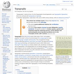
MyFonts: Webfonts & Desktop Fonts. Kinetic Typography. Prints on Typography. Typography Books. Typography. In philately "typography", especially in the case of 19th century stamps, refers to letterpress printing.

Typography is performed by typesetters, compositors, typographers, graphic designers, art directors, manga artists, comic book artists, graffiti artists, clerical workers, and everyone else who arranges type for a product. Until the Digital Age, typography was a specialized occupation. Digitization opened up typography to new generations of visual designers and lay users, and David Jury, Head of Graphic Design at Colchester Institute in England, states that “typography is now something everybody does.”[6] §History[edit] Printing press, 16th century in Germany The essential criterion of type identity was met by medieval print artifacts such as the Latin Pruefening Abbey inscription of 1119 that was created by the same technique as the Phaistos disc.
Modern movable type, along with the mechanical printing press, is most often attributed to the goldsmith Johannes Gutenberg.