Coursera. Making Sense of Data - - Unit 1 - Introducing the Data Process. Big Data At Work: The World Is Making A Digital Copy Of Itself. Steven Wright, the great deadpan comedian, told what may have been the first big data joke: “I have a map of the United States, actual size.
People ask me where I live, I say E5.” Today, we’ve got interactive, geolocation-based apps in our pockets. Yet it’s precisely how ordinary the previously impossible has become that obscures why big data is such a big deal. Big data is center stage not simply because it’s increased in heft relative to the scale, scope, and speed of only a few years ago (see “As Big Data Explodes, Are You Ready For Yottabytes?”). Big data is big because of how much of the real world it covers.
In other words, the world is making a digital copy of itself. Think of it like this. As such digital copies become ever more faithful representations of the actual, they’re no longer shadows of the real world. But there’s a big catch. Let’s back up briefly to put this into context: The history of computing is one of reduction. But big data is about expansion, not reduction. Contact. Investigación e Innovación Cultural.
11 herramientas para crear infografías. Te presentamos 11 herramientas para crear gráficos que te permitirán desarrollar de forma diferente el contenido de tus publicaciones. 1.
Easel.ly Es un servicio de acceso libre en el que puedes crear nuevas infografías o modificar las que ya están en la plataforma. La página ofrece 15 plantillas sencillas y diferentes, pero que no dejan de ser creativas, dinámicas y atractivas. Te permite editar colores, texto, gráficos, introducir íconos y añadir o modificar formas dentro de tu gráfico. 2. La versión gratuita incluye siete de las 115 que hay disponibles. Las herramientas de edición permiten agregar más gráficos al material, además de formas, textos e imágenes.
Accede a Piktochart usando tu cuenta en G+ o Facebook. 3. Esta herramienta, a la que puedes acceder usando tu cuenta de Facebook, ofrece seis diseños diferentes de infografías. El contenido de algunas plantillas es interactivo, lo que mejora la presentación de datos. Real time graphics about people thoughts. Our Gallery of Services - Testimonials, Case Studies, Video Gallery. Mechdyne provides clients with complete solutions to solve some of their most difficult challenges - helping their projects and companies to reach new heights.
We service customers in a wide variety of industries within a wide array of applications. Case Studies Mechdyne is your one source for consultation, design, integration, installation and the service of immersive and complex audio visual projects. We have had the priviledge of working with a variety of organizations and industries. See Case Studies Testimonials Our extensive design experience is recognized by our hundreds of satisfied customers and industry leaders. See Testimonials Video Gallery With more than 1,000 installations all over the world, Mechdyne is the most experienced complex AV and visualization hardware/software provider in the market today. See All Videos. Scientific Visualization. About BSC. Early in 2004 the Ministry of Education and Science (Spanish Government), Generalitat de Catalunya (local Catalan Government) and Technical University of Catalonia (UPC) took the initiative of creating a National Supercomputing Center in Barcelona.
BSC-CNS (Barcelona Supercomputing Center – Centro Nacional de Supercomputación) is the National Supercomputing Facility in Spain and was officially constituted in April 2005. BSC-CNS manages MareNostrum, one of the most powerful supercomputers in Europe, located at the Torre Girona chapel. The mission of BSC-CNS is to investigate, develop and manage information technology in order to facilitate scientific progress. With this aim, special dedication has been taken to areas such as Computer Sciences, Life Sciences, Earth Sciences and Computational Applications in Science and Engineering.
All these activities are complementary to each other and very tightly related. TENDER Please find in this section the open public tenders. VisualizeUs. Data Visualization Lab. Cycle of Life - Xavi Bové. Sand Falls. How can we extract quantitative data from the impact of a work of art?
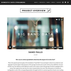
This is the question put into play in the installation “Sand Falls”. It is an attempt to extract in an objective and aggregate way the impact of the presence of five groups of works of art on the visitors of an exhibition. Or seen another way, the influence of the different works on the visitors. Each of the groups of works is equipped with a sensor that captures the time that the visitor remains before the work. This information is transferred analogically to each of the corresponding modules through the fall of a constant quantity of sand, a new reading of time that allows the impact of each group to be quantified over the course of a month.