
Secret to Combining InDesign Documents. Self-publishing: designing the cover of your book in Photoshop or InDesign ~ WebVivant. Your cover is your most effective marketing and sales collateral for your book.

People do judge books by the cover, so it's important to get it right. What follows are some tips on the mechanics of laying out your cover. But it's not a course in graphic design: you're still going to need some visual flair to put together a great cover. If you don't think you have the necessary visual abilities, find someone who has. Design is a skill - it's not something you can pick up overnight. This article uses Photoshop and InDesign as the file creation tools - because they're the best tools for the job and because that's what I use. For the sake of this article, let's assume you're producing a 6x9in perfect-bound trade paperback. Before you can start, you need to know the width of the spine. Image size and bleed area If you're book is 6x9in you might assume you need a 6x9in image for the cover. Printers require a 'bleed' area around the cover image.
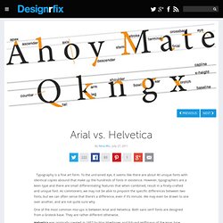
Color Explorer. Arial vs. Helvetica. Typography is a fine art form.

To the untrained eye, it seems like there are about 40 unique fonts with identical copies abound that make up the hundreds of fonts in existence. However, typographers are a keen type and there are small differentiating features that when combined, result in a finely-crafted and unique font. As commoners, we may not be able to pinpoint the specific differences between two fonts, but we can often sense that there’s a difference, even if it’s minute.
We may even be drawn to one over another, and are not quite sure why. One of the most common mix-ups is between Arial and Helvetica. Helvetica was originally created in 1957 by Max Miedinger and Eduard Hoffmann of the Haas type foundry based in Switzerland. Helvetica blew up in the ‘60s and ‘70s as it became the favorite font of designers, for its modern, clean, and commercial appeal. Arial was created in 1982 by Robin Nicholas and Patricia Saunders of Monotype (a type foundry). Free Photoshop Tutorials, Custom Shapes, Photo Effects, PSD Files and More. Photoshop Tutorials - Photoshopgirl.com. Mikro knjiga: Prikaz: CMYK vodič. CMYK vodič U CMYK vodiču date su dve ton karte.

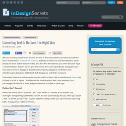
Converting Text to Outlines the Right Way, Updated. By: David Blatner | November 2, 2011 Who would have thought that here, in the second decade of the 21st century, we would still find ourselves explaining how to convert text to outlines in order to print our documents?!

It’s a crazy thing to do, completely unnecessary in the vast majority of instances, and yet we continue to hear requests from users who say they need to do it for one reason or another. (Here’s a piece on why you shouldn’t convert text to outlines. I generally agree with Steve’s last comment, where he says if your printer wants you to outline text, you should find another printer. Unfortunately, that’s not always possible.) A few years back, I wrote up a relatively easy hack that generated a lot of interest and excitement, because it allowed InDesign users to convert all text to outlines while exporting to PDF (or, god forbid, EPS), but still leaving you with editable text in your InDesign document. Converting Text to Outlines The Right Way.
Why do so many people want their all the text in their documents converted to outlines?

Don't answer that; I've heard the reasons, and they all make me sad. Nevertheless, some people do want all the text converted, and they find themselves up a creek because Type > Create Outlines doesn't always give them what they want. Specifically, paragraph rules (rule above/below) disappear. How to Select the Right Typeface for Text. Text makes up the vast area of gray in books, reports, magazines, print ads, and hundreds of other documents.

Reading the material is the most essential and primary goal so it’s the designer’s job to ensure that the text is even, flows effectively and pleasant to read. It should bear the two qualities of a good text type which are legibility and readability. Legibility refers to clarity; it’s how easily one letter can be distinguished from all others. Readability refers to how well letters relate with each other to form words, sentences and paragraphs. Essentially, everything else taken into consideration, the driving factor to consider is about moderation or being medium on all sides. Here are seven valuable tips and hints in choosing the right and effective typeface for text that’s smooth, clear and readable. 1.
Typefaces with similar character widths have the smoothest appearance. The Secret Law of Page Harmony. “A method to produce the perfect book.”

The perfect book. This is how designer-genius Jan Tschichold described this system. Not the ok book, nor the pretty good book, but the perfect book. This method existed long before the computer, the printing press and even a defined measuring unit. Photoshop Tutorials.