
Create a Thumbnail Proximity Effect Using CSS3. The new year is well under way and there certainly has not been a let up in the creativity department when it comes to developing new code with CSS3 and jQuery.
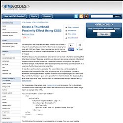
It didn't take me long at all to find this demo from Mary Lou, who we have featured here on HTML Goodies in the past. This time, Mary Lou has provided code which shows how to create a thumbnail proximity effect. What does that mean? Basically, what Mary Lou did was to take a large collection of thumbnail images and when a visitor hovers over a particular thumbnail, not only does that specific thumbnail enlarge, the thumbnails within a close proximity also enlarge, just not as much. It's a very nice effect that deserves some recognition.
In total, there are three demos available. For the purposes of the sample code, the second demo will be covered. The CSS starts off by centering the unordered list on the page. Here's how to add a tint to the background image by adding a pseudo element with a rgba background color: Beautiful UI styling with CSS3 text-shadow, box-shadow, and border-radius. By Henrik Helmers Introduction Previous articles have covered the basics of CSS3 transitions and 2D transforms and CSS3 borders, backgrounds and box-shadows; refer to those articles if you need to read up on the basics of using these properties.
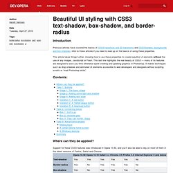
This article takes things further, showing how to use these properties to create beautiful UI elements without the use of any images, JavaScript or Flash. This last line highlights the real beauty of CSS3 — many of its features are designed to save you time otherwise spent creating and updating graphics in Photoshop. It makes techniques such as drop shadows and animated UI elements accessible to web developers and designers without scripting smarts or mad Photoshop skills. Contents: Where can they be applied? Support for these CSS3 features was introduced in Opera 10.50, and you’ll also be able to rely on most of them in the latest versions of Firefox, Safari and Chrome. For the Web at large, however, all is not lost. Take 1: Buttons Box 1: Surf’s up. The Shapes of CSS - StumbleUpon.
Learn Development at Frontend Masters CSS is capable of making all sorts of shapes.

Squares and rectangles are easy, as they are the natural shapes of the web. Add a width and height and you have the exact size rectangle you need. Add border-radius and you can round that shape, and enough of it you can turn those rectangles into circles and ovals. We also get the ::before and ::after pseudo elements in CSS, which give us the potential of two more shapes we can add to the original element. Square Rectangle Circle Oval Triangle Up Triangle Down Triangle Left Triangle Right Triangle Top Left Triangle Top Right Triangle Bottom Left Triangle Bottom Right Curved Tail Arrow via Ando Razafimandimby Trapezoid Parallelogram Star (6-points) Star (5-points) via Kit MacAllister Pentagon Hexagon Octagon Heart via Nicolas Gallagher Infinity via Nicolas Gallagher Diamond Square via Joseph Silber Diamond Shield via Joseph Silber Diamond Narrow via Joseph Silber Cut Diamond via Alexander Futekov Egg Pac-Man Talk Bubble TV Screen Lock.