
Parti diagrams. Www.aiahouston.org/mgmc/2004/pdfs/ArchitectsToolbox.pdf. Book report: architectural diagrams. Mar 22, 2011 designboom book report: architectural diagrams ‘floating islands’ by vincent callebaut architectures image © designboom editor: pyo mi-young publisher: DOM publishers year: 2011 size: 750 pages, 225 × 280 mmISBN 978-3-86922-148-9 designboom rating: the society is becoming more complex. there is an increase in information and desires of the city. with broad issues including material, environment, ecology, and behavior, clear diagram becomes more important within today.

Depts.washington.edu/redline1/AIRE264.pdf. Building Diagrams. I've always found the gulf between architect and end user most fascinating, particularly the legibility of architectural production (plans, elevations, sections, details, sketches, models, perspectives, renderings, etc.) by -- for lack of a better term -- laypeople.
It goes without saying that much of that produced by the former is not fully grasped by the latter, in terms of how a set of drawings, for example, will translate into a building. Models and renderings attempt to bridge this gulf of understanding, but in some cases diagrams done after a building's completion can prove even more helpful. These post-occupancy aids may be done for publication, though more often than not they are done for public buildings (museums, libraries, etc.) as wayfinding devices, given to visitors to help orient themselves in space. Below is a sampling of what I found, with some broad categorizations on how the diagrams increase legibility.
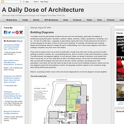
The color-coded plan: and: The solid-void plan: Diagrams Explaining the Structure of the Bay Area Polycentric Region. The drawing skillfully filter the complexity of form that comprises the Bay Area into a series of discrete and understandable layers.
Each of the diagrams illustrating spatial design also display an adept sense of understanding required in producing urban design drawings that are both communicative and highly legible. Although the project was subject to strict time constraints, the resulting designs clearly recognize the importance of regional landforms in determining the urban landscape as well as their potential in defining a regional urban form that effectively balances urban development with the natural and environmental resources of the Bay Area. Regional map of the San Francisco Bay Area by Stefan Pellegrini depict a continuous greenbelt between Bay Area cities.
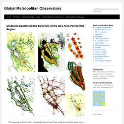
Infographic of the Day: How Segregated is Your City? Recently, cartographer Bill Rankin produced an astounding map of Chicago, which managed to show the city's areas of racial integration.
Eric Fischer saw those maps, and took it upon himself to create similar ones for the top 40 cities in the United States. Fisher used a straight forward method borrowed from Rankin: Using U.S. Census data from 2000, he created a map where one dot equals 25 people. The dots are then color-coded based on race: White is pink; Black is blue; Hispanic is orange, and Asian is green. The results for various cities are fascinating: Just like every city is different, every city is integrated (or segregated) in different ways.
Washington, D.C., for example, has a stark east/west divide between white and black: Detroit, meanwhile, is marked by the infamous Eight Mile beltway, which serves a precise boundary for the city's black and white populations. However, other cities present better pictures of racial integration. L.A., meanwhile, is sort of the opposite. Mario Klingemann update. Datavisualization. Infographic of the Day: Using Flickr Geotags to Map the World's Cities [UPDATED] Update: Fischer has added some fascinating tweaks to his mapping technique--check them out at the bottom of this post.
![Infographic of the Day: Using Flickr Geotags to Map the World's Cities [UPDATED]](http://cdn.pearltrees.com/s/pic/th/infographic-innovation-3829888)
We've seen maps of photographic activity around the world, and maps of traffic activity in a city, which reveal how heavily roads are used. And now, photographer Eric Fischer has combined both ideas, creating maps of 50 different cities around the world, using only the geotags of photos uploaded to Flickr and Picasa. What emerges are basically maps of human interest--that is, all the places fascinating enough that someone decided to take a picture.