
Choosing great logo colors & combinations. Choosing colors for your brand shouldn’t be about your favorite color, but rather what you want your logo to say about your company.

Here’s a crash course on color psychology and what the 100 most valuable brands in the world are doing. How do companies pick logo colors? People pick their logo colors for a wide variety of arbitrary reasons. Color Trends + Palettes. The Bird-Based Color System that Eventually Became Pantone. WASHINGTON, DC — An effort to describe the diversity of birds led to one of the first modern color systems.

Published by Smithsonian ornithologist Robert Ridgway in 1886, A Nomenclature of Colors for Naturalists categorizes 186 colors alongside diagrams of birds. In 1912, Ridgway self-published an expanded version for a broader audience — Color Standards and Color Nomenclature — that included 1,115 colors. Some referenced birds, like “Warbler Green” and “Jay Blue,” while others corresponded to other elements of nature, as in “Bone Brown” and “Storm Gray.” OneRepublic - Wherever I Go. Color Palettes From Famous Movies Show How Colors Set The Mood Of A Film. Movies In Color. 5 Common Film Color Schemes - Cinematic Color Design.
Being able to use color to create harmony, or tension within a scene, or to bring attention to a key visual theme can be used to spectacular effect.

In this article we look at 5 common film color schemes that can help you understand how cinematic color design works. This industry of ours is great. I truly love it, the people, the gear, the creativity and energy. At the same time, as your experience grows and your expanding network of connections allows you to move up the ranks, you also find the expected, assumed level of knowledge increases. This is logical, but I have found the assumed knowledge is often rarely discussed, because, well, it’s assumed that you already have it. I want to share a few of my “ah ha!” Planning the look In post of course, a colorist can only work with what he (or she) is given, and so it can be argued that the overall look and feel of the image is the responsibility of the production designer. Sometimes perhaps, but certainly not for every project. 1. 2. 3. 4.
Wes Anderson Palettes. Are Black & White Colors? Is Black a Color?

Is White a Color? The answer to the question - "Are black and white colors? " Additive color. Additive color mixing: adding red to green yields yellow; adding all three primary colors together yields white.
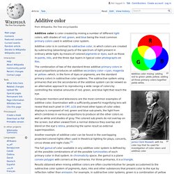
James Clerk Maxwell, with his color top that he used for investigation of color vision and additive color Additive color is color created by mixing a number of different light colors, with shades of red, green, and blue being the most common primary colors used in additive color system. Additive color is in contrast to subtractive color, in which colors are created by subtracting (absorbing) parts of the spectrum of light present in ordinary white light, by means of colored pigments or dyes, such as those in paints, inks, and the three dye layers in typical color photographs on film. The combination of two of the standard three additive primary colors in equal proportions produces an additive secondary color—cyan, magenta or yellow—which, in the form of dyes or pigments, are the standard primary colors in subtractive color systems.
History[edit] Basic color schemes: Color Theory Introduction. With colors you can set a mood, attract attention, or make a statement.

You can use color to energize, or to cool down. By selecting the right color scheme, you can create an ambiance of elegance, warmth or tranquility, or you can convey an image of playful youthfulness. Color can be your most powerful design element if you learn to use it effectively. Is Your Red The Same As My Red? 100 Brilliant Color Combinations: And How to Apply Them to Your Designs. Color makes a design come alive.

It can attract attention, set a mood, and even influence our emotions and perceptions. But sometimes it can be hard to know where to start when choosing a color palette for your design project. The Harvard Library That Protects The World's Rarest Colors. Today, every color imaginable is at your fingertips.
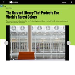
You can peruse paint swatches at hardware stores, flip through Pantone books, and fuss with the color finder that comes with most computer programs, until achieving the hue of your heart's desire. But rewind to a few centuries ago and finding that one specific color might have meant trekking to a single mineral deposit in remote Afghanistan—as was the case with lapis lazuli, a rock prized for its brilliant blue hue, which made it more valuable than gold in medieval times. The history of pigments goes back to prehistoric times, but much of what we know about how they relate to the art world comes from Edward Forbes, a historian and director of the Fogg Art Museum at Harvard University from 1909 to 1944.
Considered the father of art conservation in the United States, Forbes traveled around the world amassing pigments in order to authenticate classical Italian paintings. "Every pigment has its own story," Khandekar says. Clemens Habicht Colour Puzzles. Chromotherapy. Chromotherapy, sometimes called color therapy, colorology or cromatherapy, is an alternative medicine method, which is considered pseudoscience.[1] Chromotherapists claim to be able to use light in the form of color to balance "energy" lacking from a person's body, whether it be on physical, emotional, spiritual, or mental levels.

Research has shown it is ineffective.[2] Color therapy is distinct from other types of light therapy, such as neonatal jaundice treatment[3] and blood irradiation therapy which is a scientifically accepted medical treatment for a number of conditions,[2] and from photobiology, the scientific study of the effects of light on living organisms. History[edit] Avicenna (980-1037), seeing color as of vital importance both in diagnosis and in treatment, discussed chromotherapy in The Canon of Medicine. He wrote that "color is an observable symptom of disease" and also developed a chart that related color to the temperature and physical condition of the body. Complementary colors. Complementary colors are pairs of colors which, when combined, cancel each other out.
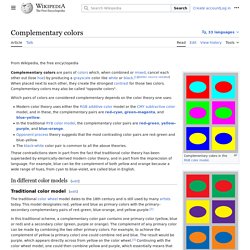
This means that when combined, they produce a grey-scale color like white or black.[1] When placed next to each other, they create the strongest contrast for those particular two colors. Due to this striking color clash, the term opposite colors is often considered more appropriate than "complementary colors". Colors. Writer Creates “Color Thesaurus” To Help You Correctly Name Any Color Imaginable. Ingrid Sundberg, a writer and children’s book illustrator, created a very useful infographic chart for anyone struggling with color names. The writer says that she loves to collect words that can help give her stories variety and depth. Show Full Text “I’ve learned that we all have different associations with color words,” Sundberg told Bored Panda. “For example the color sapphire is a light blue to me (since that’s the color of the sapphire on my engagement ring), but a sapphire can also be a very dark blue.
Color Theory Tutorial, Concepts, Essays and Color Basics. Why study color theory? If you are involved in the creation or design of visual documents, an understanding of color will help when incorporating it into your own designs. Choices regarding color often seem rather mystical, as many seem to base decisions on nothing other than "it looks right. " Although often told I had an eye for color, the reason why some colors worked together while others did not always intrigued me and I found the study of color theory fascinating.
While attending the University of Minnesota I enrolled in almost every course I could from different departments: graphic design, interior design, and fine arts. During my studies, I learned that there were 2 main reasons why scholars investigated color—the first involved the communication of colors; the other involved the application of color. Contrast effect. Perception example: A neutral gray target will appear lighter or darker than it does in isolation when immediately preceded by, or simultaneously compared to, respectively, a dark gray or light gray target. Cognition example: A person will appear more or less attractive than that person does in isolation when immediately preceded by, or simultaneously compared to, respectively, a less or more attractive person. Performance example: A laboratory rat will work faster, or slower, during a stimulus predicting a given amount of reward when that stimulus and reward are immediately preceded by, or alternated with, respectively, different stimuli associated with either a lesser or greater amount of reward.
Lesson in Color: Simultaneous Contrast. Fred Fehlau, our guest writer for March, shares with us the importance of knowing about Simultaneous Contrast when working with color. Here, he shares his story. Simultaneous Contrast is the affect of one color upon another, or more specifically the condition in which a stronger color pushes a weaker color towards the stronger color's opposite, or complement (complementary colors are located directly across from one another on a color wheel – see figure 1). The Color Scheme Designer. Awesome Animation Shows You What Colorblind People See. Colour blindness, or colour vision deficiency, affects approximately 1 in 12 males, and 1 in 100 females.
There are various causes for the condition. For the majority of sufferers, the condition is genetic. However, illnesses such as diabetes and multiple sclerosis can cause degeneration of sight and cause vision deficiencies. So have you ever wondered what the world looks like to the colour blind? What you should see is the colours of the pencils fade out. There Are 3 Forms Of Colour Blindness. Protanopia, in which seeing and distinguishing between colours within the green-yellow-red section of the spectrum is impossible, Dueteranopia which means sufferers struggle to see green-yellow-red, Facts About Color Blindness. Josef and Anni Albers Foundation. Color Theory Tutorial, Concepts, Essays and Color Basics.
Color Systems - Subtractive & Additive Color. Available color systems are dependent on the medium with which a designer is working. Josef and Anni Albers Foundation. Josef Albers Biography, Art, and Analysis of Works. Color Blocking and Transparency Inspiration: Josef Albers. Developing An Eye For Color : The Maine. How Humans React To Different Colors. Umbra. Are we all born with synaesthesia? – Shruti Ravindran. Vladimir Nabokov once called his famed fictional creation Lolita ‘a little ghost in natural colours’. The natural colours he used to paint his ‘little ghost’ were especially vivid in part because of a neurological quirk that generated internal flashes of colour whenever letters of the alphabet appeared within his mind. In his memoir Speak Memory (1951), he described a few of them: ‘b has the tone called burnt sienna by painters, m is a fold of pink flannel, and today I have at last perfectly matched v with “Rose Quartz” in Maerz and Paul’s Dictionary of Color’.
The condition he had was synaesthesia, a neurological oddity that mixes up the senses, making those who possess it see as well as hear music, or taste the shapes they set their eyes upon. Synaesthetes such as Nabokov see letters and numbers wreathed in fixed, seemingly idiosyncratic colours. Grapheme-colour synaesthesia, the term for this variety, is the most common sub-type of synaesthesia, occurring among four people in 100. These X's Are The Same Shade, So What Does That Say About Color? This is a re-creation of a color plate from Interaction of Color, by Josef Albers. The two X's are are exactly the same — it's the different backgrounds that make them look like very different colors. The Psychology of Color. Fantastic World of Color: Using Color for Meaning. Basic color schemes: Color Theory Introduction. Basic color schemes: Color Theory Introduction.
A Work In Progress » Analogous Color in Art History. How Retail Stores Use Smell, Touch, Color And Music To Make You Buy Their Products. Color. Color wheel. Edible Color Wheel -"Got Frosting!" - Color Theory Lessons. Symbolism of Color: Using Color for Meaning. Art Lesson: The Color Game. Basic Color Theory. The Square in the Raw: Josef Albers’ Unguarded Moments. A Brief History of Ultramarine—The World’s Costliest Color. The Color Matrix on Vimeo. What is blue and how do we see color? Sign Up. 8 Things You Didn't Know About Color That Almost Seem Too Ridiculous To Be True. The Role of Color in Art (or, How to Use Color to Enhance a Painting)