
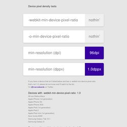
Device pixel density tests. If you have a device that isn’t listed below and has a -webkit-min-device-pixel-ratio that’s not 1.0, please let me know and I’ll add it to the list.
I’m @marcedwards on Twitter. Devices with -webkit-min-device-pixel-ratio: 1.0 All non-Retina Macs Apple iPhone (1st generation) Apple iPhone 3G Apple iPhone 3GS Apple iPad (1st generation) Apple iPad 2 Apple iPad mini (1st generation) Acer Iconia A500 Samsung Galaxy Tab 10.1 Samsung Galaxy S. The Ultimate Guide To iPhone Resolutions. Ios - Image resolution for new iPhone 6 and 6+, @3x support added? Retina Display Media Query. Safari HTML5 Canvas Guide: Setting Up the Canvas. To set up a canvas for drawing, you need to add a <canvas> tag to your HTML and assign a 2D drawing context to it.
All your drawing operations are performed on the context. Start by Adding a <canvas> Tag In your HTML, include a line that defines the canvas element, giving it a width and height. Be sure to include a closing tag. If you don’t specify a width or height, the default width of 300 pixels and the default height of 150 pixels are used. Specify the Fallback Behavior Put any fallback behavior for older browsers between the opening and closing <canvas> tags. HTML5-savvy browsers ignore everything between the opening and closing <canvas> tags.
Create a Drawing Context Using JavaScript, get the canvas element into an object and get a "2d" drawing context. Support Retina Displays From the Start. High Resolution Guidelines for OS X: Optimizing for High Resolution. After you optimize your app for high resolution, users will enjoy its detailed drawings and sharp text.
And depending on how you’ve designed and coded your app, you might not have that much optimization to perform. If your app is a Cocoa app and uses only the standard controls, doesn’t require custom graphics resources, and doesn’t use pixel-based APIs, your work is over. OS X handles the scaling for you. If your app is like many apps, however, you probably need to perform some work to ensure your users will have a great visual experience.
Using CSS Sprites to optimize your website for Retina Displays — miekd. CSS Sprites have been around for a while now.
Matter of fact, they have been around for over eight years. They allow for some great monetary and bandwidth optimizations for medium and large websites, and they allow for a better experience on the user’s side, since there is a reduction in load time. For a lot of small websites, the extra layer of complexity that CSS Sprites brings to your assets was not always worth it. iOS apps - why include both @2x and low-res images? Device pixel density tests. Max-device-width vs max-width? Which one should I use? I have wrestled with this question for a long time, and also been muddled up the device pixel with the CSS pixel for some time.
I'd like to share my findings and hope it helps someone. What we discuss here is for max width. The same goes for min and height naturally. Difference max-width is the width of the target display area, e.g. the browser; max-device-width is the width of the device's entire rendering area, i.e. the actual device screen. If you use max-device-width, when you change the size of the browser window on your desktop, the CSS won't change;If you use max-width, when you change the size of the browser on your desktop, the CSS will change and you might be shown the styling for mobiles, such as touch-friendly menus.
Which one to use. High DPI Images for Variable Pixel Densities. Introduction One of the features of today's complex device landscape is that there's a very wide range of screen pixel densities available.
Some devices feature very high resolution displays, while others straggle behind. Application developers need to support a range of pixel densities, which can be quite challenging. On the mobile web, the challenges are compounded by several factors: iPhone 5 and iOS 6 for HTML5 developers, a big step forward: web inspector, new APIs and more. The new main version of the Apple’s iOS is with us, along with the new iPhone 5 and the iPod Touch fifth generation.
As every big change, lot of new stuff is available for HTML5 developers and -as always- no much official information is available. Quick review I’m going to divide this post in two parts: iPhone 5 and iOS 6 new stuff. CSS Image Replacement for High-DPI Retina Display – Phatness.com. (Note: This article was originally written for the iPhone 4.
Since then, we have seen the iPad 3 with Retina, and now the MacBook Pro. This technique works with all of them.) The new iPhone 4 is certainly a marvel of technology. One of the surprising side effects it has is how bad it makes things look that weren’t designed for high-DPI displays. For the most part, text is automatically beautiful on the iPhone 4 1. But that is only 1/3rd the story. The trick here is that we check to see if the font size for our special class is set to value declared in our high-DPI CSS file. Image without ".replace-2x" Image with ".replace-2x" (Under normal DPI monitors, the images will look identical.) Note: all text looks good, except text rendered using Cufón and sIFR. Sidebar I really, really wanted to be able to do something different then what I described above. About the Author: Learned something?
Contact me: mike@brilliantchemistry.com Discussion. Iphone - High Resolution images in a uiwebview.