

Image Effects with CSS. Bennett Feely Twitter CodePen How it works Using one or more newer CSS properties (background-blend-mode, mix-blend-mode, or filter) gives us a surprising amount of possibilities to manipulate a single source image.
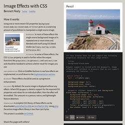
In most of these effects the single source background-image url is repeated one or more times and blended with itself using CSS blend modes (multiply, overlay, screen, difference, etc.) In some of these effects, the CSS filter property is used to further refine the output. How Flexbox works — explained with big, colorful, animated gifs. Three.js Sketches. CSS 3D Clouds. An experiment on creating volumetric 3d-like clouds with CSS3 3D Transforms and a bit of Javascript.

Check out the tutorial here! Move the mouse to rotate around and mouse wheel to zoom in and out. Hit space to generate a new cloud. Works on Firefox (faster if Nightly), Chrome and Safari. Texture list Select one or more textures to create clouds. White clouddark cloudsmoke cloudexplosionexplosion 2box Presets Credits Coded by Jaume Sánchez (@thespite) Original Hover Effects with CSS3. Animated Buttons with CSS3. Online CSS3 Code Generator With a Simple Graphical Interface - EnjoyCSS.
Mini.css - Minimal, responsive, style-agnostic CSS framework. How to Set CSS Margins and Padding (And Cool Layout Tricks) — SitePoint. This article was peer reviewed by Dave Maxwell, Adrian Sandu, and Panayiotis Velisarakos.
Thanks to all of SitePoint’s peer reviewers for making SitePoint content the best it can be! When I was just starting to learn CSS, the margin and padding properties always confused me. They seemed very similar and in some cases appeared to produce the same result. In this tutorial, you will learn the difference between CSS margins and padding and how these properties affect the space between elements on a webpage.
We will also discuss margin collapsing, the effect of using different units while creating responsive websites, and conclude with some layout tricks you can do with CSS margins and padding. The Box Model Elements in CSS are represented as a rectangular box. ContentPadding BorderMargin The content area of an element lies in the middle of the element. The following diagram should make the arrangement clearer. W3C box modelTraditional box model All browsers use the W3C box model by default. CSS Grid VS Flexbox: A Practical Comparison. Danny Markov Not too long ago, the layout for all HTML pages was done via tables, floats, and other CSS properties that were not well suited for styling complex web pages.
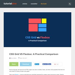
Then came flexbox – a layout mode that was specifically designed for creating robust responsive pages. Flexbox made it easy to properly align elements and their content, and is now the preferred CSS system of most web developers. Now we have a new contender for the best-system-to-build-html-layouts trophy (trophy title is a work in progress). It is the mighty CSS Grid, and by the end of this month, it will be available natively in Firefox 52 and Chrome 57, with other browsers (hopefully) following soon. CSS Grid Layout: A New Layout Module for the Web. People have been using grid designs in magazines, newspapers, posters, etc. for a long time before the Web appeared.
At the point when web developers started to create web pages, many of them were based on a grid layout. Different solutions have been used to create grid layouts, like tables, floats, inline blocks, or flexboxes, but all of these techniques have different issues when you try to define a complex grid design. In order to solve these problems, a new standard was defined to provide a good solution to create grid designs. This specification, called CSS Grid Layout, allows users to very easily create two-dimensional layouts on the Web.
It has been designed specifically for this purpose and it brings very powerful features to divide the web page into different regions, granting great flexibility to web authors in order to define the sizing of the different sections and how the elements are positioned in each of them. Basic Concepts Grid Definition Item Placement Alignment Conclusion. Caption Hover Effects. A tutorial on how to create some subtle and modern caption hover effects.
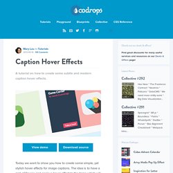
View demo Download source Today we want to show you how to create some simple, yet stylish hover effects for image captions. The idea is to have a grid of figures and apply a hover effect to the items which will reveal a caption with the title, author and a link button. For some of the effects we will use 3D transforms. The aim is to keep the effects subtle and provide inspiration for many different variations. Please note: this only works as intended in browsers that support the respective CSS properties. The images used in the demos are Dribbble shots by talented Jacob Cummings.
Let’s get started. The Markup The structure of our grid and the figures will be made of an unordered list and each item will contain a figure element. Shakrmedia.github. Caption Hover Effects. Modern CSS Layouts: The Essential Characteristics. Advertisement Today, too many websites are still inaccessible.
In our new book Inclusive Design Patterns, we explore how to craft flexible front-end design patterns and make future-proof and accessible interfaces without extra effort. Hardcover, 312 pages. Get the book now! Now is an exciting time to be creating CSS layouts. But all of this change can be stressful, too. Be sure to check out the following articles: