
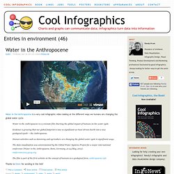
Big Blue Marble: Water and Air. World Clock Counter. Breathing Earth. Meet The World, Infographic Flags. World Progress Report poster - Available for one week ONLY. Nathan Yau at FlowingPrints has released a new poster, the World Progress Report.
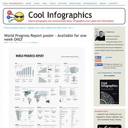
It’s available for one week ONLY, and then he’s going to release the printer to start printing them up. Orders will only be taken until January 21st. Each 24”x30” poster is signed and numbered, and one can be yours for $26 + shipping & handling. Nathan is doing another great thing. All proceeds go to UNICEF’s relief effort in Haiti! One more thing…for the first 50 people who pre-order: a free copy of Atley’s “How America Learns” poster! UNdata provides a catalog of 27 United Nations statistical databases and 60 million records about the past, present, and future state of the world.
Check out some of the great details in the poster: Humans! Cool Infographics - Blog. Nathan Yau at FlowingPrints has released a new poster, the World Progress Report.
It’s available for one week ONLY, and then he’s going to release the printer to start printing them up. Orders will only be taken until January 21st. Each 24”x30” poster is signed and numbered, and one can be yours for $26 + shipping & handling. Nathan is doing another great thing. All proceeds go to UNICEF’s relief effort in Haiti! One more thing…for the first 50 people who pre-order: a free copy of Atley’s “How America Learns” poster! UNdata provides a catalog of 27 United Nations statistical databases and 60 million records about the past, present, and future state of the world.
Check out some of the great details in the poster: Plastic Bags. Here's another one from Chris Jordan.
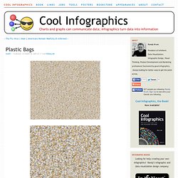
Is it art, or is it infographic? The image shows 60,000 plastic bags, which is how many bags are used in the U.S. every 5 seconds! The picture currently on display at the Paul Kopeikin Gallery in Los Angeles is 5ft x 6ft large so viewers can step up close to see all of the details. How Long Will It Last? Good infographic from the New Scientist showing how many years we have left of our key natural resources.
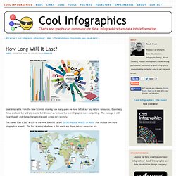
Essentially these are basic bar and pie charts, but dressed up to make the overall graphic more compelling. The message is still clear though, and the author gets his point across very strongly. This comes from a 2007 article in the New Scientist called "Earth's Natural Wealth: an Audit" that include two more infographics as well. The first is a map of where in the world are these natural resources are. The next is a bubble graphic showing the scale of how much of each resource an average American will consume during their lifetime. The Source listed on the first infographic: Armin Reller, University of Augsburg, Tom Graedel, Yale University. Cool Infographics - Blog. Volvo’s new infographic puts their 2011 CSR (Corporate Social Responsibility) and Sustainability Report into a tidy, easy to read design!
Shaping the Future of Transport focuses on Volvo’s environmental, economic, and social responsibility. All you need to know about the Volvo Group’ CSR and Sustainability Report 2011.The Volvo Group’s vision is to become world leader in sustainable transport solutions. We’re convinced that efficient transport is crucial for societal and economic development. Visualizing How A Population Grows To 7 Billion. 7 Billion: How Did We Get So Big So Fast?
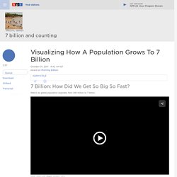
Watch as global population explodes from 300 million to 7 billion. Sometime Monday, the world will have more humans than ever: 7 billion, according to the U.N. The U.N. estimates that the world's population will pass the 7 billion mark on Monday. Best-infographics-data-vizualisation-24. United Nations Development Programme (UNDP) Best-infographics-data-vizualisation-22. Best-infographics-data-vizualisation-49. 20 things that happen in 1 minute.
Weightoftheunion2012-anytimefitness-sm.jpg (JPEG Image, 740x4983 pixels) - Scaled (21%)