
Skeleton: Beautiful Boilerplate for Responsive, Mobile-Friendly Development. Free iPad CSS layout with landscape/portrait orientation modes. By Matthew James Taylor on 27 May 2010 The iPad has finally launched in Australia today, hooray!

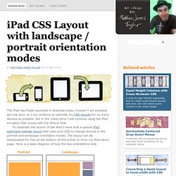
I will probably get one soon so I can continue to optimise my CSS layouts for as many devices as possible. But in the mean-time I will continue using the iPad emulator that comes with the iPhone SDK. To celebrate the launch of the iPad I have built a special iPad optimised website layout that uses pure CSS to change layouts in the portrait and landscape orientation modes. The layout can be downloaded for free at the bottom of this article or from my iPad demo page.
In Landscape mode the layout is in two columns. In both orientations there is a header at the top and a footer at the bottom. How does it work? The first thing I do is lock the layout's resolution to a 1:1 ratio so that each pixel exactly lines up with the pixels in the iPad's screen. Next I combine this with some CSS rules that change the layout in portrait and landscape modes. Demo Download (ipad-css-layout.zip - 41kb) How To Build A Mobile Website. Advertisement Today, too many websites are still inaccessible. In our new book Inclusive Design Patterns, we explore how to craft flexible front-end design patterns and make future-proof and accessible interfaces without extra effort. Hardcover, 312 pages. Get the book now! Over the past few years, mobile web usage has considerably increased to the point that web developers and designers can no longer afford to ignore it. Unfortunately, the mobile arena introduces a layer of complexity that can be difficult for developers to accommodate.
Further Reading on SmashingMag: Link In addition to supporting different platforms, each device may use any number of mobile web browsers5. 6Source: Nielsen Study7, Image credit8 The mobile web reintroduces several issues that have been largely ignored in recent years. How To Implement Mobile Stylesheets Link The first step to adding mobile support to a website is including a special stylesheet to adjust the CSS for mobile devices: Large image15.
Responsive Web Design. The English architect Christopher Wren once quipped that his chosen field “aims for Eternity,” and there’s something appealing about that formula: Unlike the web, which often feels like aiming for next week, architecture is a discipline very much defined by its permanence.

Article Continues Below A building’s foundation defines its footprint, which defines its frame, which shapes the facade. Each phase of the architectural process is more immutable, more unchanging than the last. Creative decisions quite literally shape a physical space, defining the way in which people move through its confines for decades or even centuries. Working on the web, however, is a wholly different matter. But the landscape is shifting, perhaps more quickly than we might like. In recent years, I’ve been meeting with more companies that request “an iPhone website” as part of their project.
A flexible foundation#section1 Let’s consider an example design. Becoming responsive#section2 responsive architecture . » CSS Media Query for Mobile is Fool’s Gold Cloud Four Blog. Read the follow up article written August 21, 2013 Ethan Marcotte’s article Responsive Web Design has caught the imagination of web developers.

Several subsequent articles have touted the CSS media query feature as a way to build mobile-optimized web sites. Even I’m guilty of contributing to this meme with my article on CSS orientation. Unfortunately, CSS media query is fool’s gold for mobile devices. It hides tough problems and gives developers a false promise of a simple solution for designing to multiple screens. The Short Version Ferreting out the problems with CSS media queries for mobile devices is easy if you look at what media queries purportedly promise: All you need to do to transform your desktop web design into something optimized for devices with smaller screens, less powerful CPUs, and slower network connections is to add more code.
The idea of adding more code—adding more to download—in order to optimize for mobile should be the first clue that this isn’t a good solution.