

Everything You Know About CSS Is Wrong. The web professional's online magazine of choice.
In: Articles By Rachel Andrew Published on October 21, 2008 When released, Internet Explorer 8 will support many new values for the CSS display property, including the table-related values: table, table-row, and table-cell—and it’s the last major browser to come on board with this support. This event will mark the end of complex CSS layout techniques, and will be the final nail in the coffin of using HTML tables for layout. Perhaps you’re feeling slightly uncomfortable about the example we’ve just seen—after all, haven’t web standards advocates like myself been insisting for years that you shouldn’t be using tables for layout?
Applying table-related display property values to web page elements causes the elements to mimic the display characteristics of their HTML table equivalents. Using CSS Tables. No Resolution. XForms for HTML Authors. Introduction - In search of the One True Layout. Articles about CSS by (Big) John Gallant, Holly Bergevin, and others. Layout Gala: a collection of 40 CSS layouts based on the same markup and ready for download! All layouts use valid markup and CSS, and have been tested successfully on Internet Explorer/win 5.0, 5.5, 6 and beta 2 preview of version 7; Opera 8.5, Firefox 1.5 and Safari 2.
Each of the columns could be the longest, and for testing columns length I've used the script filler text on demand. Each layout could represent a site with five main sections: header, content, navigation, other stuff and footer. The basic markup, common to every layout, is the following: Hype — Gallery. Comment améliorer l’expérience de vos visiteurs grâce au Single-page Interface. Le Single Page Interface (SPI), aussi appelé *application web monopage* est un site web ou une application (ou une section de ceux-ci) qui tient en une seule page (un seul URL).
Le principal avantage de cette utilisation est d’améliorer l’expérience usager en augmentant la rapidité des réponses aux actions de l’utilisateur ainsi qu’en diminuant l’utilisation de la bande passante. Depuis les débuts d’Internet, on essaie de rendre les sites Internet plus interactifs. Le Flash a longtemps répondu à ce besoin, mais cette technologie propriétaire (Adobe) n’est pas nécessairement performante et cause des problèmes au niveau de l’indexation et du référencement Internet.
Le SPI vient répondre à ces besoins en interactivité en utilisant des standards/technologies non propriétaires et ne nécessitant pas l’installation d’outils supplémentaires. Si offrir une expérience utilisateur hors pair à vos clients est une de vos priorités, alors la lecture de cet article pourrait grandement vous intéresser.
Liquid Web Design. Negative margin. Liquid design. Div et CSS : une mise en page rapide et facile. Tout au long de cet exercice, nous allons utiliser deux fichiers : index.html : contiendra tout notre code HTML. style_div.css : contiendra toutes les informations relatives au positionnement de nos différents blocs.
Pour inclure notre CSS dans notre page HTML, rien de plus simple, il nous suffit d'insérer le code suivant entre les balises <head> et </head> : Css/edge. Please note that none of the demonstrations in css/edge are intended to work in Navigator 4.x.
I say this not to denigrate that browser, but instead to spare you any frustration you might otherwise feel. This site exists to explore the cutting edge of HTML+CSS design, and Navigator 4.x is, at four years and counting, just too old to keep up with most things that will be done here. Again, there's nothing wrong with Navigator 4.x, but you probably don't want to use it in this area. Consider it a friendly warning. Welcome to the edge. Dynamic Drive CSS Layouts- Liquid Layouts.
Kyle Schaeffer - Web Design and SharePoint Branding. One of the most confusing aspects of CSS styling is the application of the font-size attribute for text scaling.
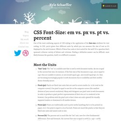
In CSS, you’re given four different units by which you can measure the size of text as it’s displayed in the web browser. Which of these four units is best suited for the web? It’s a question that’s spawned a diverse variety of debate and criticism. Finding a definitive answer can be difficult, most likely because the question, itself, is so difficult to answer. Meet the Units “Ems” (em): The “em” is a scalable unit that is used in web document media. So, What’s the Difference? It’s easy to understand the difference between font-size units when you see them in action. As you can see, both the em and percent units get larger as the base font-size increases, but pixels and points do not.
Em vs. We’ve decided that point and pixel units are not necessarily best suited for web documents, which leaves us with the em and percent units. The Verdict The winner: percent (%).