
How to perfect your mobile app’s login screen – Prototyping: From UX to Front End. The sign-up screen on mobile applications — we love it, we hate it, and we definitely love to hate it.

If done right, it can be the trigger to a massive user retention. If done poorly it can have the exact opposite effect. Yet, the sign-up screen is designed poorly more frequently than anyone would love to admit. But what does ‘getting the sign-up screen done right’ actually mean? How do we tame this wild beast? The best practices for a mobile app’s login screen are (in no particular order): Simplify registrationsAllow login via external accountsGo for email instead of usernamesFacilitate password resettingKeep users logged in By following these best practices, you can start building an amazing user experience right from the first screen, which will do wonders for user retention, as well. 10 tips for a better login page and process - UXM. 4 minutes read.

How to Design Effective Registration Forms - Usersnap Blog. Even though user registration is quite a common thing, it’s also one of the trickiest parts of web design.

Designing UX Login Form and Process — UX Planet. Designing UX Login Form and Process by Nick Babich While sign-in walls (demanding that users must register or log in before they can fully access an app or site) generally isn’t a very good practice, they are still very common in our digital life.

Most likely you go through a login process pretty much every day. However, even though they are so common thing, they also are one of the trickiest parts to design and designer’s job is to figure out which elements they should include or exclude to create great user experience. The Ultimate UX Design of: the Sign-Up Form. In this series Marcin Treder of UXPin – The UX Design App explains how to design the User Experience of the most important ingredients of web and mobile apps.

Step-by-step tutorials and examples from the most important services in the world will help you in your own, everyday practice. Introduction. 8 Reasons Users Don’t Fill Out Sign Up Forms. By anthony on 04/05/12 at 10:14 am Signing up for a website is a big commitment to most people.
Users who sign up for your site are giving you their personal information. If you misuse their personal information, you could abuse their trust. Most users today are more wary than ever about who handles their personal information. In a cyber world full of hackers and spammers, who can blame them? 1. Gerry Gaffney: Repeating email addresses. A few days ago James Hunter and I were talking about why forms often require the user to repeat their email address.
I've always found it irritating, although I'll happily concede that for people who don't spend an inordinate amount of time filling in online forms, it's at most a petty annoyance. There are two reasons for requesting the repetition: The email address is a key piece of information, without which it may not be possible to complete the transaction (such as a registration process)The email address may be a relatively complex string, and a high degree of precision is required for it to be used successfully.
However, these apply equally to a credit card number or card holder name (for example), even though I can't recall a form asking me to repeat those fields. In fact I have mistyped my credit card number on occasion, but the resulting error, or non-confirmation of the transaction, has alerted me to the fact. Email Entry in Web Forms. Many online transactions (such as registration or checkout) rely on email communication to verify user identity and intent or to establish ongoing customer dialog.
So it's no wonder companies and organizations care a lot about valid email addresses in Web forms. Get the wrong email address and potential customers can't be confirmed or contacted. The most common cause of unintentional email input errors is misspelling. Death to email address re-entry. I hate it when forms like this Oxfam donation form ask me to re-enter or confirm my email address: Oxfam donation form - email address re-entry fields I suspected I wasn’t alone so I tweeted to find out what others do when presented with this situation and I have to say I was overwhelmed with the number of responses I received.
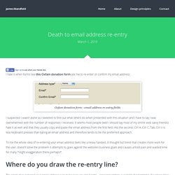
It seems most people (well I should say most of my online web savvy friends) hate it as well and that they usually copy and paste the email address from the first field into the second. Ctrl A, Ctrl C, Tab, Ctrl V is less keyboard presses than typing an email address and therefore tends to be the preferred approach. To me the whole idea of re-entering your email address feels like a heavy handed, ill thought out trend that creates more work for the user, doesn’t solve the problem it attempts to, goes against the websites business goals and causes untold pain and wasted time for many *slight exaggeration there perhaps*.
Why the Confirm Password Field Must Die. By anthony on 08/25/15 at 9:32 am Sign up forms are one of the trickiest web pages to design.
Including and excluding certain form elements affects the conversion rate. The designer’s job is to figure out which elements they should include or exclude. Confirm Password Fields Lower Conversion Rate Many think the confirm password field is necessary to include when creating a password. While the confirm password field seems sensible, including it can lower your conversion rate. Five UX Antipatterns To Avoid When Designing Log-in & Registration Areas. Registration and log-in areas have been a common feature on the web since – well – since forever really. With this in mind, it’s amazing how many top name sites deliver frustrating registration and log-in experiences that not only annoy their users, but also impact their conversion rates and chip away at their profitability.
This post highlights five User Experience (UX) antipatterns, and explains how you can avoid them in your own designs. Example: youtube.com Problem: the user fills in the registration form, but makes a few errors. Upon submitting, they not only get an error message but also find their chosen password has been wiped out. Solution: where possible, use JavaScript validation to ensure fields have been completed correctly – this avoids the password fields being wiped out. Example: Archive.org. Account 'Sign Up': Ask to Confirm E-mail, Not Password. During account ‘sign up’, a misspelled password is annoying, whereas a misspelled e-mail address is hazardous. More and more sites use people’s e-mail address as their “username” too when requiring authentication.
This makes a lot of sense: e-mails are unique, you often need it anyways, people have an easier time remembering their e-mail than an arbitrary username, etc. However, on most of those sign-up forms, I’ve noticed a very peculiar tendency – to the point where it is almost a standard – people are asked to confirm their password but not their e-mail address. To this day this still baffles me – surely getting the e-mail correct is more important than getting the password correct. After all, people can always use the “Forgot password?” 14 Steps to Building Sign-up Forms That Convert.
Growing your mailing list and generating leads should be one of your focus points of your marketing efforts. If Groupon didn’t have over 115 million or Appsumo 500 000 email subscribers, they wouldn’t have a business. Too many businesses don’t give it enough attention, and just throw something together (then complain that online lead generation doesn’t work). This post is about building email and sign-up forms that convert. 1. Less is more (Few fields = more conversions) Every field you ask them to fill increases friction.
In one study an 11-field version of a contact form was replaced with a 4-field version, resulting in a 160% increase in the number of forms submitted and a 120% increase in conversion while the quality of submissions stayed the same.