
Responsive Web Design: What It Is and How To Use It. Advertisement Almost every new client these days wants a mobile version of their website.
It’s practically essential after all: one design for the BlackBerry, another for the iPhone, the iPad, netbook, Kindle — and all screen resolutions must be compatible, too. Top Website Design Trends for 2012. 2012 has brought with it a wave of web design trends.
Keeping up with these constant developments is essential, but it's important to keep in mind that effective web design is more than just a coat of paint; it always needs to support your business goals. Good web design is a necessary part of your larger web marketing and user experience picture. In keeping with this holistic approach, we selected the following as the top web design trends to implement this year: 1.
HTML5, CSS3 and JQUERY In the last couple of years, HTML5 has gained quite a bit of traction, and now all major browsers support it. 2. Designers can no longer ignore the exponential growth in mobile usage, and always have to consider how a website will perform on mobile. Responsive layout refers to how well a layout responds to the size of a screen. Web Design Trends in 2012. It’s that time of year again, where we look into our crystal ball to see what will be the hot trends in web design for the upcoming year.
It’s no secret that trends come and go, with some hanging around longer than they should. (Yes, splash page, I’m talking about you.) Font Awesome, the iconic font designed for use with Twitter Bootstrap. Web-Design Trends: 40 Illustrative Website Designs. There are a ton of awesome web design trends going around.
I call them awesome – you may call them oversaturated and ‘old school’ – however, I feel that any design trend out there has its place in the web design community and this one is a trend that I hope NEVER goes away. The illustrations in the below websites showcase design skill well beyond creating boxes and gradients in photoshop. They show the visual detail and skill levels of the designers who created them.
jQuery Image Galleries & Sliders – Best Of. jQuery image galleries and sliders are very common on portfolio sites and are also useful for any other type of site for displaying images and photos.

Also, provide a good user experience and make viewing images more pleasant and intuitive on your website. With the advent of powerful JavaScript frameworks like jQuery, Prototype, Mootools etc., the quality of JavaScript based image galleries and slideshows have improved dramatically. Today we’ve prepared for you a good list of the best jQuery image sliders and galleries plugins that can provide you with the resources that you need to get a gallery or a slider on your site. A look into: Designing for Mobile Devices. When the first iPhone was released it took the tech world by storm.

Since then it has been almost 5 years and the smartphone market has ramped up in popularity, with even the Microsoft has gotten into the competition with its Windows 7 OS and partners. With so many Internet users on their smartphone nowadays, it’s common sense to expect the number of mobile website to increase aggressively. Mobile Web Design: 10 Tips To Better Usability.
Mobile web browsing is expected to turn into the next major Internet platform.
It is now easy to browse the net from nearly anywhere utilizing mobile devices that fit in a hand because of technology. CSS-Tricks. Demos - Wumblr. 5 Useful CSS Tricks for Responsive Design. Making the design to be responsive is very easy as shown in my Responsive Design in 3 Steps tutorial, but maintaining the elements to look aesthetically balanced on all breakpoint layouts is an art.
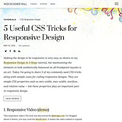
Today I’m going to share 5 of my commonly used CSS tricks along with sample cases for coding responsive designs. They are simple CSS properties such as min-width, max-width, overflow, and relative value — but these properties play an important part in responsive design. View Demos 1. Responsive Video (demo) This responsive video CSS trick was discovered by tjkdesign.com. 2. Max-width property allows you to set the max width of the element. Max-Width Container In the example below, I specify the container to display at 800px if possible, but it should not exceed 90% of the boundary width. Responsive Image You can make the image auto resize to the max width of the boundary by using max-width:100% and height:auto. The above responsive image CSS works on IE7 and IE9, but doesn’t work on IE8. Min-Width. 6 Methods For Vertical Centering With CSS.
Centering elements vertically with css is something that often gives designers trouble.
There are however a variety of methods for vertical centering and each is fairly easy to use. Today I want to present 6 of those methods. I’ve usually skipped over the topic of vertical centering, since there are some good posts already out there that are easy enough to find, but recently Bikram commented requesting a tutorial on vertically centering so I thought why not. You can view demos of each of the methods below by clicking here. Clicking the images above each section will also take you to that specific demo. Let’s start by first talking about something that doesn’t work as many expect. Responsive Navigation Patterns. Web Standards Sherpa. 10 webdesigntrends voor 2012. Euro- en begrotingstekorten.
De wereld gaat failliet en ondertussen browset en surft diezelfde wereld er met steeds ruimere bandbreedtes en uiteenlopender apparaten op los. Welke kant gaat webdesign op in 2012? Op internet verwachten we eigenlijk weinig zuinigheid. We zien grote, ruime en rijke ontwerpen en inventieve animaties. Symptoms Of An Epidemic: Web Design Trends. Why You Should Get Excited About Emotional Branding Globalization, low-cost technologies and saturated markets are making products and services interchangeable and barely distinguishable.
As a result, today’s brands must go beyond face value and tap into consumers’ deepest subconscious emotions to win the marketplace. In recent decades, the economic base has shifted from production to consumption, from needs to wants, from objective to subjective. We’re moving away from the functional and technical characteristics of the industrial era, into a time when consumers are making buying decisions based on how they feel about a company and its offer.