

50 jQuery Function Demos for Aspiring Web Developers - Smashing Coding. Every aspiring Web developer should know about the power of JavaScript and how it can be used to enhance the ways in which people see and interact with Web pages.

Fortunately, to help us be more productive, we can use the power of JavaScript libraries, and in this article we will take a good look at jQuery in action. What Is jQuery? Link In a nutshell, jQuery is a leading JavaScript library that can perform wonders on your Web pages and make your Web development life much easier and more enjoyable. The New Web Typography. Asynchronous UIs - the future of web user interfaces. It's an interesting time to be working on the frontend now.
We have new technologies such as HTML5, CSS3, Canvas and WebGL; all of which greatly increase the possibilities for web application development. The world is our oyster! However, there's also another trend I've noticed. Web developers are still stuck in the request/response mindset. I call it the 'click and wait' approach - where every UI interaction results in a delay before another interaction can be performed. Speed matters; a lot.
Amazon: 100 ms of extra load time caused a 1% drop in sales (source: Greg Linden, Amazon).Google: 500 ms of extra load time caused 20% fewer searches (source: Marrissa Mayer, Google).Yahoo! Yet, despite all this evidence, developers still insist on using the request/response model. A good example of the problem is Gmail's 'sending' notification; how is this useful to people? As developers, we should optimize for the most likely scenario. The solution The result. jQuery Scripts for Creating Cool Image Slideshows. The good old slideshow is one Javascript powered effect that will never go out of fashion.
Slideshows are often used to showcase multiple images sequentially, or to feature a site’s popular content at the top of the homepage. This collection of jQuery plugins and tutorials will help you create your own jQuery powered slideshow, with various styles and options to choose from. Don’t fancy getting your hands dirty with Javascript code? I don’t blame you! It can be a little tricky getting these scripts to work correctly. Easy Slider 1.7 Download the plugin Slides Download the plugin AnythingSlider Download the plugin Nivo Slider Download the plugin Gelleria Download the plugin Coin Slider Download the plugin AviaSlider Download the plugin TN3 Gallery Download the plugin Keen to learn how to build your own slideshow or tailor the style exactly to your own design?
Creating a Slick Auto-Playing Featured Content Slider. ColorTheory_Screen_White.jpg (1224×792) CrossBro - A realtime multi-browser refresher utility - Colin Ord. URL textbox: If a URL is typed here and Activated as the item to be refresh in the browser, you will be able to edit a source file (e.g. PHP) on a local server and have a different item refreshing in the browser as the source file is being edited. Work brilliantly with Adobe Shadow. You can now extend Adobe Shadows capabilities by editing any file e.g. php and automatically refreshing the browsers set URL while editing the code.
The Zip below contains the v0.91 Beta executable only.Please download and install the Full free version (v0.9) and copy the Beta executable file into that location to use...more soon!
Adaptive Images for Responsive Designs… Again. When I was asked to write an article for 24 ways I jumped at the chance, as I’d been wanting to write about some fun hacks for responsive images and related parsing behaviours.
My heart sank a little when Matt Wilcox beat me to the subject, but it floated back up when I realized I disagreed with his method and still had something to write about. So, Matt Wilcox, if that is your real name (and I’m pretty sure it is), I disagree. I see your dirty server-based hack and raise you an even dirtier client-side hack. How to Design the Best Navigation Bar for Your Website. Daniel Alves is the design director for the small business web design division at the digital marketing and web design company 352 Media Group.

The navigation bar is the most important design element on a website. Not only does it guide your users to pages beyond the homepage, but it’s also the singular tool to give users a sense of orientation. With this in mind, it’s important to adhere to time-tested design and usability conventions. Doing so will give your users a comfortable and easy reference point to fully engage with your content. Despite the necessity of an accessible navigation bar, usability studies on navigation across the web aren’t positive. Teleject/Responsive-Web-Design-Artboards - GitHub. The Messy Art Of UX Sketching - Smashing UX Design. Advertisement I hear a lot of people talking about the importance of sketching when designing or problem-solving, yet it seems that very few people actually sketch.
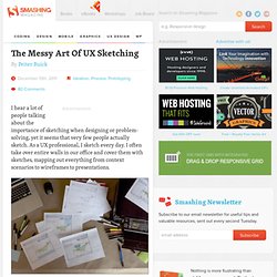
As a UX professional, I sketch every day. I often take over entire walls in our office and cover them with sketches, mapping out everything from context scenarios to wireframes to presentations. My desk. Although starting a prototype on a computer is sometimes easier, it’s not the best way to visually problem-solve.
HTML5. SloDive - Graphics & WebDesign Blog. Javascript Libraries. “Mobile first” CSS and getting Sass to help with legacy IE. Taking a “mobile first” approach to web development poses some challenges if you need to provide a “desktop” experience for legacy versions of IE.
Using a CSS pre-processor like Sass can help. One aspect of a “mobile first” approach to development is that your styles are usually gradually built up from a simple base. How to structure your CSS. Chrome Frame - Google Code. The Difference Between “Block” and “Inline” For the purpose of CSS styling, elements can be generally divided into a few different categories.
Two of those categories are block-level elements and inline elements. The difference between width:auto and width:100% When adapting a layout for different viewport widths (a.k.a. responsive design) or media (like print), it’s common to reset any float and width values on major layout blocks to linearise their display.

Unfloating a floated element is as simple as specifying float:none. Width doesn’t seem to be quite as straightforward – lately I’ve come across several cases where people use width:100% to undo explicitly specified widths when they should be using width:auto instead. So here’s a brief explanation of the difference. The initial width of a block level element like div or p is auto. Responsive design.