
Responsive Typography: The Basics. When we built websites we usually started by defining the body text.
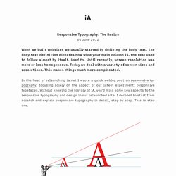
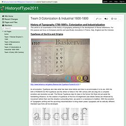
The body text definition dictates how wide your main column is, the rest used to follow almost by itself. Used to. Until recently, screen resolution was more or less homogeneous. Today we deal with a variety of screen sizes and resolutions. This makes things much more complicated. In the heat of relaunching ia.net I wrote a quick weblog post on responsive typography, focusing solely on the aspect of our latest experiment: responsive typefaces. To avoid designing different layouts for every possible screen size, many web designers have adopted the concept of Responsive Web Design. Uppercase Treasure. Flamboyant lettering graphics by Paulus Franck from his 1601 book, 'Schatzkammer Allerhand Versalien Lateinisch vnnd Teutsch' (A Treasure Trove of Latin and German Uppercase Letters In the late 1500s, a Nuremberg publisher/bookkeeper named Conrad Bauer combed through the books from his local region, hoping to compile a selection of elegant fonts.
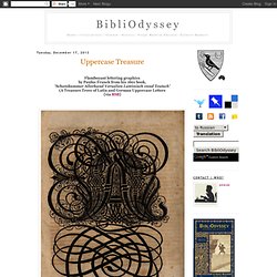
He wasn't particularly satisfied with his findings; there weren't enough stylish scripts around to meet his exacting standards. Abc typography - a virtual type museum. History of typography: Humanist. Incunabula Every subject, from dentistry to dog handling has its own vocabulary — terms that are peculiar (unique) to it.
Typography is no exception. Learning the lingua franca (lingo) of type will make typography that much more accessible; and that will, in turn, lead to greater understanding, and hopefully a greater appreciation for all things “type”. Today we’re going to take a look at just one of those terms, namely “Humanist”. You may have come across this term before (or you may even be thinking, what the hell’s that?). Humanist | Old Style | Transitional | Modern Slab Serif (Egyptian) | Sans Serif. Typographer's Glossary. Serif: Serif's are semi-structural details on the ends of some of the strokes that make up letters and symbols.

A typeface that has serifs is called a serif typeface (or seriffed typeface). HistoryofType2011 - Team 2 Renaissance 1400-1600. HistoryofType2011 - Team 1 Roman Empire 0 - 1300. A brief prehistory of writing systems: Before beginning to qualify the history of typefaces in the Common Era, a brief history of writing systems is required to illustrate the direction of the evolution of written language.
The description of a writing system is a symbolic system used to convey ideas and concepts understood with language. This means that there are a couple types of writing system: the kind that uses images or symbols immediately recognizable by the reader and not requiring any kind of understanding of language. These Logographic writing systems, like the ancient cave paintings at Lasceaux in France, would eventually evolve into more complex forms of written language designed to transcend the spoken word. HistoryofType2011 - Team 3 Colonization & Industrial 1600-1800. This article is an examination of the history of typography pertaining to the development of Roman letterforms.
For this purpose we focus on European practice and specifically innovations in France, Italy, England and the Colonies. Typefaces of the Era and Origins. Historical Allsorts. Old and improved.
A resurrection of six beloved typefaces, the Historical Allsorts collection uses digital techniques to achieve warm, handmade results. Didot. MartinSilvertant on deviantART. You say Bodoni, I say Bodoni. THE AMERICAN TYPE DESIGNER Sumner Stone said, (in the context of a discussion of revivals and digital releases) that "the types of the 19th century are rushing to meet us.
" Some late -18th- century classics are also now coming within the gravitational pull of our own times, with the recent revivals of two families, Bulmer from Monotype Typography and ITC Bodoni, whose original styles date from the 1790s. Bodoni Poster. The Ludlow: Typographic Influence, 1931–1962. On Saturday, November 12, I gave a brief presentation at the International Printing Museum about a selection of typefaces that were designed by Robert Hunter Middleton for the Ludlow Typograph, a letterpress linecasting machine (for which we just so happen to be doing a Kickstarter Campaign).
Focusing on the idea of “typographic influence,” I have attempted to trace some examples of what inspired Middleton’s designs while he worked for Ludlow from 1933–1971, and also what his designs later influenced during the first decade of the 21st century. What I find most interesting about type design and typography is how each era in time has its own look and feel—its own zeitgeist, if you will. It gets tricky to pinpoint, though, as typographic trends tend to cycle and repeat over time. The World of Fonts. Sans Serif History. He first half of 20th century is the end of the Modern era, the moment when revived typefaces were flooding the typography mainstream.
But it was also the time when a completely different font design was booming, called sans serif (which is French for "without serifs"). It wasn't an absolutely new idea at that time, since first sans serif faces had appeared in the beginning of 19th century; but never before this seemingly peripheral and exotic trend claimed so much importance as in 1920s and 30s. The materials of typefounding. Futura. A Brief History of The Broadside. Research Project: Ashley Barreda Broadsides throughout history have been one of the most popular printed formats. Printed on single sheets of paper and printed on one side only; broadsides were used to inform the public about current news, events and public decrees, publicize official proclamations and government decisions, announce and record public meetings and entertainment events, advocate political and social causes, advertise commercial and private products and services, and celebrate popular literary and musical efforts.
Early broadsides were often crudely printed and distributed freely in town squares, taverns and churches, they were sometimes sold by itinerate salesman and chapmen for nominal charges. Broadsides were often crudely produced and quickly printed in large quantities, meant for immediate impact, and then be discarded. Broadsides, meant to be read from faraway, required large type. A Firm Turn Toward the Objective: Josef Müller-Brockmann 1948–1981. In February of 1989, I had the pleasure of meeting Josef Müller-Brockmann. I was a young, wide-eyed student of 21 years studying at Arizona State University. With great fortune, a professor of mine had heard that Müller-Brockmann was going to be in the country and asked him to add a stop in Tempe, Arizona.
The program director for the design department at ASU at the time was the famous Rob Roy Kelly, known for putting together successful design programs, many of which became blueprints for other design schools. Johannes Gutenberg. ARH3990 History of Design.