
Facebook Design. Créer des GIFs animés de présentation d'UI/UX Design. Réaliser une petite animation pour présenter son site web ou son application mobile est un bon moyen de faire une démonstration de celle-ci.
En effet, il devient beaucoup plus facile de s'imaginer soit même l'utiliser. Pourtant, réaliser une animation nécessite souvent des compétences en logiciels vidéos tels qu'After Effects, et prennent beaucoup de temps à réaliser. Je vais vous proposer une méthode qui fonctionne plutôt efficacement, et qui n’est pas très compliquée à mettre en place. Il doit exister bien d’autres moyens d’arriver à un tel résultat, mais celui-ci me parait être un des plus faciles. Cet article a été publié initialement sur le blog personnel de l'auteur, edenpulse à la date du Vendredi 26 Septembre 2014. Le but de ce petit tutoriel est de réaliser un GIF de ce type : source dribbble Le nécessaire.
Make Your UX Design Process Agile Using Google’s Methodology. In an age of tight resources and constrained finances companies are more reluctant than ever to commit to big design projects without a thorough understanding of their chances of success. Google has developed a methodology to make the design process fast and still offer valuable insight. Forget minimum viable products and focus on prototypes and build and test in a week! The Google Design Sprint Process Overview operates in a 5 phase process. Each phase takes approximately 1 day to perform (8 hours) and all 5 phases take approximately 40 hours to execute in full. The Surprising Power of Minimalist Web Design. We’ve all heard this, right?
It’s the idea that by refusing to clutter our designs up with lots of stuff just to make it look like we did something, people actually end up seeing more because they can focus on what’s really important and impart their own meaning on the blank space. That’s certainly the case with a well-done minimalist web design. Some of the most impactful websites utilize the technique, and the results can be striking, elegant, and classic.
But beware: when minimalist web design is done poorly, it can work against you. When you don’t have a whole lot for people to look at, what’s there better be good or you’ll draw attention to flaws and appear unprofessional. Define the objective. Minimalist designs work best when there is a clear goal for the website. Find your focus. Look for what’s iconic, beautiful, or memorable. Create an unexpected juxtaposition. Build a bridge between two ideas or images that seem unrelated. Get united. Lossy compression Definition from PC Magazine Encyclopedia. Definition of: lossy compression lossy compression A compression technique that does not decompress digital data back to 100% of the original.
Lossy methods can provide high degrees of compression and result in smaller compressed files, but some number of the original pixels, sound waves or video frames are removed forever. Examples are the widely used JPEG image, MPEG video and MP3 audio formats. The greater the compression, the smaller the file. I ♥ wireframes - The ultimate source of inspiration and collection of resources for wireframes.
Design Details by Brian Lovin. How designers worked in 2015? All Design Lessons - Hack Design. A Comprehensive Reading List for and by Designers. Updated 8/10/2016: We've recently updated this list to include even more of our favorite designers’ recommended books.
Happy reading! Being big bibliophiles here at InVision, we asked some of our favorite designers to recommend the book that inspired them the most this past year. Check out the most popular answers and the top designers who recommend them, plus 5 inspiring periodicals. Just My Type by Simon GarfieldGarfield uncovers where fonts come from and why we need so many. Sydney Emery Graphic/motion designer at Vevo Decorative Logo DesignThis image-heavy book explores the marks and logos of charming brands. Yoga Perdana Coordinator Designer at Volcom Indonesia David Cran Illustrator, Designer and Photographer Dangerous Curves: Mastering Logotype Design by Doyald YoungThis book exhibits Young's amazing collection of typography by focusing on the form and curves of the letters.
Ryan Hamrick. Why empty states deserve more design time. An empty state, or zero-data state, is an afterthought for many designers.
The thing you design last—if at all—because it’s a temporary or minor part of the user experience. But don’t be fooled by the name. Empty states are actually full of potential to drive engagement, delight users, and retain users at critical moments like when someone downloads the app, clears out their content, or runs into an issue. These empty states are commonly known as first use, user cleared, and errors. UX design tips for your app. 6 key insights on UX design. At Dom & Tom, we’ve developed mobile apps and online platforms for over half a decade.
We’ve had the privilege of working with amazing companies like General Electric, Hearst Corporation, Priceline, and many more. After working on over 300 such projects, we’ve learned a ton of lessons. Now we’d like to share 6 important insights to help you take your user experience to the next level. 1. Focus on the presentation. Typography tips for a more comfortable read. There are 3 small changes you can make to your content to provide a more pleasurable read.
The tips don’t just apply to design—use them to make your text documents look great, too. The names of each principle may be complicated, but understanding and using them is simple. For demonstration purposes, I’m going to use an un-styled page from A Clockwork Orange by Anthony Burgess. Important note: every font is different, so if the content doesn’t feel right, go ahead and adjust your measurements. 8 visual design tips for UX designers. The UX industry places an enormous emphasis on usability.
User stories, site maps, wireframes, and usability testing get all the limelight—while visual design fades into obscurity. But in my experience, aesthetics plays an important part in almost every user’s experience of a product. I work at Illumina, a life sciences company in San Diego, California. GoodUI Evidence. Thank You To All Those Who Made This Possible GoodUI Evidence is made possible by people who believe in sharing their amazing A/B tests for others to benefit from.
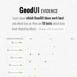
Share your test by reaching out to me (and sharing at least two screenshots) to make this project even better. Startups, This Is How Design Works – by Wells Riley. Michel Fortin – Sim Daltonism.