
Retour sur 2015 en 4 projets. We are incredibly excited for 2016 and the upcoming release dedicated to 360-degree photos and videos.
We are also very proud of the work produced last year by Klynt community. Take a glimpse at these inspiring projects published last year with special 30” video walkthroughs and let us know what you think! Handmade Stories (FRANCE) Let’s start by congratulating the team for their design award at FDI! Julien Champarnaud and Claire Pesqueux tell the story of those who stayed faithful to their cultural heritage by maintaining their traditional craftsmanship. Using subtle visual and sound interactive design, the authors pay a beautiful tribute to the women portrayed in this interactive documentary.
See how: The Man Who Sells Samosa (UNITED ARAB EMIRATES) The hardest part in making any interactive documentary is often finding the simplest structure. Des Montagnes d'Histoires. Gdrparcs.fr. Méli Mélo - "De source sûre !" avec Jacques Chambon et Franck Pitiot - Episode 16. À SAVOIR - ACE Aquitaine. Emile, on bande ? Styles graphiques. Agence BD, Vidéo Motion design, Infographie. Journalism Tools sur Pinterest. Vidéo Labouïche 2. Les îles du futur, un jeu documentaire transmédia coproduit par Seppia et Vertical pour ARTE et Universcience, avec le soutien de Pictanovo, de l’Eurométropole Strasbourg, de la Région Alsace, du CNC et de l’ADEME et en partenariat avec Längengrad Film Produktion, l’INSA, l’ENGEES et le Jardin des Sciences de L’Université de Strasbourg.

Sans titre. How the Recession Reshaped the Economy, in 255 Charts. Acte1-"Sauvons le Rhône"- Sensibilisation aux publics. Dataviz review. Datagraphica - Agence de datavisualisation et infographie. Accueil - La biodiversité c'est quoi ? Data-visualisation Archives - Citizen T. Chaque motion design est une petite histoire.
Il déroule ses arguments suivant un fil éditorial. Voici les films que nous avons réalisés dernièrement. Dataconnexions 6. Opendata Brocas : une commune ouvre ses données publiques. EXPOVIZ. Biodiversité, l'essentielle différence #DATAGUEULE 24. Datavisualisation et applications cartographiques. As part of my internship at Interactive Things, I was offered the opportunity to work on a purely self-directed project.

I decided to create a visualization based on the interview collection of Substratum. I was involved in the redesign of the website itself and the idea for a more quantitative or lexical access to the content was part of my initial concept exploration. You can read more about the design process of the website itself on the Interactive Things Internship blog. Step 1: Analysing the text Honestly, the world of data mining and natural language processing was something I never worked on before.
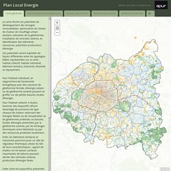
The first step I took to dive into the subject was to look out for tools doing Natural Language Processing. With this first insight, I decided to do the first most obvious kind of visualisation: word cloud. After this first analysis I decided to work with R, to be able to clean the corpus and direct a bit the analysis. Plan Local Energie. La carte illustre les potentiels de développement des énergies renouvelables: optimisation du réseau de chaleur de chauffage urbain existant, utilisation de la géothermie, installation de centrales solaires, et identification des bâtiments ressources, potentiels producteurs d’énergie.
La boite à outils. Debtris US. The Vault is Slate's history blog.
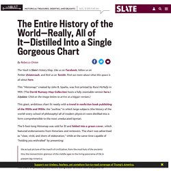
Like us on Facebook, follow us on Twitter @slatevault, and find us on Tumblr. Find out more about what this space is all about here. This “Histomap,” created by John B. Sparks, was first printed by Rand McNally in 1931. (The David Rumsey Map Collection hosts a fully zoomable version here.) This giant, ambitious chart fit neatly with a trend in nonfiction book publishing of the 1920s and 1930s: the “outline,” in which large subjects (the history of the world! The 5-foot-long Histomap was sold for $1 and folded into a green cover, which featured endorsements from historians and reviewers. The actual picture of the march of civilization, from the mud huts of the ancients thru the monarchistic glamour of the middle ages to the living panorama of life in present day America. This stunning geological map of Europe was produced in 1875 by Andre Dumont, a Belgian scientist and mapmaker.
It’s unclear what the width of the colored streams is meant to indicate. Vysda- On the Data Socializing Frontier – Vysda Blog. The rising popularity of data journalism has spurred action not only amidst major news outlets (in the form of in-house data analytics departments) but also amongst individuals that are utilizing data visualization tools to identify hidden trends in the growing list of public data repositories.
Forum-like venues have been increasingly popping up, including the tremendously popular /DataIsBeautiful SubReddit, which allow users to share their findings and engage in open discussions surrounding data and data analytics. As a frequent user of such forums, I often find myself leaving those sites with more questions than answers. What if I invert the parameters and look in the data in a different light? What if I were to combine these two datasets to see if I can gather an insight into a separate trend? Unfortunately, to handle these types of inquiries requires a series of time-consuming tasks. And that is why we developed Vysda. In Vysda, all data, visualization projects, and posts are public. Mining the deep seabed is about to become a reality.
Mining impacts on ecosystems Many deep sea mining activities often require grinding up seafloor ecosystems using robotic bulk cutters and other heavy mining machines that can be three times the size a large bulldozer.
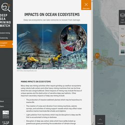
Direct impacts of mining may include the loss of unique species and the destruction of sensitive deep sea habitats. 6 outils gratuits de data visualisation. Observez cent dix-sept ans de réchauffement climatique en France. Avec les mesures de Météo France depuis la fin du XIXe siècle, constatez vous-même l’accélération du réchauffement climatique dans l’Hexagone.
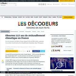
LE MONDE | • Mis à jour le | Par Pierre Breteau L’année 2016 pourrait bien être la plus chaude depuis… 2014, qui avait déjà été la plus chaude depuis 2011. DataBasic.io. La Kolok. Romain, personnage hyper-connecté de la websérie L@-KOLOK.com, présente l’émission « C'est pas compliqué si c'est bien expliqué » (CPC SCBE) : une émission pédagogique et humoristique où il explique des phénomènes complexes à l’aide d’ustensiles de cuisine.
Heureusement que son voisin Sacha lui donne un coup de main ! Three.js - Javascript 3D library. Création culturelle numérique d’aquitaine.