

Axes and Text. Many high level plotting functions (plot, hist, boxplot, etc.) allow you to include axis and text options (as well as other graphical paramters).
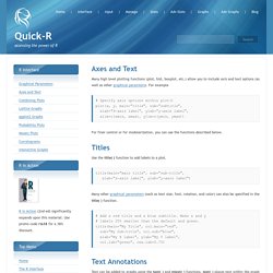
For example # Specify axis options within plot() plot(x, y, main="title", sub="subtitle", xlab="X-axis label", ylab="y-axix label", xlim=c(xmin, xmax), ylim=c(ymin, ymax)) For finer control or for modularization, you can use the functions described below. Titles Use the title( ) function to add labels to a plot. R - Generalized linear Models.
5 Generalized Linear Models Generalized linear models are just as easy to fit in R as ordinary linear model.
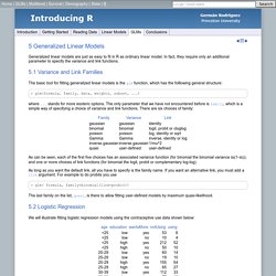
In fact, they require only an additional parameter to specify the variance and link functions. 5.1 Variance and Link Families The basic tool for fitting generalized linear models is the glm function, which has the folllowing general structure: > glm(formula, family, data, weights, subset, ...) How to Deal with Missing Data Values in R. The cor() function in R can deal with missing data values in multiple ways.

For that, you set the argument use to one of the possible text values. The value for the use argument is especially important if you calculate the correlations of the variables in a data frame. By setting this argument to different values, you can Use all observations by setting use='everything'. This means that if there’s any NA value in one of the variables, the resulting correlation is NA as well. In fact, you can calculate different measures of correlation. R for beginners and intermediate users 3: plotting with colours. For my third post on my R tutorials for beginners and intermediate users, I shall finally touch on the subject matter that prompted me to start these tutorials - plotting with group structures in colour. If you are familiar with R, then you may have noticed that assigning group structure is not all that straightforward. You can have a dataset that may have a column specifically for group structure such as this: and you'd hope that there is an intuitive and easy way of specifying colour or grouping structure based on this last column.
The short answer is, yes, there is. R devel - Wait for user input with readline() This post has NOT been accepted by the mailing list yet.

THIS IS A HOW-TO on HOW TO SCRIPT OR PROGRAM IN THE R-PROGRAMMING LANGUAGE A SIMPLE INPUT AND OUTPUT OF NUMERIC INFORMATION OR DATA. In other words, you are writing a program, which you want to save, and then later run from the console by using some Source("My File") type deal. The program will ask you for numeric information, you will put in numeric data, and assuming you ask it to output (demonstrated), you will get the numeric data output. 1. Boxplots. Boxplots can be created for individual variables or for variables by group.
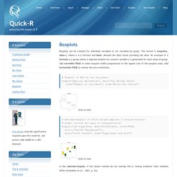
The format is boxplot(x, data=), where x is a formula and data= denotes the data frame providing the data. An example of a formula is y~group where a separate boxplot for numeric variable y is generated for each value of group. R help archive: Re: [R] Correlation Mapping. I have not seen that book cover but I assume the question is how to plot the cells of a correlation matrix in different colors.
![R help archive: Re: [R] Correlation Mapping](http://cdn.pearltrees.com/s/pic/th/archive-correlation-mapping-18447112)
Try heatmap or the gplot package function heatmap.2 . For example, we create a correlation matrix, K, from the first 4 columns of the iris data set and create a heatmap using the bluered color scheme: # heatmap.2 library(gplots) K <- cor(iris[,1:4]) heatmap.2(K, col = bluered(16), cexRow = .7, cexCol = .7, symm = TRUE, dend = "row", trace = "none", main = "Iris Data") balloonplot, also in the gplots package, and image in graphics (i.e. core R) might be other functions to look at. On 7/16/06, justin rapp <jdrapp@gmail.com> wrote: > On the cover of Zivot and Wang's Modeling Financial Time Series with S > Plus, there is a correlation plot that seems to indicate the strength > of correlation with color-coded squares, so that more highly > correlated stocks appear darker red.
R-help@stat.math.ethz.ch mailing list PLEASE do read the posting guide! Received on. Error in lm.fit( Multiple Regression. R provides comprehensive support for multiple linear regression.
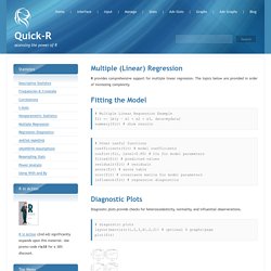
The topics below are provided in order of increasing complexity. Fitting the Model # Multiple Linear Regression Example fit <- lm(y ~ x1 + x2 + x3, data=mydata) summary(fit) # show results. Mann-Whitney-Wilcoxon Test. Two data samples are independent if they come from distinct populations and the samples do not affect each other.
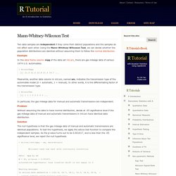
Using the Mann-Whitney-Wilcoxon Test, we can decide whether the population distributions are identical without assuming them to follow the normal distribution. Example In the data frame column mpg of the data set mtcars, there are gas mileage data of various 1974 U.S. automobiles. > mtcars$mpg [1] 21.0 21.0 22.8 21.4 18.7 ... Meanwhile, another data column in mtcars, named am, indicates the transmission type of the automobile model (0 = automatic, 1 = manual). Saving plot to tiff, with high resolution for publication ? A GUI for R - Deducer Manual. An R Graphical User Interface (GUI) for Everyone Deducer is designed to be a free easy to use alternative to proprietary data analysis software such as SPSS, JMP, and Minitab.
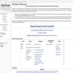
It has a menu system to do common data manipulation and analysis tasks, and an excel-like spreadsheet in which to view and edit data frames. The goal of the project is two fold. Provide an intuitive graphical user interface (GUI) for R, encouraging non-technical users to learn and perform analyses without programming getting in their way. Increase the efficiency of expert R users when performing common tasks by replacing hundreds of keystrokes with a few mouse clicks. Deducer is designed to be used with the Java based R console JGR, though it supports a number of other R environments (e.g.
Download and Install Join the Help/Discussion Group. An introductory tour of Deducer. Cor.test for a correlation matrix. Position_stack. had.co.nz. R help archive: Re: [R] Plotting a simple subset. To be fair none of Introduction to R, ?
![R help archive: Re: [R] Plotting a simple subset](http://cdn.pearltrees.com/s/pic/th/archive-plotting-simple-subset-12468650)
Plot nor the reference card really cover this without substantial digging. Akaike's An Information Criterion. Description Generic function calculating Akaike's ‘An Information Criterion’ for one or several fitted model objects for which a log-likelihood value can be obtained, according to the formula -2*log-likelihood + k*npar, where npar represents the number of parameters in the fitted model, and k = 2 for the usual AIC, or k = log(n) (n being the number of observations) for the so-called BIC or SBC (Schwarz's Bayesian criterion). Usage AIC(object, ..., k = 2) BIC(object, ...) Error message: " The following object(s) are masked" Input and Output. R] remove multiple columns by name from dataframe. PCA on Correlation or Covariance? - Statistical Analysis - Stack Exchange.
Plot 2 graphs in same plot in R. Vocabulary - GitHub. Getting rid of axis values in R Plot. R: Pairwise linkage disequilibrium between genetic markers. LD {genetics} Current - Producing Simple Graphs with R.