
Seaside - Unsaid, Unheard EP on Packaging of the World. Designer: Tamas Birinyi Printing, packaging: Gravus Kft Project Type: Produced, Commercial Work Client: Seaside Location: Budapest, Hungary Packaging Contents: CD Packaging Substrate / Materials: Cardboard, canvas Printing Process: Letterpress, silkscreen printing "Seaside is a repository of dreams, memories and tales, woven into a tapestry of intricate soundscapes and lush melodies.
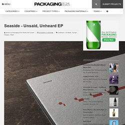
Seaside is the background music to the afternoons when you find yourself lost in thought, exploring faded images still stuck in your mind. Seaside is an attempt at capturing the fleeting emotions that bring colour into our lives.Seaside is music that tries to be honest. "Album identity design for the hungarian multi-intrumentalist producer, SEASIDE. The project includes Seaside logo design, real cd cover design and packaging, digital cover variations for the songs, music video and social media stuffs. What's Unique?
Low Carbon Holidays. TM Research Archive. Bernard Stein. Bernard Stein Berlin, Germany, 1949 Who’s Who Bernard Stein is a prominent german graphic designer.

He graduated in 1977 from the Hochschule der Künste (University of Arts) in Berlin, studying under Helmut Lortz, a master of german graphic design. The year later he cofounded Ott+Stein with his schoolmate Nicolaus Ott. In 2004 he was appointed creative director on the management board of Meta Design, an international design company originally founded by the well-known typographer Erik Spiekermann. His work is always very specific to the subject in terms of both means and meanings. During the early 1980s he lectured and taught at the Hochschule der Künste (University of Arts) in Berlin.
Member of AGI (Alliance Graphique Internationale) and member of the Architekturpreis Berlin since 2007. Together with Nicolaus Ott he published several books including “Typo” (Könemann, 1998) a typographic encyclopedia. Enjoy your reading, Q&APublished Apr 13, 2014Recorded Nov 18, 2013 A piece of architecture. Your daily dose of creativity. Only selected creativity - Brands. A beautifully illustrated glossary of typographic terms you should know – Learn. The world of typography often seems like it has its very own language, full of serifs, strokes, and swashes.
Sorting out all those terms can be confusing in itself, so we’ve compiled a visual glossary that will guide you through the lingo — whether you’re an aspiring typeface designer or just a general typography enthusiast. Learning the building blocks of typography will help you better understand how to pick a suitable font and apply it effectively within your design projects. The Basics: Typefaces Categories & Styles 01. Font/Typeface: Back in the days of metal type and printing presses, fonts and typefaces were two different things — the typeface was the specific design of the letters, say Times New Roman or Baskerville; while the font referred to the particular size or style of that typeface, say 10 point regular or 24 point italic (each created as its own collection of cast metal letters and other characters). 02. 03. 04. 05. 06. The Foundation: Positioning & Spacing 07. 08. 09. Mark Porter Associates: Award-Winning Content-Driven Design.
BSC.