
Saul Bass. Saul Bass Saul Bass was an American designer whose 40+ year career spanned everything from print and identity development to movie title credits.
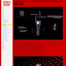
He worked with major corporations to establish logos and branding guidelines, including AT&T, United Way and Continental Airlines. He designed titles for over 30 films and he won an academy award for his short film Why Man Creates. Also proficient in typography his "cut-paper" style is one of the most recognized styles of design from the 1950s and 60s. The Man with the Golden Arm was one of four movies that Saul Bass worked on under the direction of Otto Preminger.
Work — Alessandro Franchini. Dasprogramm about. Das Programm researches Braun Design 1955-1995 (the period of Dieter Rams’ directorship).
Our activities span writing projects, exhibition curation and the supply of objects to museums – amongst others, the London Design Museum, Vitra Museum, Cooper Hewitt Smithsonian Design Museum and the HfG Ulm Archive. Stocked with over 550 Braun objects, from ‘60s audio equipment to ‘80s shavers, Das Programm’s website combines archive, reference book and educational resource. Our London seminars make use of Das Programm’s core collection and the expertise of its Director, Dr Peter Kapos. The objects around which seminars are constructed exist together in only a handful of places across the world. Using these key pieces as physical reference points, visitors are led through a history of Braun Design. Das Programm Director, Dr Peter Kapos, is a leading authority on the history of Braun Design.
Jaap Proost. Lo and Behold! Category: > Printed Matters, > Typography, < Design By: written by: Jaap Proost THE bold typographic covers you see are the work of Dutch graphic designer Jan Vermeulen.
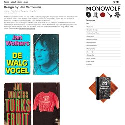
He and novelist Jan Wolkers were a team. Wolkers wrote the books, Vermeulen designed the covers. It is nice to see that Vermeulen paid the back of the novel the same attention as the front. The most famous one he designed is for the book ‘Turks Fruit’. Check out some other Jan Vermeulen covers. - related posts - View From Above WAR can be horrible and beautiful at the same time, as you can see on this spread in LIFE magazine from January 1963. Designculture. Cini Boeri Milan, Italy, 1924 Who’s Who Maria Cristina Mariani Dameno—better known as Cini Boeri—is a leading Italian architect and designer, the mother of the internationally renowned architect Stefano Boeri.

She graduated in architecture in 1951 from the Politecnico University in Milan. After a short experience with Gio Ponti—a famous master of Italian design and architecture—she started to collaborate with Marco Zanuso, another acclaimed architect and designer. Pentagram Skewers Corporate Jargon In This Hilarious Holiday Card. The international design firm Pentagram has a storied tradition of creating elaborate, beautifully crafted holiday cards every year.

This year, the firm's card pokes fun at the bane of many a designer’s existence—corporate jargon—with an illustrated seven-verse rap. Called "Gamechanger: A Cautionary Tale of Corporate Jargon," the card is actually a 15-page booklet filled with the pretentious argot that’s spread plague-like through the boardrooms of the world. "We have developed a bit of an allergy to corporate jargon," Marina Willer, who designed the card, tells Co.Design. "People start to overdose on it. " Interview. Joan Pedragosa. Graphic Journey Blog: Schmalfette: Tall, dark and handsome. I know a lot has been written about this… Twen's Art Director, Willy Fleckhaus 1925 - 1987 The ground-breaking 1960s German magazine Twen, including on this blog.
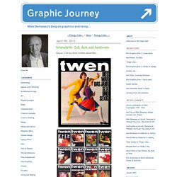
But then again, you can never get enough of a good thing. When I first got into this funny old business of graphic design way back in the ‘60s, the high point of the month was picking up a copy of Twen magazine from the international newsagents in Old Compton Street, Soho. I couldn’t speak a word of German but that didn’t stop me from shelling out a not insubstantial amount for a mint copy of Twen. It is called Schmalfette Grotesk and was designed by Walter Haettenschweiler in 1954, a Swiss typoholic.
Many designers in the UK at the time wanted to use it, but couldn’t as it wasn’t available here, even via the early iterations of photo setting. Here is a book cover I designed in 1965 that uses cut-up Schmalfette for the title. Designculture. Willy Fleckhaus y la revista Twen. Willy Fleckhaus y la revista Twen Willy Fleckhaus nació en Alemania en 1925, donde fallecería en 1983.
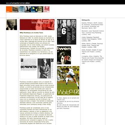
Su carrera alcanzó su momento de mayor esplendor en su época de director de arte de la revista Twen, publicada por primera vez en 1959. Twen combinaba la fotografía erótica con artículos de actualidad; era en cierta medida, una versión europea, gráficamente más cuidada, del Playboy norteamericano. Durante los once años de publicación de la revista, Fleckhaus consolidó un estilo muy característico con cubiertas muy llamativas y un uso particular de la fotografía en la que predominban los primeros planos. Fleckhaus concebía la página como un conjunto de grandes bloques jerarquizados donde la foto tenía el papel primordial incluso cuando ésta no tenía excesiva calidad.