
Lamson Guru Spare Spool. Correspondence analysis. K-means analysis R-Script. # initialize all necessary libraries library(cluster) library(psych) # read CSV file - (kmeans_data.csv) - convert to a matrix data1 <- read.table(file='kmeans_data.csv', sep=',', header=T, row.names=1) data.p <- as.matrix(data1)
Engaging Market Research: Centering and Standardizing: Don't Confuse Your Rows with Your Columns. R uses the generic scale( ) function to center and standardize variables in the columns of data matrices.

The argument center=TRUE subtracts the column mean from each score in that column, and the argument scale=TRUE divides by the column standard deviation (TRUE are the defaults for both arguments). For instance, weight and height come in different units that can be compared more easily when transformed into standardized deviations.
Since such a linear transformation does not alter the correlations among the variables, it is often recommended so that the relative effects of variables measured on different scales can be evaluated. However, this is not the case with the rows. A concrete example will help. Unfortunately, we are now measuring something different.
Running. Engaging Market Research: TURF Analysis: A Bad Answer to the Wrong Question. Now that R has a package performing Total Unduplicated Reach and Frequency (TURF) Analysis, it might be a good time to issue a warning to all R users.

DON'T DO IT! The technique itself is straight out of media buying from the 1950s. Given some number of n alternative advertising options (e.g., magazines), which set of size k will reach the most readers and be seen the most often? Unduplicated reach is the primary goal because we want everyone in the target audience to see the ad. In addition, it was believed that seeing the ad more than once would make the ad more effective (that is, until wearout), which is why frequency is a component.
The R package turfR includes an example showing how to use their turf() function by setting n to 10 and letting k range from 3 to 6. OPTIMIZATION OF SAMPLE SIZE AND NUMBER OF TASKS PER. Similar documents Sample Size Issues for Conjoint Analysispdf259 KB Sample Size for Multivariable Prognostic Modelspdf4 029 KB Individual-level models vs. sample-level modelspdf294 KB.
Home streaming. Segmentation r. Python. Pca before clustering. R - Randomizing balanced experimental designs. Electronics and sound. Electronics. Bread. Arduino. Python simple sentiment analysis. Brand maps. Welcome to nginx! Log In - Sign In. Bread banh mi. Roc curves. Circle Packing. Language agnostic - What's the algorithm for laying out a circular TreeMap? Tree Visualization. How to Make Bubble Charts. A bubble chart can also just be straight up proportionally sized bubbles, but here we're going to cover how to create the variety that is like a scatterplot with a third, bubbly dimension.
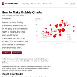
The advantage of this chart type is that it lets you compare three variables at once. One is on the x-axis, one is on the y-axis, and the third is represented by area size of bubbles. Have a look at the final chart to see what we're making. Step 0. Download R We're going to use R to do this, so download that before moving on. Step 1. Assuming you already have R open, the first thing we'll do is load the data. Okay, moving on. You're telling R to download the data and read it as a comma-delimited file with a header. Step 2. Now we can get right to drawing circles with the symbols() command. Run the line of code above, and you'll get this: Circles incorrectly sized by radius instead of area. All done, right? Step 3. To size radiuses correctly, we look to the equation for area of a circle: Yay. Step 4. Programming in R (Bubble Chart visualization) Pack Layout · mbostock/d3 Wiki. Wiki ▸ API Reference ▸ Layouts ▸ Hierarchy ▸ Pack Layout Enclosure diagrams use containment (nesting) to represent the hierarchy.
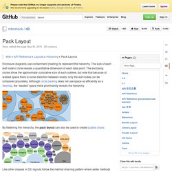
The size of each leaf node’s circle reveals a quantitative dimension of each data point. The enclosing circles show the approximate cumulative size of each subtree, but note that because of wasted space there is some distortion between levels; only the leaf nodes can be compared accurately. Although circle packing does not use space as efficiently as a treemap, the “wasted” space more prominently reveals the hierarchy. By flattening the hierarchy, the pack layout can also be used to create bubble charts: Like other classes in D3, layouts follow the method chaining pattern where setter methods return the layout itself, allowing multiple setters to be invoked in a concise statement. # d3.layout.pack() Visualize areal data via cartograms. Introducing the streamgraph htmlwidget R Package. We were looking for a different type of visualization for a project at work this past week and my thoughts immediately gravitated towards streamgraphs.

The TLDR on streamgraphs is they they are generalized versions of stacked area graphs with free baselines across the x axis. They are somewhat controversial but have a “draw you in” aesthetic appeal (which is what we needed for our visualization). You can make streamgraphs/stacked area charts pretty easily in D3, and since we needed to try many different sets of data in the streamgraph style, it made sense to make this an R htmlwidget. Thus, the streamgraph package was born. Making a streamgraph The package isn’t in CRAN yet, so you have to do the devtools dance: Streamgraphs require a continuous variable for the x axis, and the streamgraph widget/package works with years or dates (support for xts objects and POSIXct types coming soon). The package recognizes when years are being used and does all the necessary conversions for you.
Mastering Parallel Coordinate Charts in R - Safari Blog. A guest post by Tom Barker, a software engineer, an engineering manager, a professor and an author.
Currently he is Director of Software Engineering and Development at Comcast, and an Adjunct Professor at Philadelphia University. He has authored Pro JavaScript Performance: Monitoring and Visualization, Pro Data Visualization with R and JavaScript, and Technical Management: A Primer, and can be reached at @tomjbarker. A previous post that I wrote looked at using scatterplots to identify relationships between sets of data. I talked about the different types of relationships that could exist between data sets, such as positive and negative correlation.
This idea was couched in the premise of team dynamics – do you see any correlation between the amount of people on a team and the amount of work that the team can complete, or between the amount of work completed and the number of defects generated.
Changing Font Face and Size Conditionally (Microsoft Excel) By Allen Wyatt (last updated September 6, 2014) Please Note: This article is written for users of the following Microsoft Excel versions: 2007, 2010, and 2013.
If you are using an earlier version (Excel 2003 or earlier), this tip may not work for you. For a version of this tip written specifically for earlier versions of Excel, click here: Changing Font Face and Size Conditionally.
Giri. Variability of word frequency useage. s3 in r. OOP in R: An Tutorial about S3 and S4 Classes - Quant Lego. This tutorial gives a brief introduction about OOP in R, covering both S3, S4, reference (R5), and R6 classes. 1 S3 Classes 1.1 The basic idea 1.1.1 Class attribute.
Running R in the Cloud (Part 1) R excels at a great number of analytical tasks. But the high level functions, rich graphics, and other qualities that make R a likely choice come at a cost--namely, performance. The good news for R lovers is that there are easy ways to speed up the operations you're running using Amazon EC2 and other cloud-based computing services. This is a post about running R and Rstudio Server on EC2. The limitations of your laptop. Sampling Weights and Regression Analysis. Social Network Data in R. Nathan J. Doogan – doogan [dot] 1 [at] osu [dot] edu A colleague asked for some help preparing data for social network analysis. Specifically, he is using ERGM. But this should be helpful for preparing data for other procedures as well, such as descriptive statistics available in the sna package, or for models like SAOM implemented in the RSiena package.
The following assumes some familiarity with R because I do not clearly explain every command or some of the underlying idiosyncrasy of R. Before I begin, I'll note that there are many ways of doing this.
Kmeans r. Word Cloud in R. ZIA/R/better_word_cloud at master · drewconway/ZIA. Word Cloud in R. Developing Data Products. Regression r. R - environments. Drums in live. Brand attibute ratins. Ggplot. Cluster analysis. R course assignment 2. Hierarchical bayes. R blogger guys stuff. R language. Baysean. Download. Max diff new. Check out. Text. Mashape - The Cloud API Hub. Tree mapping. Text analysis - vis. Similarity coef binary data. Text Clustering. Natural Language Processing. Statistics. Conjoint.