
50 Examples of Responsive Web Design (plus 1) Nowadays, it's not only important to develop your clients' websites to look good on all browsers, and on PC and MAC, it's also a must that websites are viewable on tablets and mobile devices.

A lot of people opt for making one version of their site for desktop and another for mobile. Others choose Responsive Design, a mix of fluid grids and layouts, flexible images and an intelligent use of CSS media queries. There are quite a few sites dedicated to lending a hand with responsive grids, Gridpak, CSSGrid, Skeleton and SimpleGrid, just to name a few. Here are 50 (plus 1) examples of responsive websites. Go to website. Web. 71 ressources en ligne Haut de page Schnaps.it, le générateur de template HTML5 Alsacréations est fier de vous annoncer la naissance de Schnaps.it, notre nouvel… Rendu par défaut des éléments HTML Outil conçu par Julien Royer, permettant d'observer les différences de rendu par… MobileHTML5 MobileHTML est un tableau de compatibilité récapitulatif à destination des plate-formes… ReformedApp Chronophage, redondant et fastidieux...

Coder vos formulaires à la main vous… Initializr Initializr vous permet de générer un template HTML5 basé sur HTML5 Boilerplate.… HTML5Please HTML5Please est un récapitulatif clair et bien organisé listant les différentes… HTML5 Boilerplate HTML5 Boilerplate est un gabarit HTML5 et CSS3 contenant toutes les bonnes pratiques… HTML5Rocks Diaporama des nouveautés HTML5, tutoriels pas à pas, et exemples en ligne. Haut de page Accessibilité Haut de page Tanaguru Contrast-Finder Un outil de plus pour vérifier si les couleurs sont accessibles ? Développement. Initializr: With Great Templates Comes Great Responsivity!
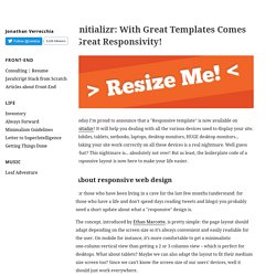
Today I'm proud to announce that a "Responsive template" is now available on Initializr!
It will help you dealing with all the various devices used to display your site. Mobiles, tablets, netbooks, laptops, desktop monitors, HUGE desktop monitors... Making your site work correctly on all these devices is a real nightmare. Well guess what? This nightmare is... absolutely not over! About responsive web design For those who have been living in a cave for the last few months (understand: for those who have a life and don’t spend days reading tweets and blogs) you probably need a short update about what a "responsive" design is. To design a responsive layout, we have to forget about the usual static 960px width layouts and go fluid with percentage widths and media queries. A fluid layout with percentage widths The first thing our page needs is a "fluid" layout. Mobile-first approach media queries The mobile view Here is the very simple mobile display of the responsive template.
The wide view. Carousel Template. Bootstrap. Initializr - Start an HTML5 Boilerplate project in 15 seconds! HTML5 Boilerplate, un template puissant et complet. HTML5 Boilerplate est un template (HTML+CSS+JS+...) lancé par Paul Irish (Modernizr) et Divya Manian. Il contient toutes les bonnes pratiques du moment en terme de performances, de compatibilité inter-navigateurs, de JavaScript, avec un soupçon d'accessibilité (si utilisé à bon escient), voire de Flash.
Une version sur-mesure peut être générée via Initializr. Vous retrouverez donc dans un zip tous les fichiers et sous-répertoires organisés pour débuter votre intégration avec d'excellentes bases. Bien entendu, vous l'aurez deviné, le but est de favoriser l'adoption de HTML, d'où l'inclusion par défaut de la librairie Modernizr, ainsi que jQuery via GoogleAPI (avec fallback local). Voici une liste des fonctionnalités supportées : Bien entendu d'autres sont à découvrir dans le code source, comme par exemples les indications pour les icônes Apple touch + favicon par exemple. Scaffolding. Need reasons to love Bootstrap?
Look no further. By nerds, for nerds. Built at Twitter by @mdo and @fat, Bootstrap utilizes LESS CSS, is compiled via Node, and is managed through GitHub to help nerds do awesome stuff on the web. Made for everyone. Bootstrap was made to not only look and behave great in the latest desktop browsers (as well as IE7!) Base.