
Mary Ann Liebert, Inc., publishers.
Journal of Statistical Software. A Tour Through the Visualization Zoo. Jeffrey Heer, Michael Bostock, and Vadim Ogievetsky Stanford University Introduction Thanks to advances in sensing, networking, and data management, our society is producing digital information at an astonishing rate.
According to one estimate, in 2010 alone we will generate 1,200 exabytes — 60 million times the Library of Congress. UW Interactive Data Lab. In this map of crime rates in Canada, the raw counts of the reported crime of “mischief” (leftmost image) gives the impression that the southern provinces are the most dangerous.
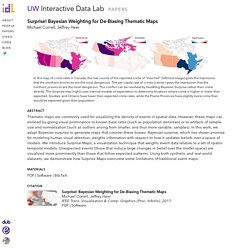
The per-capita rate of crimes (center) gives the impression that the northern provinces are the most dangerous. This conflict can be resolved by modeling Bayesian Surprise rather than crime directly. The Surprise map (right) uses internal models of expectation to determine locations where crime is higher or lower than expected: Quebec and Ontario have lower than expected crime rates, while the Prairie Provinces have slightly more crime than would be expected given their population. Abstract. CSDL - IEEE Computer Graphics and Applications - Table of Contents. Loading [Contrib]/a11y/mathjax-sre.js The Community for Technology Leaders CSDL Home IEEE Computer Graphics and Applications 2017 vol. 37 Issue No. 02 - Mar.

-Apr. Issue No. 02 - Mar. -Apr. Papers. New Directions for Evaluation - Volume 2013, Issue 139 - Data Visualization, Part 1. IEEE Xplore Document - Machine Learning. IEEE Xplore Document - Machine Learning. 50YearsDataScience. Sex as an Algorithm: The Theory of Evolution Under the Lens of Computation. Review articles By Adi Livnat, Christos Papadimitriou Communications of the ACM, Vol. 59 No. 11, Pages 84-93 10.1145/2934662 Comments Look around you, and you will be stunned by the work of evolution.
According to Nobel Laureate Jacques Monod, a strange thing about evolution is that all educated persons think they understand it fairly well, and yet very few—if any, one may grumble—actually do. Understanding evolution is essential: "Nothing in biology makes sense except in the light of evolution," famously said the eminent 20th century biologist Theodosius Dobzhansky. Infovis survey. Tukey : The Future of Data Analysis. The Annals of Mathematical Statistics The Future of Data Analysis John W.

Tukey Full-text: Open access. UW Interactive Data Lab. We present Vega-Lite, a high-level grammar that enables rapid specification of interactive data visualizations.
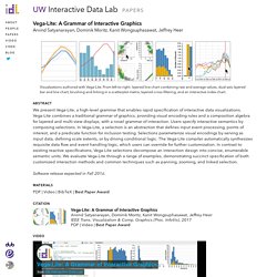
Vega-Lite combines a traditional grammar of graphics, providing visual encoding rules and a composition algebra for layered and multi-view displays, with a novel grammar of interaction. Users specify interactive semantics by composing selections. In Vega-Lite, a selection is an abstraction that defines input event processing, points of interest, and a predicate function for inclusion testing. Selections parameterize visual encodings by serving as input data, defining scale extents, or by driving conditional logic. The Vega-Lite compiler automatically synthesizes requisite data flow and event handling logic, which users can override for further customization. Computing Now - IEEECS. 7 Classic Foundational Vis Papers You Might not Want to Publicly Confess you Don’t Know. (In my last post I introduced the idea of regularly posting research material in this blog as a way to bridge the gap between researchers and practitioners.
Some people kindly replied to my call for feedback and the general feeling seems to be like: “cool go on! Rock it! We need it!”. An Illustrated Tour of the Pie Chart Study Results – eagereyes. In two papers, Drew Skau and I recently showed that our idea of how we read pie charts is wrong, that donut charts are no worse than pie charts, and a few more things.
Here is a detailed walk-through of the results of the three studies we conducted for this purpose. Let’s go on a little journey through some real data and do a little science together! Analytical Review of Data Visualization Methods in Application to Big Data. Golden STS268. The Golden Age of Statistical Graphics. Michael Friendly.
The Golden Age of Statistical Graphics. Ststistical Science, vol. 23, no. 4, pp. 502–535, 2008. Download: from web | via doi Statistical graphics and data visualization have long histories, but their modern forms began only in the early 1800s. Between roughly 1850 to 1900 (± 10), an explosive growth occurred in both the general use of graphic methods and the range of topics to which they were applied. Software Engineering for Big Data Systems Guest Editors" Introduction.
Guest Editors' Introduction • Ian Gorton, Ayse Basar Bener, and Audris Mockus • April 2016 We edited a special issue on “Software Engineering for Big Data Systems” for the March/April 2016 issue of IEEE Software magazine.

The issue focused on big data’s implications for software engineering and five categories of design requirements for building such systems: Big Data. Journal of Machine Learning Research Homepage. TOWARDS A QUANTITATIVE VISUAL SEMIOTICS? Panteion University, Athens, Greece gskarp@panteion.gr Abstract Visual Semiotics, as is the case with most of Visual Studies so far, have not found yet a sound and methodologically rigorous equilibrium between ‘visual’ and ‘semiotics’.
Instead, following existing examples, they scrutinize visuality, the gaze and other similar objects of inquiry, or work on visual grammar and syntax. In all cases, they deal mostly with meta-language about images than with images themselves. Hypothetical Outcome Plots Outperform Error Bars and Violin Plots for Inferences about Reliability of Variable Ordering. Abstract Many visual depictions of probability distributions, such as error bars, are difficult for users to accurately interpret. We present and study an alternative representation, Hypothetical Outcome Plots (HOPs), that animates a finite set of individual draws. In contrast to the statistical background required to interpret many static representations of distributions, HOPs require relatively little background knowledge to interpret. Instead, HOPs enables viewers to infer properties of the distribution using mental processes like counting and integration.
Patent US20140157170 - Storytelling in Visual Analytics Tools for Business Intelligence - Google Patent. [0001] An organization uses business intelligence (BI) to analyze data sets and convert them into knowledge that can be communicated, shared, and interpreted with others. With increasingly large data sets, BI experts use data visualization to convey the BI analysis. Certain BI systems, such as dashboards, provide a multi-chart interface where the user can explore multiple charts on the same user interface.
The data sources for these charts may be different, which means each chart represents a different data set from a different source. The BI experts analyze the data, make sense of their visualizations, and typically prepare a report to share with other people. Hypothetical Outcome Plots: Experiencing the Uncertain. Hypothetical Outcome Plots: Experiencing the Uncertain If you are like most people, including many data analysts, interpreting visualizations of uncertainty feels hard and abstract. This article describes Hypothetical Outcome Plots (HOPs), a promising approach to visualizing uncertain data for general audiences and analysts alike.
Rather than showing a continuous probability distribution, HOPs visualize a set of draws from a distribution, where each draw is shown as a new plot in either a small multiples or animated form. HOPs enable a user to experience uncertainty in terms of countable events, just like we experience probability in our day to day lives.
Author’s Response to Stephen Few’s critique of Hypothetical Outcome Plots. Author’s Response to Stephen Few’s critique of Hypothetical Outcome Plots Hypothetical outcome plots (HOPs) are an approach to visualizing uncertainty using a set of discrete outcomes. HOPs consist of a set of frames, each depicting a draw from a theoretical distribution, which are presented using animation or small multiples. HOPs can act as an alternative to static representations including error bars, standard pdf plots, violin plots or gradient plots or provide an additional layer of information on such plots. To learn more about HOPs, consult our paper and related materials or blog post.
A Snapshot of Current Visualization Trends Guest Editors' Introduction - March 2016 - IEEECS. Hbook.