
10 Great Nonprofit Donation Pages. 12 Best Nonprofit Donation Pages. 5 Elements of an Effective Call to Action Button. A call to action – every email’s gotta have one.

After reading your email, your recipients should have a clear idea of what to do next. Without a call to action, you leave ‘em hanging. But you can easily avoid that problem by creating an effective call to action. How? For starters, there isn`t a one-size-fits-all button that you can copy and paste in every email. 1. 2. 3. 4. Notice the use of the green box. Designing Stronger Nonprofit Calls to Action. When your nonprofit decides to build a site, you should have certain goals in mind.

This could be boosting fundraising, increasing volunteerism or any other number of mission-driven aims. You could have the most beautiful website in the world, but if it isn’t helping your organization achieve your goals it’s not benefitting you as much as it could be. 5 Tips on Where to Put that Donate Button. Photo by tristanf Last week, we talked about Facebook memes–what works and what may not work.
This week, I want to talk a bit about where to put the “donate” button on your website. As an NPO, this button is all-important, and therefore the decision on where it should go is also extremely important. In order to give you some tips and ideas on where your donate button could go, I pulled five different cause websites. Let’s look at how they treated their donate buttons and determine what about that placement works. 1.
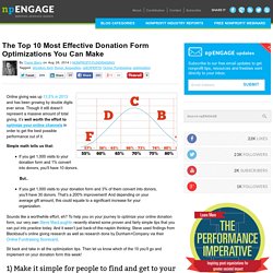
One thing you will see in all five screen captures is that the donate button is visible without you having to scroll. The “donate” button is placed on the far left, just next to the charity: water logo. 2. In the screen capture below from the World Wildlife Fund, the donate button is in line with the navigation buttons as it was on the charity: water site. This donate button pops a lot more than the one on the charity: water site because the gold background color helps a lot! What Word is on your Donate Button? - GiftWorks. 3 Tips for a Better Donate Button on Your Website. The Top 10 Most Effective Donation Form Optimizations You Can Make. Online giving was up 13.5% in 2013 and has been growing by double digits ever since.
Though it still doesn’t represent a massive amount of total giving, it’s well worth the effort to optimize your online channels in order to get the best possible performance out of it. Simple math tells us that: 6 Essential Donation Page Best Practices. The 3 Pillars of a Strong Donation Page. Collecting donations should be your website’s number one goal, and the design should make that task easy for people to accomplish.

Not only do you have to guide potential supporters to your donation page, but you need to get them to complete the process, too. This means that your donation form is the most critical stage of the giving experience. Donation Form Optimization Whitepaper. The New Best Donation Page Practices, 2013 Edition. In my previous post I shared a presentation I put together for the Ignite sessions at the 2013 NTC, but I didn’t mention much about what we learned there and how it’s helped shape our planning process around the next iterations of our product and how we advise our clients.
I’ve written fairly exhaustively about donation page best practices and likely will continue to do so, as our understanding of how donation pages perform best is always evolving. Some of the key points I took away from NTC are below, use them to raise money like there’s no tomorrow, y’all! 1.) Keep your desired average gift amount pre-selected. When donors land on your page, the average gift (or the ideal average gift) should be preselected in your suggested amounts array. 2.) 5 Nonprofit Website Mistakes That Will Destroy Your Online Fundraising. It won’t come as a surprise to most nonprofits that online fundraising is an important piece of the overall funding puzzle.

Nor will most nonprofits find it surprising that online fundraising is only becoming more important as time goes by. We live in a world suffused with technology. A world where many people, if not most, are more likely to make a donation through a smartphone than by mailing a check. But even though nearly everyone recognizes the importance of establishing an online fundraising presence, not everyone pulls it off equally well!
In fact, a lot of organizations struggle with some of the basic elements of maintaining an effective online fundraising program. 1. Do $5 Asks + Big Red Buttons Work? Results from our 2009 End-of-Year Fundraising Tests. Do $5 Asks + Big Red Buttons Work?
Results from our 2009 End-of-Year Fundraising Tests When December 2009 rolled around, we were itching to test a number of promising new strategies to increase our clients’ online fundraising returns. We decided to take advantage of the high volume of online fundraising and website traffic that mark the end-of-year period to run a number of tests for our clients. The results were surprising. The Ultimate Donation Page Course.