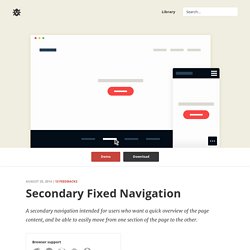

CSS & jQuery Secondary Fixed Navigation. A secondary navigation intended for users who want a quick overview of the page content, and be able to easily move from one section of the page to the other.

Browser support ie Chrome Firefox Safari Opera 9+ A fixed navigation with smooth, jQuery powered scroll. Create a Responsive Website Using HTML5 and CSS3 - Video Tutorial. FullPage.js One Page Scroll Site Plugin. 10 Developer Tips To Build A Responsive Website [Infographic] - ReadWrite. Many website owners say to themselves, “I want my site to look great on mobile, but I don’t know where to start.”
![10 Developer Tips To Build A Responsive Website [Infographic] - ReadWrite](http://cdn.pearltrees.com/s/pic/th/responsive-infographic-88884871)
If you are in the business of building and designing websites, you cannot ignore the fact that many people are going to be visiting your sites on their smartphones and tablets. The Web and the mobile browsers remain one of the top ways that users interact with websites and if they have trouble on their smartphone, there is a good chance they are not coming back. That’s where responsive design can help. Responsive design is a concept where you build your website once and then format it so it can adapt to any screen size that accesses it.
Designers use HTML5 and CSS to build the sites and set parameters so the content will resize itself whether the user is in vertical or horizontal viewing mode, on a tablet, desktop or smartphone or even a screen as large as a television. We employ responsive design here at ReadWrite. See what happened? So designers, keep it simple. Best Practices. How to Create a Responsive Website in about 15 Minutes. The buzz around responsive websites has been going on for several months now, and a lot of websites are already responsive, or underway. You know what that means? Today I will teach you how to create a responsive website. If you follow 1WD on Facebook or Twitter, then you already know that we’re already preparing for an explosive design, which includes being responsive. Watch out for it! Tutorial Level: BeginnerSkills Required: Basic knowledge in HTML and CSSCompletion Time: Approximately 15 minutesWarning: This tutorial is targeted towards beginners, but it can also be for designers and developers who want to have fun!
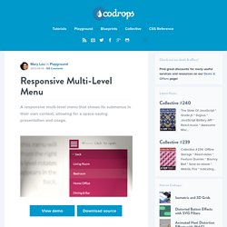
By the end of this quick tutorial about responsive design, you will already be on your way to web stardom, and by that, I mean, you’ll be ready to convert and create responsive websites! Are you ready? Examples of Navigation in Responsive Design. Responsive Multi-Level Menu. A responsive multi-level menu that shows its submenus in their own context, allowing for a space-saving presentation and usage.

View demo Download source Today we want to share an experimental drop-down menu with you. The main idea is to save space for menus that have a lot of content and sub-levels. Each sub-level in this menu will be shown in its own context, making the “parent” level disappear. This is done with subtle animations that are defined in separate animation classes. Please note: this only works as intended in browsers that support the respective CSS properties. The structure of the menu contains an unordered list that can have an arbitrary number of sub-lists: Build a smart mobile navigation without hacks. Create a Responsive Website Using HTML5 and CSS3.
Responsive Web Design: Using Fonts Responsively. Typography is one of the most important aspects of responsive web design, and optimizing your fonts for mobile devices is an absolute necessity if you want your content to be palatable across all screen sizes.

Fortunately, the process of building flexible fonts is not very difficult. When we talk about flexibility (which is the guiding principle in this case), we cannot overlook the specified size of the font we’ve chosen to adapt for our responsive website. We may use different metrics for this purpose, including pixels, ems, rems, or percentages. Choosing the right metric is critical for designing a malleable, responsive interface. In this continuation on responsive web design, I’ll explain how to manage dynamic fonts responsively, and I’ll analyze all of the aforementioned metrics, comparing the strength and weaknesses of each choice. Pixels For a long time, pixels have been the unit preferred of web designer due to its inherent precision and accuracy.
Ems. Build a Responsive, Mobile-Friendly Website from Scratch. In the last article we’ve seen the basic rules to create a simple layout for a website.

After concentrating on the pc-desktop version, in this fifth part of the series, we’ll see which are the rules to apply to make the layout responsive. So, the final result will become pleasant for both tablets and smartphones, as we’ll see in the final part. Remember that a responsive design isn’t a mere matter of a technique applied to pat yourself on the back, but it’s a way to enhance the experience of the user in using the website. As I introduced in the fourth article of the series, for the sake of clarity, we’ll use two stylesheets for our website to keep different concepts separated; in relation with this topic, it’s good to remember that in production, you should use one of the available tools to minimize and merge the various CSS stylesheets into a unique file to improve performances.
First of all, we’ve to set the chosen breakpoints in our document. Zoom always triggers hasLayout. Build a Responsive Design Using 960 Grid. Drop-Down Navigation: Responsive and Touch-Friendly · Osvaldas Valutis. Performance & RWD — Implementing Off-Canvas Navigation For A Responsive Website. Advertisement Today, too many websites are still inaccessible.

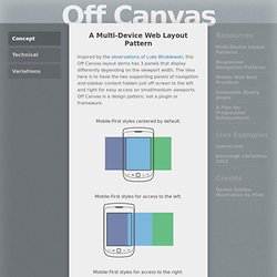
In our new book Inclusive Design Patterns, we explore how to craft flexible front-end design patterns and make future-proof and accessible interfaces without extra effort. Hardcover, 312 pages. Get the book now! Off Canvas. Inspired by the observations of Luke Wroblewski, this Off Canvas layout demo has 3 panels that display differently depending on the viewport width.

The idea here is to have the two supporting panels of navigation and sidebar content hidden just off-screen to the left and right for easy access on small/medium viewports.