
NBA Per Game Data Scatter-Correlation Matrix<br>Colored by Position<br>1951-2014 End of Season Data, 2015 Data Through 11/20/14<br><a href = ' target ='_blank'>Data Source<br>CLICK BOX TO ACTIVATE SCATTEPLOT</a> NBA Per Game Data Correlation-Correlation Matrix<br>Colored by Position<br>Scaled Mean 0, Standard Deviation 1<br>1951-2014 End of Season Data, 2015 Data Through 11/20/14<br><a href = ' target ='_blank'>Data Source</a><a href = 'http: Alex Bresler sur Twitter : "This @NBA #PCA #rstats #dataviz on SGs/SFs epitomizes value of data analysis 100s of stories told here @jon_wertheim. When to fly to get there on time? Six million flights analyzed.
Extracting insights from the shape of complex data using topology : Scientific Reports. Mathematical underpinnings of topological data analysis (TDA) TDA applies the three fundamental concepts in topology discussed in the introduction to study large sets of points obtained from real-world experiments or processes.
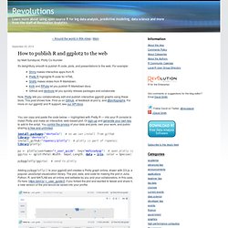
The core problem addressed by TDA is how to use data sampled from an idealized space or shape to infer information about it. Figure 1 illustrates how our particular topological method based on a generalized Reeb graph6, operates on sampled points from a human hand. The method takes three inputs: a distance metric, one or more filter functions (real valued quantities associated to the data points), and two resolution parameters (“resolution” and “percent overlap”), and constructs a network of nodes with edges between them. The layouts of the networks are chosen using a force directed layout algorithm.
Randy Olson sur Twitter : "Republicans vs. Democrats on Twitter. #sna #dataviz Source: GOP and Dems Battle Royale on Twitter : dataisbeautiful. Alex Bresler sur Twitter : "1st #rstats #kohonen cluster #dataviz using @NBA 13-14 stats & holy crap is this amazing, here are the 8 clusters. R Graph Catalog. Pip install sandwich on Twitter: "My favorite #infographic from @pewresearch's polarization in media piece #dataviz #transmedia. NBA Leader Analysis. NBA Leader Analysis. Visualizing basketball statistics with R star plots. How Many Paths are Possible in an 18 Hole Round of Match Play Golf? - Todd W. Schneider. In honor of the Ryder Cup, here's a fun puzzle for the mathematically inclined golfer to consider: how many different paths are possible in an 18 hole round of match play golf?

If you'd rather not wade through the math then you can skip ahead to the "practical exploration" section of this post to see some actual match play data, but if you like puzzles then let's assume the following match play rules, adapted and condensed via the USGA: A match consists of one side (individual or team) playing against another over a round of 18 holes A hole is won by the side that holes its ball in the fewer strokes A hole is halved if each side holes out in the same number of strokes A match is won when one side leads by a number of holes greater than the number remaining to be played If the match is tied after 18 holes, it ends as a tie We can depict the set of all possible match play paths as a tree that looks like this: This tree shows all possible paths in an 18 hole round of match play.
Becoming a data “hacker” Your typical, everyday data hacker.
Image: elhombredenegro / Flickr “I don’t know where to start” I recently spoke to about a dozen aspiring data scientists, and a very common concern was, “There are just so many different programming languages, and so many different software packages and databases. I feel overwhelmed, and I don’t know where to start!” How to publish R and ggplot2 to the web. You can copy and paste the code below — highlighted with Pretty R — into your R console to install Plotly and make an interactive, web-based plot.
Or sign-up and generate your own key to add to the script. You control the privacy of your data and plots, own your work, and public sharing is free and unlimited. Asbcllc. Clippers vs Nets Valuation Comps. Aragorn. NBA Rookie of the Year Analysis. Oklahoma Football and Basketball Player Majors Since 2007. Aragorn. Aragorn. The Traveling Salesman with Simulated Annealing, R, and Shiny - Todd W. Schneider. I built an interactive Shiny application that uses simulated annealing to solve the famous traveling salesman problem.
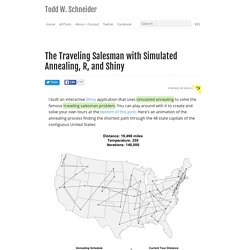
You can play around with it to create and solve your own tours at the bottom of this post. Here's an animation of the annealing process finding the shortest path through the 48 state capitals of the contiguous United States: How does the simulated annealing process work? We start by picking an arbitrary initial tour from the set of all valid tours. From that initial tour we "move around" and check random neighboring tours to see how good they are. Start with a random tour through the selected cities. The key to the simulated annealing method is in step 4: even if we're considering a tour that is worse than the tour we already have, we still sometimes accept the worse tour temporarily, because it might be the stepping stone that gets us out of a local minimum and ultimately closer to the global minimum.
Aragorn. Men's U.S. Open Finalst Performance. Serena's Serves by Round. Daily Data Visualization: Analyzing the players in the women's quarterfinals - Tennis. Daily Data Visualization: Comparing Wozniacki and Errani's consistency head-to-head - Tennis. Alex Bresler sur Twitter : Love this @RevolutionR graphic on #data innovation; hope these things come even faster! Daily Data Visualization: A look back at the U.S. Open's final 32 players by country - Tennis. Daily Data Visualization: Breaking down the age factor at the Grand Slams - Tennis. Daily Data Visualization: Heat map of Nadal, Federer, Williams and more 2013 U.S. Open game results based on in-game scores - Tennis. /r/dataisbeautiful metrics (DataIsBeautiful) 2014 US Open Bracket Breakdown by Age. Exploring US Open Winners by Country Since 1970.
Ncaa_data/player_majors/football/2012-2013 at master · AragornTech/ncaa_data. AragornTech/ncaa_data. AragornTech/ncaa_data. District Data Labs - How to Transition from Excel to R. How to Transition from Excel to R An Intro to R for Microsoft Excel Users Tony Ojeda In today's increasingly data-driven world, business people are constantly talking about how they want more powerful and flexible analytical tools, but are usually intimidated by the programming knowledge these tools require and the learning curve they must overcome just to be able to reproduce what they already know how to do in the programs they've become accustomed to using.
For most business people, the go-to tool for doing anything analytical is Microsoft Excel. If you're an Excel user and you're scared of diving into R, you're in luck. Excited? Quick note before we do: There are usually multiple ways to do everything in R. The Basics Let's start with the basics. You'll also want to install and load the ggplot2 library, which not only contains the data set we want to use but will also come in handy when we get to creating charts and graphs later.
14 Tools for Data Visualization. Don't Forget to participate in a contest where you can win custom logo design package from LogoDesignBundle.
Exploring WTA and ATP Tennis Earnings by Playing Hand. AragornTech/wta_atp_tennis_rank_player_data. The History of ATP #1 Players Since 1973. NFL vs NBA Transaction Analysis. WebGL Library for Data Visualization and Simulation - PathGL. This is a bubble map of historical events scraped from wikipedia.
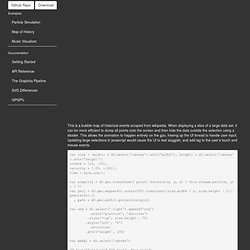
When displaying a slice of a large data set, it can be more efficient to dump all points onto the screen and then hide the data outside the selection using a shader. This allows the animation to happen entirely on the gpu, freeing up the UI thread to handle user input. Updating large selections in javascript would cause the UI to feel sluggish, and add lag to the user's touch and mouse events. Swimsuit Timeline. Aragorn. A Day in the Life. Aragorn. Aragorn. Abresler : For my #datascience friends ... How Americans spend their money: 1949 vs 2011. : dataisbeautiful. Visualization of age, height and weight of players in the 2014 FIFA World Cup. Oranges and Blues — BoxOfficeQuant. When I launched this site over two years ago, one of my first decisions was to pick a color scheme – it didn’t take long.

Anyone who watches enough film becomes quickly used to Hollywood’s taste for oranges and blues, and it’s no question that these represent the default palette of the industry; so I made those the default of BoxOfficeQuant as well. But just how prevalent are the oranges and blues? Some people have commented and researched how often those colors appear in movies and movie posters, and so I wanted to take it to the next step and look at the colors used in film trailers.
Infographic: Each nation's odds at the World Cup. Which Site Has the Best Fantasy Football Projections? 2014 Update. In prior posts, I demonstrated how to download, calculate, and compare fantasy football projections from ESPN, CBS, NFL.com, and FantasyPros, which aggregates projections from many different sources to increase prediction accuracy.
Last year, I compared fantasy projections from ESPN, CBS, NFL.com, and FantasyPros, including our average and latent projections to determine who had the best fantasy football projections. In this post, I compare fantasy football projections over the last two years to see if the best projections in 2012 are still the best in 2013. The R Script The R Script for comparing the projections from different sources is located at: To compare the accuracy of the projections, I use the following metrics: For a discussion of these metrics, see here and here.
Whose Predictions Were the Best? The results are in the table below. Aragorn. NBA Franchise Sales 1946 to 2014. A Visual Compendium of Basketball Jerseys. This all-star jam of 165 basketball jerseys across time and space is a stunning survey of the sartorial side of swishing and dishing. Starting with the New York Celtics in 1921, this ballin’ breakdown boasts time-tested three-point threads from dapper dunkers throughout hoops history, including trey-cool fashion centerpieces like the '72 Nets, the '89 Magic, all manner of globe-trotting Harlemites, and even a selection of pop culture jerseys like the inimitable Tune Squad and Monstars from the 1996 documentary Space Jam. Also features the many custom tops of hip-hop, and vintage throwbacks that harken to a time of high-pulled shorts and socks. Perfect for posting up on your wall, this is one dazzling documentation of fashion-forward designs that will never fade away.
Boom shakalaka! 24" x 36" Each print is signed and numbered by the artists from a first printing of 500, and comes packaged in a Pop Chart Lab Test Tube. Raises $15 Million to Empower Governments with Transparency and Business Intelligence Software. When we co-founded OpenGov two years ago, I was living in a shipping container in Afghanistan while serving as an advisor on the Anti-Corruption Task Force. My partners were technologists from Stanford University and together we embarked on a mission—to build the most powerful web-based business intelligence platform for the world’s most important industry: government.
More than any other industry, government provides services that affect our lives. Yet governments remain the most underserved by technology. Here's Why In-Game Betting Is Taking Off. Almost anybody watching the final minutes of last night’s NBA playoff game between the Los Angeles Clippers and Oklahoma City Thunder would have felt safe turning off their TV and moving on to other things. With 9:07 left to play in the fourth quarter, the Clippers were down by 16 points. At that moment, if you had bet at online sites that accept in-game bets (such as Betfair and Stan James) on the Clippers coming back to win, you could have made 57 times your money, according to calculations by Michael Beuoy, who runs the sports data visualization website Inpredictable. After being down 16, the Clippers went on a 35-17 run to end the game, capped by a Darren Collison layup with 32 seconds to go.
Once you’ve set up an account, online betting sites let you place bets on game outcomes throughout the entirety of the game. With odds changing in time windows so small, these sites effectively update on a real-time basis. Final_aba_nba_mvp_data_1955_2014. Introduction to R. Togaware: One Page R: A Survival Guide to Data Science with R. Rsaporta/R_data.table_intro. CSE512-ValueOfVisualization. An Error Occurred Setting Your User Cookie. This site uses cookies to improve performance. If your browser does not accept cookies, you cannot view this site. Setting Your Browser to Accept Cookies There are many reasons why a cookie could not be set correctly. Below are the most common reasons: You have cookies disabled in your browser. Why Does this Site Require Cookies? Rsaporta/R_data.table_intro. All_ncaa_revenue_football_programs_since_2000.
Map of all of the friendships formed on Facebook across the world : dataisbeautiful. Citi Bike usage data. Data Visualization. I spent a good deal of time over the course of the past semester working on topics about Chinese development. A lot of it started from my work at MKM Partners over the summer in which I worked on topics of regional Chinese growth. This eventually turned into a sequence of Quartz articles: one on the growth potential of the inland provinces, another on the overall success of the high speed rail program (which was actually backed up by a later NYT article), and a third on boosting Chinese consumption through a social service led urbanization (which ended up being an important part of the 3rd plenum).
I found it an engaging topic to research, and I will have an article in the next edition of the Milken Institute Review on these topics. If you have any thoughts about those articles, please share in the comments below and I'll try to get back to you. OpenHeatMap. Welcome to Booshaka.
Visualization. Database.