
Google AMP, ou quand notre impatience menace le Web ouvert - Tech. Avec les Accelerated Mobile Pages (AMP), Google pousse un standard adapté à la soif insatiable des internautes pour la rapidité d'affichage, contrôlé de façon opaque, qui devra cohabiter avec les normes ouvertes établies par le W3C.

Sommes-nous tous fous ? Nous connaissons une rapidité d’accès à l’information comme jamais l’humanité n’en avait connue, mais nous ne sommes jamais satisfaits. Des informations qui prenaient des semaines à être obtenues il y a quelques siècles, des jours au 19e siècle, des heures au 20e siècle, puis des minutes et désormais des secondes, ne nous parviennent toujours pas assez vite.
Nous n’avons plus besoin d’aller dans une bibliothèque ou dans une librairie pour trouver un livre, accessible en quelques clics. Nous n’avons plus besoin d’attendre que le facteur délivre le journal du matin, nous avons accès aux articles des journalistes dès qu’ils ont fini de les écrire. Qu'est-ce que AMP ?
Mixins Better for Performance. When it comes to preprocessors, one of the most frequent questions I’m asked is Mixins or @extend?
I’ve always been quitevocal about this topic, and I firmly believe you should avoid @extend for a number of reasons: It alters your source order, which is always risky in CSS. It creates awkward groupings in your code, putting unrelated selectors together. It is very greedy, @extending every instance of a given subject, not just the one you actually wanted.. It can get really out of control, really fast. @extend is now widely considered an anti-pattern, so its usage is thankfully fading out, but we’re not quite there yet. I was workshopping with a client yesterday and was asked about the mixin vs. It is true that @extend (when used correctly) will produce less CSS, but my answer was a firm no: mixins are better for performance. I answered the question with quite some confidence, despite having never actually done any tests. I got back to my hotel room and decided to put my theory to the test.
WTF, HTML and CSS? Full-height app layouts: A CSS trick to make it easier. That makes sense for documents, but it’s a pain for application UIs.
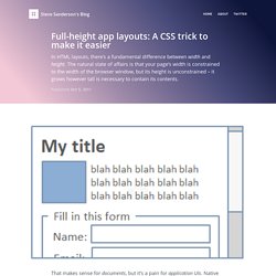
Native application UIs tend to slice up the screen both horizontally and vertically into a nested set of panels, some of which may scroll/resize, others being docked against particular edges of their parent panes. So, what’s the robust way, with HTML/CSS, to set up a nested collection of panes that exactly divide both the width and height of the browser window? Hang on, didn’t we have this one solved back in 1999? Hmm… this reminds me of something… I remember: the **** tag from *HTML 4*. Yes, HTML frames do divide the browser window both horizontally and vertically, exactly consuming the available screen area. Un fichier vide – La vie en #ffoodd. Et c’est bien normal.

C’est ainsi que nous découvrons nos outils, les personnalisons et atteignons leurs limites (ainsi que les nôtres). Éternels insatisfaits ⤴ Cependant aucun outil magique n’existe. Parmi les outils auxquels je pense, Bootstrap et Foundation se tirent la bourre depuis quelques années pour le titre de « Meilleur framework de l’année ». Cependant tout le monde leur trouve des défauts : trop de dépendances ;trop de composants ;des choix techniques trop orientés ;des partis-pris graphiques trop saillant ;etc.
The Fab Four technique to create Responsive Emails without Media Queries. The Fab Four technique to create Responsive Emails without Media Queries I think I found a new way to create responsive emails, without media queries.
The solution involves the CSS calc() function and the three width, min-width and max-width properties. Or as I like to call them all together: the Fab Four (in CSS). The problem Making responsive emails is hard, especially since email clients on mobile (like Gmail, Yahoo or Outlook.com) don’t support media queries. That last approach has been my favorite so far. Once all the blocks are stacked, they don’t take the full width of the email. I’ve been looking for ways to solve this problem for a long time.
A solution Remembering width, min-width and max-width On top of the calc() function, the solution I found involves these three CSS properties. A Complete Guide to Flexbox. Background The Flexbox Layout (Flexible Box) module (a W3C Candidate Recommendation as of October 2017) aims at providing a more efficient way to lay out, align and distribute space among items in a container, even when their size is unknown and/or dynamic (thus the word “flex”). The main idea behind the flex layout is to give the container the ability to alter its items’ width/height (and order) to best fill the available space (mostly to accommodate to all kind of display devices and screen sizes).
A flex container expands items to fill available free space or shrinks them to prevent overflow. Most importantly, the flexbox layout is direction-agnostic as opposed to the regular layouts (block which is vertically-based and inline which is horizontally-based).