
For the Love of Logos: Tips, Resources, and More - Noupe Design Blog Jan 12 2011 When it comes to design projects, logo designs tend to be some of the trickiest to work with, simply because of their purpose. All design tends to be conveying a message, this is true, but most designs get to use so much more to make their points accessible to the viewer. Not to mention that the message being conveyed through most design gets to be a bit more focused or general as well. This is not always true with a logo. It is with that in mind that this post came to be. We also thought that we would go ahead and drop some tips into the mix as well to share a few of the pearls that have always stuck out and stayed true with us in this arena of choice: logo design! The Basics Now in most conversations that we’ve had on logo design, there are a few standard bits of advice that tend to get tossed at the reader, so we thought that would be a good place to start. Less is More Counting on Color The Scaling Font Fixation The Brief Get the History History is important. Get the Mission
10 Principles For Readable Web Typography - Smashing Magazine Advertisement by Matt Cronin Readability is one of the more important aspects of Web design usability. Readable text affects how users process the information in the content. Poor readability scares readers away from the content. On the other hand, done correctly, readability allows users to efficiently read and take in the information in the text. In this post, we’ll explain some Web typography terms and how they play into readability; we’ll present numerous tips to help improve the readability of your content; and we’ll showcase very readable websites, layouts and articles. You may also be interested in the following related posts: The Terms, And What Each Means For Readability There are many factors that play into the readability of text. Hierarchy Every typographic layout needs the essential element of hierarchy. UXBooth5 uses a very clean hierarchy to achieve readable Web typography. Contrast Contrast is the core factor in whether or not text is easy to read. 1. 2. 3. 4. 5. 6. 7. 8. 9.
25 High Quality Free Fonts for Professional Designs Sometimes, the best things in life are free – fonts are a great example of this concept. There are many typography designers and type foundries that choose to share their beautiful creations to the public. In this collection, you’ll find some of the best free and high-quality sans serif fonts for clean and professional designs that you can download on the web. 1. Nevis Download: Ten by Twenty (ZIP) 2. Download: Danmarks Medie (ZIP) 3. Download: The League of Moveable Type (ZIP) 4. Download: SMeltery (ZIP, read EULA first) 5. Download: Typophile (ZIP) 6. Download Page: MyFonts 7. Download: TrueType/OpenType Tools (ZIP) 8. Download: deviantART (ZIP) Download: freedesktop.org (TAR) 10. Download: The Crud Factory (ZIP) 11. Download Page: MyFonts 12. Download: The League of Moveable Type (ZIP) 13. Download Page: MyFonts 14. Download: Tiro Typeworks (Windows/OSX TTF) 15. advent font Download: deviantART (ZIP) 16. Download: SMeltery (ZIP, read EULA first) 17. Download: deviantART (ZIP) 18. 19. 20. 21. 22. 23.
11 Ways to Speed Up WordPress WordPress is inherently fast, and that's why so many professional bloggers call it their choice platform. Like many new bloggers, I used to think that until I had enough traffic to make a difference, I'd worry about the bandwidth and site speed later. But that's not thinking ahead considering that today social media can drive an overwhelming amount of traffic in a very short period of time; you don't want to get caught with a crashed site. When you're not prepared for lots of traffic, it's common for a web host to suspend your account temporarily, and that's something you don't want. Note: As always, with everything, you should backup your WordPress installation before making any code changes. 1. Utilize WordPress Object Cache By inserting this simple code into your wp-config.php file, you can set WordPress to begin caching database queries rather than initiating new server requests on each load. Utilize a caching plugin 2. There are several web hosts that are optimized to run WordPress.
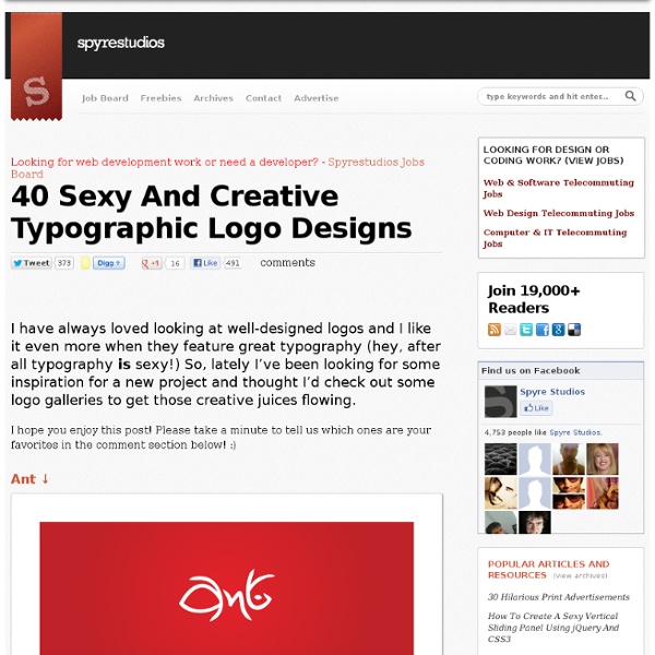
72 Creative And Smart Typographic Logo Inspiration | Graphic and If we are starting to go crazy in typography style, then let’s continue with typographic and smart logo designs, shall we? Here you’ll find 72 beautiful logos created by talented designers. This showcase just proves the point how much can one/two words, icons tell using correctly white, negative, positive spacing, colors, accents creating interesting associations. Explore and get creative as I did! 1. Who killed letter i? 2. Really smart logo! 3. Typeface: word-play: face from the type and letter T. 4. Just loving this logo, great stylization! 5. Very popular logo already, but thought I still share it in typography section. Author’s comment: “Logo was made for a bold creative team consisting of two people. 6. Just smart logo, which rings the bell! 7. Author’s comment: “Gizzy bear is how a little kid might say grizzly bear. Just genius! 8. Simple, artistic and very clever – all in one place! 9. Very good logo – yes, sticky! 10. Oh, snap – logo with very clear message. 11. 12. 13. 14. 15. 16. 17.
Inspirational Showcase Of Type-Based Logos A proper use of type is fundamental to create a good, and working, logo design. There are some logos where the typography is the essential element of the design, and where the designer works to make unique and communicative any single typeface. We are talking of typographic logos. A clean and direct type-based logo can be a good solution to represent a serious company and many designers love researching the perfect balance among typefaces to create stunning logos, that’s not an easy operation… anyway they can be very effective, they can communicate in a simple and clever way a strong message. Below you can see a collection of 60+ type-based logos, they are very clever and highly communicative. Note: in the bottom of the article there is a list of logo galleries where you can find more inspiration and more information about the logos (and their designer) collected in this post. 60+ Beautiful Type-Based Logos Logo Design Resources
25 Font-tastic Type Resources for Web Designers There have been quite a few good typography roundups posted around recently with varying levels of design focus. This roundup of resources and articles directly useful to the everyday web designer. Here’s a list of some interesting, eye-opening, and downright useful type resources for the web design world. HTML Ipsum HTML Ipsum is the brainchild of Chris Coyier of CSS Tricks. Typetester Typetester is an extremely comprehensive tool for determining how different typefaces will appear on the screen, and for the web. What the Font In addition to having a great acronym, What The Font is perfect for identifying fonts. Flipping Typical Flipping Typical lets you browse through some of most popular typefaces installed on your computer, and then demo them with custom input text. A Guide to Web Typography Ampersands with Attitude
55+ Extremely Useful Online Generators for Designers (Build 2010 In 2008 when I launched my personal blog to share my experiences, I decided to call it Balkhis instead of using my full name (Syed Balkhi). As time passed on, I regretted that decision because it created a lot of confusion. People thought that my last name was Balkhis instead of Balkhi. I basically combined my last name with the first letter of my first name.I was @syedbalkhi across all social media platforms, so the brand wasn’t consistent.People didn’t know about my personal blog as much because they didn’t relate Balkhis with me. Well as I focus more on my personal brand in 2015, I made the crucial move of switching domain names. As you noticed with this change, I got a new site design. I didn’t want to spend too much time creating a custom theme, so I used my friend Michael Hyatt’s theme which you too can buy if you like: GetNoticed. I did customize it to give it a bit of personal touch. The main reason why I chose this theme is because of all the amazing functionality it comes with.
LogoMoose ? Logo design community and inspiration gallery Create a Letterpress Effect with CSS Text-Shadow The letterpress effect is becoming hugely popular in web design, and with a couple of modern browsers now showing support for the text-shadow CSS3 property it’s now simple and easy to create the effect with pure CSS. No Photoshop trickery here! Letterpress – Isn’t that a type of industrial print method? That’s right! With the recent support of text-transform in Safari and Firefox (3.1+) the effect can easily be created without needing to use any image replacement techniques. View demo Start out by creating a simple background. <! <h1>Line25</h1> <h2>Pure CSS Letterpress Effect</h2> Set up a plain HTML document, then add a few lines of text to test the effect on. Style up the text using the usual CSS properties to edit the size and basic appearance. Now we’re ready to apply the text-shadow property. color: #222; text-shadow: 0px 2px 3px #555; To create the letterpress effect, we need to add a shadow that’s lighter than the colour of the text to ensure the effect works correctly. Simple!
Social Media Mini Icon Pack No frilly styles, gradients or lighting effects — just the basics. This set of social media icons is optimized at 32 and 64 pixels in five different shapes (over 1100 icons). All files are semi-transparent bitmap PNGs. Included in the download are these variants: CircleRounded SquareSquareSymbol (just the logo) Monochrome Simple & Styleable I kept them simple intentionally, but with a little know-how and a sprinkling of pixie dust, you can pull off some pretty sweet styles, like these: freebie icons social resource Share
Buttonator