
Delta – A Free jQuery UI Theme | Kiandra IT Blog Kiandra is pleased to announce the open sourcing of a jQuery UI theme we think you’re going to love. We have been using the “Delta” theme for the better part of a year and made the decision to share it with the community. We’re hoping this results in plenty of feedback as well as the continued development of the theme. If anything, we think that this theme can act as a starting point for other smart cookies to create their own visually engaging jQuery UI themes. Features: Open source – Free for commercial and personal use alike under an MIT license.Retina ready – The theme makes use of CSS3 gradients and some @2x images to ensure it’s retina display friendly.Dark and light friendly – The vibrant colour scheme means “Delta” works on both light and dark backgrounds. Support & Testing: IE7, IE8 & IE9But rounded corners and drop shadows will degrade depending on supportChromeFirefoxSafariOpera Did you find an issue? View Demo – Go to Repository
How To Use Size, Scale, And Proportion In Web Design Loud and soft, dark and light, big and small. Each is a relative measurement of some quality on some scale. Day doesn’t exist without night and up doesn’t exist without down. Each exists in contrast to the other and contrast occurs on a scale. Size, scale, and proportion are all related concepts. Size: the physical dimensions of an objectScale: the relative size of different objects or of an object to a common standardProportion: harmony of scale Size Web designers make a lot of choices about size. Size is an absolute measurement. We even need to consider the size of the files we create in order to speed up download times. We aren’t limited to using absolute measurements when designing of course, but when your audience is viewing your design everything will appear in absolute measurements. On it’s own size isn’t very interesting. Things get more interesting when we talk about scale. Scale Scale is a relative level or degree. Again scale is about relative measurements. Typographic Scale
Isotope jquery Slider jquery responsive : SlideMe Par Florian le 14 novembre 2013 SlideMe est un slider jquery responsive qui vous permettra d’effectuer des transitions en CSS3. Il est moderne et s’intègre facilement dans tous les sites grâce à à design très sobre et facilement personnalisable. Carousel responsive jquery : Ownlcarousel Par Florian le 1 octobre 2013 OwlCarousel est un carousel complet et tactile, avec une fonctionnalité originale : pouvoir afficher un nombre de slides différent en fonction du support (desktop, tablette, smartphone) Jquery responsive: NProgress.js Par Florian le 18 septembre 2013 Voici un peut jquery sympathique , qui est un loader responsive facile à mettre en place. Jquery responsive : Least Par Florian le 29 mai 2013 Least est un plugin jQuery permettant de créer un mur d’images responsive avec lazyload. Jquery responsive : Magnific Popup Par Florian le 15 mai 2013 23 Sliders responsive Par Florian le 29 avril 2013 Jquery responsive : Nested Par Florian le 9 avril 2013
slideControl.js jQuery Plugin In Your <head> <link rel="stylesheet" type="text/css" href="slideControl.css" /><script type="text/javascript" src=" type="text/javascript" src="jquery.slideControl.js"></script><script type="text/javascript"> $(document).ready(function() { $('.slideControl').slideControl();});</script> Options speed: Controls the speed of the animation for a slider reszing, defaults to 400 lowerBound: Sets the minimum amount the slider can be set to, defaults to 1 upperBound: Sets the maximum amount the slider can be set to, defaults to 10 <ul><li><label>Responsiveness: </label><input type="text" value="6.0" class="slideControl" /></li><li><label>Safety: </label><input type="text" value="4.0" class="slideControl" /></li><li><label>Information: </label><input type="text" value="9.0" class="slideControl" /></li></ul> The CSS file included should be pretty straight-forward. Usage
How to Design a Landing Page to be Conversion Focused Landing pages get a a bad rap. Designers often rebel against some of the basic principles of landing pages. And clients as well as agencies often misunderstand what a landing page really is and how to make it really sing. If you’re in the landing page business — as I am — you know that landing pages are really much more than they’re given credit for. Debunk 1: A Landing Page is a Page. First, they’re far more than a page. Landing Page The first page of any landing experience is its landing page. Land & Jump A single-page landing experience that’s designed to warm the user up to something before it’s shown to them is of-ten called a land & jump (because they’re landing & jumping off to somewhere else for conversion). Microsite A small, topic-specific website with specific, persistent navigation is usually referred to as a microsite. Conversion Path A series of pages designed to segment visitors into sub-groups and subsequently deliver segment-specific content and offer is a conversion path.
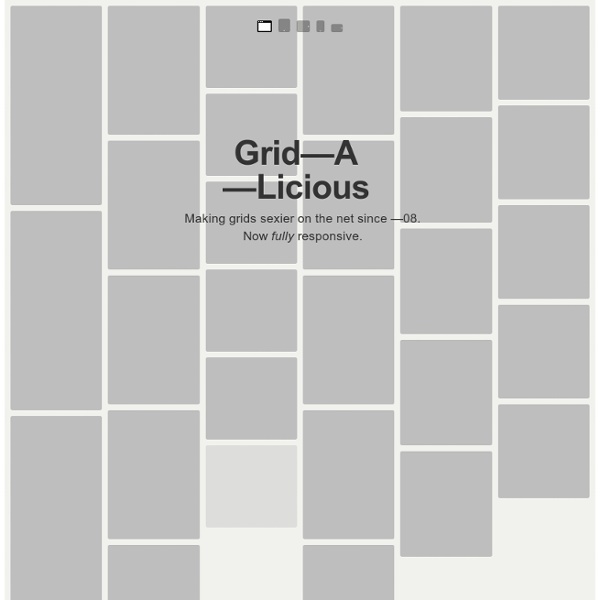
15 Best jQuery Grid Plugins for Developers Todays requirement when designing and developing a website is based on Responsiveness, where ones website must be able to adapt and resize across all handheld devices – thus: our thinking towards a tablet – like approach must incorporate fluid and adaptive as well as responsive layouts in developing a website. Most website design today seems to rely on the Grid system and layout, which allows designers a way by which to organize content on a page, using any combination of margins, guides, rows and columns. Grid design is most commonly seen in newspaper and magazine layouts which consist of columns of text and images. The amount of grid layouts which can be created is basically limitless and can be arranged in a myriad of ways, such as : equally sized two, three and four-column grids with a header across the top, as well as a full-page grid of squares with a consistent look and feel. 1. 2. S Gallery is a jQuery image gallery plugin that displays images in a responsive grid. 3. 6. 7. 9.
Usage Examples | MaxImage 2.0 Caution: This example is meant for expert users. Remember, with FillElement you can often accomplish an offset scheme very easily... just set your containing element where you want the images to be displayed. Because the first rule of Maximage 2.0 is to try to remain hands off and out of your way, the built in support for offsets have been dropped with version 2.0. This doesn't mean they aren't possible. What I am doing with the below code is creating curtains / offsets that live in front of the slideshow. Once we have our curtains up, the slideshow is still resizing to the full window and we want to have it maximize within the viewable area... our window size minus our offsets. View Example
Tiny Circleslider: A lightweight circular carousel for jQuery What is it? Tinycircleslider is a circular slider / carousel. That was built to provide webdevelopers with a cool but subtle alternative to all those standard carousels. Tiny Circleslider can blend in on any wepage. It was built using the javascript jQuery library. Features IOS and Android support. Need support or custom features? Anything is possible! Examples $(document).ready(function(){ $('#circleslider1').tinycircleslider();}); Note: There is no lightbox natively in tiny circleslider for this example fancybox was used. To get a better understanding of how it all comes together I made a (corny) styled example. Constructor Properties Methods Events Usage The image below displays how you calculate the radius of your circleslider.
Helps you build good looking and functional web sites