
Should You Reset Your CSS? By Michael Tuck This article explores the ongoing debate on whether or not web designers and web developers should reset their CSS, sharing the thoughts and opinions of several web professionals. This is a three-part series of articles on the topic of CSS resets. The Benefits of Resetting Your CSS Web designer/developer and book author Morten Rand-Hendriksen is a huge fan of CSS resets; he has advised everyone to use them as the foundation of their stylesheets. Defending the "hard reset" method, Coyier outlined two main concerns that web designers typically have against using the universal selector. The first is that it can break web browser default styles for things such as form elements, which he said was "untrue" unless you use a border:0 property in the style rule. The other concern of using the universal selector to reset your styles is the performance hit caused by using such an unspecific selector. In Support of No CSS Reset Main Concerns with CSS Reset Stylesheets Dissecting Reset CSS
CSS Specificity Some people are confused by CSS Specificity, especially with all of the (not-so) new CSS3 Selectors. The image below may help make sense of CSS Specificity. Download the PDF Legend: X-0-0: The number of ID selectors, represented by Sharks0-Y-0: The number of class selectors, attributes selectors, and pseudo-classes, represented by Fish 0-0-Z: The number of type selectors and pseudo-elements, represented by Plankton a la Spongebob*: The universal selector has no value +, >, ~: combinators, although they allow for more specific targeting of elements, they do not increase specificity values:not(x): The negation selector has no value, but the argument passed increases specificity CSS SpeciFISHity You can download the PDF of fishy CSS specificity here Specificity determines which CSS property declaration is applied when two or more declarations apply to the same element with competing property declarations. With CSS3 Selectors, order is even more important, as is understanding specificity: !
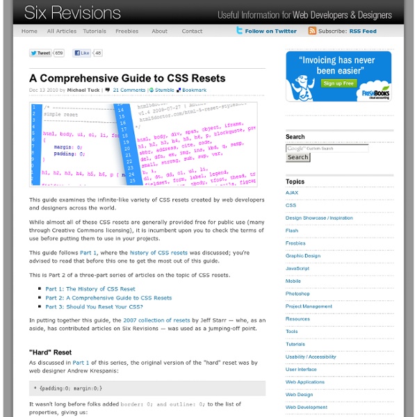
The History of CSS Resets When artists begin a new painting, they don’t immediately reach for the cadmium red and the phthalo blue. They first prime the canvas . Why? Many web designers prefer to use a CSS "reset" to "prime" the browser canvas and ensure that their design displays as uniformly as possible across the various browsers and systems their site visitors may use. This is Part 1 of a three-part series of articles on the topic of CSS resets. What Is CSS Reset? When you use a CSS "reset," you’re actually overriding the basic stylesheet each individual browser uses to style a web page. The problem is that every browser’s stylesheet has subtle but fundamental differences. Some of the most common elements that are styled differently among different browsers are hyperlinks ( <a> ), images ( <img> ), headings ( <h1>through <h6>), and the margins and padding given to various elements. So which browser is right, Firefox or IE? It might be useful to peruse this chart showing the various browser defaults. The Yahoo!
CSS Style Guides As we wrap up our recent poll on ordering CSS properties, it brings up the larger issue of CSS style guides. Ordering properties is just one choice you have to make that makes up a complete styling strategy. Naming is a part of it. Let's round up some existing ones. But first... I love pattern libraries. The List I'll list some excerpts from each that I like below. GitHub GitHub CSS Style Guide → As a rule of thumb, don't nest further than 3 levels deep. Unit-less line-height is preferred because it does not inherit a percentage value of its parent element, but instead is based on a multiplier of the font-size. Google Google HTML/CSS Style Guide → Use ID and class names that are as short as possible but as long as necessary. E.g. Do not concatenate words and abbreviations in selectors by any characters (including none at all) other than hyphens, in order to improve understanding and scannability. E.g. .demo-image not .demoimage or .demo_image Idiomatic CSS Nicolas Gallagher's Idiomatic CSS → More?
Objects, Images, and Applets in HTML documents 13.1 Introduction to objects, images, and applets HTML's multimedia features allow authors to include images, applets (programs that are automatically downloaded and run on the user's machine), video clips, and other HTML documents in their pages. For example, to include a PNG image in a document, authors may write: <BODY><P>Here's a closeup of the Grand Canyon: <OBJECT data="canyon.png" type="image/png"> This is a <EM>closeup</EM> of the Grand Canyon. Previous versions of HTML allowed authors to include images (via IMG) and applets (via APPLET). They fail to solve the more general problem of how to include new and future media types. To address these issues, HTML 4 introduces the OBJECT element, which offers an all-purpose solution to generic object inclusion. The new OBJECT element thus subsumes some of the tasks carried out by existing elements. The chart indicates that each type of inclusion has a specific and a general solution. 13.2 Including an image: the IMG element src = uri [CT]
Object Oriented CSS · stubbornella/oocss Wiki About rel="canonical" - Webmaster Tools Help If you have a single page that's accessible by multiple URLs, or different pages with similar content (for example, a page with both a mobile and a desktop version), Google sees these as duplicate versions of the same page. Google will choose one URL as the canonical version and crawl that, and all other URLs will be considered duplicate URLs and crawled less often. If you don't explicitly tell Google which URL is canonical, Google will make the choice for you, or might consider them both of equal weight, which might lead to unwanted behavior, as explained in Reasons to choose a canonical URL. How Googlebot indexes and chooses the canonical URL When Googlebot indexes a site, it tries to determine the primary content of each page. Google chooses the canonical page based on a number of factors (or signals), such as whether the page is served via HTTP or HTTPS, page quality, presence of the URL in a sitemap, and any rel=canonical labeling. Valid reasons for keeping similar or duplicate pages
Couleurs du Web Un article de Wikipédia, l'encyclopédie libre. Les couleurs du Web désignent les couleurs utilisées dans l'affichage des pages web, ainsi que les méthodes pour définir (par des combinaisons de teintes) et référencer (par un nom de couleur) ces couleurs. Les auteurs de pages web peuvent spécifier les couleurs des éléments qui composent un document web de plusieurs manières : par un code agglutinant les valeurs hexadécimales RGB ; par un triplet donnant ces valeurs en décimal de 0 à 255 ou par un pourcentage ; par des références Teinte Saturation Luminosité. Des noms de code basés sur une désignation en anglais peuvent rappeler plus de deux cents codes de couleur. Souvent un outil de gestion des couleurs ou un autre logiciel graphique est utilisé pour générer la valeur numérique de la couleur souhaitée. Codage informatique des couleurs[modifier | modifier le code] Triplet hexadécimal[modifier | modifier le code] Octet 1 : valeur du rouge Octet 2 : valeur du vert Octet 3 : valeur du bleu
Les sprites CSS - Alsacréations Le temps des onmouseover, des images préchargées via JavaScript et des autres joyeusetés héritées des grandes périodes de tag soup est, comme le temps des Elfes de la Terre du Milieu, définitivement révolu : faire des effets de rollover sur des images est tout à fait possible en utilisant uniquement les CSS. La technique consiste à exploiter un fichier unique pour stocker de multiples images, positionnées les unes à côté des autres. Celles-ci seront ensuite appelées dans la feuille de style, et la fenêtre d'affichage sur l'une ou l'autre image sera définie en CSS grâce à la propriété background-position. Attention : la technique exposée dans ce tutoriel est à manier avec précaution car elle peut engendrer des problèmes d'accessibilité (typiquement lorsque les images ne sont pas actives). Les avantages des sprites CSS sont multiples : Des sites à fort trafic (Youtube, Google, Facebook, Amazon, ...) exploitent cette technique sur des pages que vous consultez tous les jours : Inconvénients
Signaler les liens externes via CSS Les liens externes, c’est-à-dire les liens qui pointent vers des sites différents du site actuel, doivent être signalés selon les recommandations du W3C. Cela apporte une petite information très utile aux visiteurs lors de la lecture d’un article. Malheureusement ce système est très rarement mis en place. De tête, le seul site connu qui l’utilise est Wikipédia au sein des articles et à l’aide d’une petite icône : Cette petite astuce est facilement mise en application à l’aide de règles CSS. Rien de plus simple, nous ajoutons ici une icône « external.png » en arrière plan à tous les liens. Il suffit maintenant d’annuler cette même règle pour les liens qui ne sont effectivement pas des liens externes en utilisant les sélecteurs d’attributs en CSS : La seconde règle permet de préciser de nouvelles propriétés pour les liens qui contiennent dans l’attribut href le nom de domaine de notre site. Cela donnera ceci :
Gérer les débordements de contenu grâce à CSS - Alsacréations Sommaire Précision : cet article se limite volontairement au dépassement de contenus et non à d'éventuelles erreurs de conception de design, de mauvaise gestion de la fluidité, ou à des débordements de blocs flottants. Préambule J'ai une mauvaise nouvelle pour vous : le Web n'est pas un média figé ou paginé tel que le média d'impression. Vous n'êtes pas maître de votre contenu et il va falloir vous y faire. Puisque - heureusement - il n'est plus possible de fixer la taille, voici un point sur les différentes techniques modernes permettant de canaliser les caprices de vos contributeurs… overflow: hidden : circulez, y'a rien à voir ! La propriété CSS2 overflow a été conçue pour administrer les débordements d'éléments au sein d'un bloc. A l'heure actuelle, le peu de valeurs prises en charge par cette propriété la rend quelque peu abrupte : soit le contenu est tronqué et masqué (valeur hidden), soit de laides barres de défilement apparaissent (valeur scroll ou auto). Exemple (HTML) : Partie CSS :
Générer des boutons en CSS Générer des boutons en CSS Si vous développez vos petits sites vous même, sachez qu'il existe un site qui s'appelle Button Maker et qui permet de créer des boutons de toute beauté, entièrement en CSS. Vous spécifiez vos couleurs, votre texte et en cliquant sur le rendu, vous obtiendrez le code CSS qui va bien pour mettre ça sur votre site. Maaaa kéééé c'est beauuuuuu ! Attention quand même sous IE car là, ça coince un peu...pas de dégradé, pas de coins arrondis... [Source] Vous avez aimé cet article ?