
Planning And Implementing Website Navigation Advertisement The thing that makes navigation difficult to work with in Web design is that it can be so versatile. Navigation can be simple or complex: a few main pages or a multi-level architecture; one set of content for logged-in users and another for logged-out users; and so on. Because navigation can vary so much between websites, there are no set guidelines or how-to’s for organizing navigation. Designing navigation is an art in itself, and designers become better at it with experience. It’s all about using good information architecture: “the art of expressing a model or concept of information used in activities that require explicit details of complex systems.” Organizing Navigation Structure Perhaps the most difficult part about navigation on the Web is organizing and designing it. Primary vs. Most websites, especially those with a lot of content or functionality, need navigation menus. 1SpeckyBoy2 Primary navigation stands for the content that most users are interested in.
CSS: Eigene Schriften einbinden - time4joomla Die Überschriften auf dieser Site bestehen aus einem Font, den ich per CSS eingebunden und entsprechend den Joomla-Klassen zugewiesen habe. Leider benutzen der Internet Explorer von Microsoft und die meisten anderen Browser unterschiedliche Fonttypen. Für die meisten Browser reicht ein True-Type-Font (TTF) aus. Die allermeisten Schriften, die sich im Internet finden, sind TTF-Schriften. Hat man seine Schriften zusammen, lädt man diese am besten direkt in das CSS-Verzeichnis des Templates und schreibt dann am Anfang der CSS-Datei dieses hier: 02. 03. font-family:meine_schrift; 04. src:url(fruitopia.eot); 08. 09. font-family:meine_schrift; 10. src:url(fruitopia.ttf); Dort wo man die Schriftart benutzen möchte, einfach so eingeben, wie in diesem Beispiel bei einer h3-Überschrift: 1.h3 { 2.font-family: meine_schrift; "meine_schrift" ist ein beliebiges Wort, welches den verwendeten Font kennzeichnet.
10 New Free Fonts for Your Designs Here at WDL, we love to keep our readers posted on fresh resources, especially when it comes to fonts. Today we gathered a new round of free fonts to spice up your libraries. So feel free to check out all of them and download the ones you like most. Idealist Sans Aleo Palacio Graham Hand Agilis Versa Stela UT Regular Canter Typeface Marta Autour One About the Author Henry Jones is a web developer, designer, and entrepreneur with over 14 years of experience. Related Posts 938 shares 10 Best New Free Fonts We’ve been on the prowl for some new free fonts to share with you. Read More 1138 shares 9 Free & Useful Fonts for your Designs Whether it’s PSD’s or icons, we love finding high quality free files and sharing them with our readers.
Beautiful web type — the best typefaces from the Google web fonts directory Lucius Annaeus Seneca60 AD Among the numerous faults of those who pass their lives recklessly and without due reflexion, my good friend Liberalis, I should say that there is hardly any one so hurtful to society as this, that we neither know how to bestow or how to receive a benefit. It follows from this that benefits are badly invested, and become bad debts: in these cases it is too late to complain of their not being returned, for they were thrown away when we bestowed them. Pro tips: 20 steps to the perfect website layout | Web design When designing a website layout there are some common mistakes that often pop up, especially with interns and new designers. In this list of steps to the perfect website layout, we cover what every new website builder working within a digital agency should know and do before starting a new project, and what they should pay attention to during the process to avoid making these mistakes. These principles cover not only design aspects but also general workflow tips that will get the job done nicely. 01. Before starting the work you need to know what is it you are designing for. Good redesigns are not necessarily the most flashy ones but the ones that improve performance over time. 02. This seems very obvious but I've found too often that designers jump straight into their work before giving any thought to the problem they are trying to solve. Think about the content, the layout and the functionality before starting to drop shadows. 03. 04. It's as simple as it sounds. 05. 06. 07. 08. 09.
@font-face Lost Type Co-op Foundation Icon Fonts 3 Use 283 icons with 1 font A custom collection of 283 icons that are stored in a handy web font. View All Icons » Style 'em with CSS A couple lines of CSS and the right markup will get you going in no time. How to Use Them » Create infinite variations Easily customize these icons to be any size, color and style in CSS. How these were built Here at ZURB, we created these icons with specific standards which gives a cohesive voice and style to develop an amazing font set for everyone to love, enjoy and use on their website. Geometric All icons are made with basic shapes like triangles, squares, rectangles and circles. After converting these vector icons into a font, we’ve given you the ability to have an endless number of sizes, colors and styles for the icons that you need which could be customized and stylized via CSS. How to use them We've made it super easy for you to get going with these icons! Merge in the styles Write your markup We've used an <i> for icon elements. Style away! Thoughts?
Lessons We Learned from Our Biggest UX and Design Mistakes We’ve finally hit the 500,000-user mark at Buffer, a product that helps you share on your social media networks more efficiently. About two years ago when we started on our path to building Buffer, we knew we’d be meeting obstacles and making mistakes along the way. One of the main things we’ve kept in mind is that making mistakes is unavoidable and that if we choose to learn from them, they’ll be helpful in giving us good guidance on how to move forward more effectively. And I believe that it’s partly because of these mistakes that we were able to get to where we are today. The Experience That Shaped How We Build Our Product Before I discuss the biggest lessons we learned from some of our UX and design mistakes, I want to talk about one of our primary product development principles: "Validate first, code later" Let me tell you how this came about. A few minutes into his coding session, he realized that that wasn’t the way to go. So he tried something else. This is how we learned this lesson.
Stylesheets / CSS-Eigenschaften / Schriftformatierung mit Schriftartendatei @font-face, src, font-family (Schriftformatierung mit Schriftartendatei) Von diesen in CSS2 eingeführten Angaben wurde nur @font-face vom Internet Explorer und Netscape 4.x unterstützt. Da sie weder in den Mozilla-Nachfolgern noch in anderen aktuellen Browsern implementiert sind, gehören sie in CSS 2.1 nicht mehr zum Standard! Sie sollten also stets auch passende Alternativ-Schriftarten angeben, wenn Ihre Seiten nicht ausschließlich von Nutzern des Internet Explorer besucht werden (die die Schriftart-Installation bei hoher Sicherheitsstufe auch bestätigen). Über @font-face können Sie für den Internet Explorer eine Schriftart definieren und dabei direkt die Daten-Ressourcen der gewünschten Schriftarten ansprechen, also bestimmte Schriftartendateien. font-family verwenden. Beispiel: Erläuterung: Mit @font-face starten Sie die Angabe einer exakten Schriftart in einem style-Bereich. Den Schriftartennamen vergeben Sie mit der Angabe font-family: innerhalb des @font-face-Bereichs. Impressum
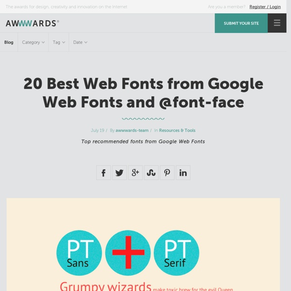
19 top fonts in 19 top combinations Sign up and download immediately to take your typography to the next level! This classic contains some great stuff: An exceptional glossary of typography terms Killer tips on establishing typographic color Choosing and using the right typefaces 20 Action-packed info-dense pages! 10 Great Google Font Combinations You Can Copy The average man considers which flavor of Doritos will taste good with his Heineken. The sophisticated man considers which cheese will pair well with his choice of wine. The designer of course considers which two fonts will look great on the same page. Today we’re going to use the Google Font API as a playground for mixing fonts and finding ideal pairings. You’ll be able to skim through and instantly grab out selections that you think are appropriate for your projects. A couple of times each month, we re-publish one of our popular posts from the archives. Why Google Fonts? The web font game was up in the air a few years ago. Here’s why @font-face wins. Now, within the @font-face world there are many competitors. However, I’ve used this solution several times on Design Shack before so I wanted to switch things up today and use something else. Quick Tips for Combining Fonts Before we get started, there are a few basic rules that you can keep in mind when combining fonts. Use Font Families
80 Creative Logo Designs For Your Inspiration They say a picture speaks a thousand words, and that is definitely true when it come logo design. A well-thought logo design can effectively use a simple icon to leave a deep enough impression for the public. Most logos communicate ideas to people, for instance the kind of quality services a company can provide for its customers. A memorable logo is always a plus if one wants to ensure first-time visitors to their websites will return in future. While there’s no easy answer as to what kind of logo design is the most effective and impressionable, it is probably intuitive to assume that creatively designed logos are more likely to stand out. However, that does not necessary mean that a logo has to be very elaborated. Here is a compilation of 80 creative logos of different variety, all categorized under these groups: Wordmark, Symbolic, and Combined mark. Wordmarks Symbolic, Iconic & Combine Mark