background preloader

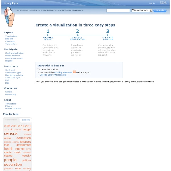
Create visualization

Create visualization

Issuu - You Publish GGobi data visualization system. Social Analytics Reports and Infographics Using Animoto in the Classroom It’s unusual for me to write a blog post extolling the virtues of a single edtech tool – I usually prefer a rundown of several resource that can be used for any given subject, because there are so many brilliant tools out there to feature and usually so many advantages and disadvantages to using each one. But Animoto is a special case! It is incredibly easy to use, which is a huge plus for the classroom, but also presents a really wide and flexible range of possible uses, which isn’t always the case with the simpler end of edtech tools. If you’re not already familiar with Animoto, it’s a website that allows you to make your own videos by choosing a background template from a wide range of options, adding a piece of music, and then creating a completely unique compilation of photographs, video clips and text, which is then all magically pulled together into an incredibly professional finished product. The real beauty of Animoto is its sheer, joyful flexibility.

Data Visualization: 20+ Useful Tools and Resources There are plenty of cool technologies available to collect and examine data. Both web and desktop applications have provided some really great interfaces to fall in love with data mining, and with the rise in popularity we have noticed an increased number of infographics created over the past few years. Today we’ll be looking into some really cool and popular online resources for data visualization. If you’ve designed your own infographic or visualization tool we’d love to check it out. Recommended Reading: More Infographic related posts. Better World Flux Now this is one beautiful visualization tool! The refined condition of BWF’s design comes as no surprise. Visual.ly This is perhaps one of my favorite new online tools today. If you check out their labs page it includes some fantastic links about what the team is building. To add onto their networking features Visual.ly has provided a handful of partner pages. We Feel Fine As advertised We Feel Fine is an exploration of human emotion.

Gapminder: Unveiling the beauty of statistics for a fact based world view. Tagxedo - Word Cloud with Styles Mosaic Maker: A world of creative photo possibilities. Tons of fun stuff... Give one of our toys a spin! Framer, FX, Trading Card, Mosaic Maker, CD Cover, Photobooth, Bead Art, Magazine Cover, Billboard, Mosaic Maker, Color Palette Generator, Mosaic Maker, Calendar, Lolcat Generator, Cube, Pop Art Poster, Mat, Hockneyizer, Movie Poster, Motivator, Jigsaw, Wallpaper, Map Maker, Pocket Album, Badge Maker, I know, right? Chart and image gallery: 30+ free tools for data visualization and analysis November 7, 2013 03:21 PM ET The chart below originally accompanied our story 22 free tools for data visualization and analysis (April 20, 2011). We're updating it as we cover additional tools, including 8 cool tools for data analysis, visualization and presentation (March 27, 2012) and Six useful JavaScript libraries for maps, charts and other data visualizations (March 6, 2013). Click through to those articles for full tool reviews. Features: You can sort the chart by clicking on any column header once to sort in ascending order and a second time to sort by descending (browser JavaScript required). Skill levels are represented as numbers from easiest to most difficult to learn and use: Users who are comfortable with basic spreadsheet tasks Users who are technically proficient enough not to be frightened off by spending a couple of hours learning a new applicationPower usersUsers with coding experience or specialized knowledge in a field like GIS or network analysis.

Free Online Word Cloud Generator Making Data Visualizations: A Survival Guide And Other Resources As part of my work as Visiting Scholar at the Packard Foundation this year, I’m facilitating a peer learning group based on “Measuring the Networked Nonprofit” and the next session we are focusing on the sense-making step of measurement. This part of the measurement process is most the fun because it covers visualization, pattern recognition, and reflection. I wanted to take a deeper dive into resources out there that provide useful tips about how to do this step for folks who were not data scientists or data nerds. I did a quick scan of data visualization resources to look for practical advice on the process of thinking visually and some technical information on what chart to select and data storytelling. Here’s what I discovered. (1) Data Visualization Survival Guide: This resource (including the 176 slides powerpoint deck) was suggested by Devon Smith. Avoid 3d-charts at all costs. Talk pivot tables to me … RT @jonesabi OH re: data: “Is it well-structured enough and is it sexy?”

Yippy Cloud Creator

Related: