
Responsive Multi-Level Menu A responsive multi-level menu that shows its submenus in their own context, allowing for a space-saving presentation and usage. View demo Download source Today we want to share an experimental drop-down menu with you. The main idea is to save space for menus that have a lot of content and sub-levels. Please note: this only works as intended in browsers that support the respective CSS properties. The structure of the menu contains an unordered list that can have an arbitrary number of sub-lists: <div id="dl-menu" class="dl-menuwrapper"><button class="dl-trigger">Open Menu</button><ul class="dl-menu"><li><a href="#">Item 1</a><ul class="dl-submenu"><li><a href="#">Sub-Item 1</a></li><li><a href="#">Sub-Item 2</a></li><li><a href="#">Sub-Item 3</a></li><li><a href="#">Sub-Item 4</a><ul class="dl-submenu"><li><a href="#">Sub-Sub-Item 1</a></li><li><a href="#">Sub-Sub-Item 2</a></li><li><a href="#">Sub-Sub-Item 3</a></li></ul></li><li></li></ul></li><li></li><li></li></ul></div>
FooseShoes a Flat ECommerce Responsive Web Template by w3layouts FooseShoes – a Flat eCommerce Responsive Web Template FooseShoes – a Flat eCommerce Responsive Web Template is a web design template which can be used for Online Shopping, eCommerce websites as well as mobile compatible devices. One can use this template as per their requirement. It could be customized to compete with shopping websites such as Fashionara, Jabong, Myntra, Snapdeal, Amazon and so on. Highlights This responsive website template has seven content sliders on top with attractive wall papers.Below the content sliders you get three categories to list your “on sale”, “special offers” and “must have” products listing.Customer testimonials provide a website with credibility and trust, for this FooseShoes HTML CSS5 website template is provided with a space for testimonial.Shipping details are highly essential for customers, so a detailed description on this would prove helpful for your clients.Blog is needed to support all the content data of a website. Template Information
40 Free Shaded Social Media Icons Social media icons play a noticeable role in a blog/website. They grab the attention of more and more viewers and uplift the standard of the blog with their appearance and fresh look. Now without having social media icons, blogs/websites look low life and not very impressive. If a website has a stunning look than such social media icons are needed that may compliment the theme and background of the website. Today I designed 40 free shaded social media icons that can be used in either dark or light background websites. I hope you will love to have these in your blogs. 40 Free Shaded Social Media Icons Free Social Icons Version: Available Size: 48, 56, 72, 96, 128, 256 px (Only for White Background) License: Free for personal use only + (Link Back to this Icon Set) Premium Version for only $ 3.00 Available Format: Vector (.ai) file (White/Dark Background ) Available Size: 48, 56, 72, 96, 128, 256 px License: Creative Commons Attribution 3.0 Unported License
Responsive Web Design: Using Fonts Responsively Typography is one of the most important aspects of responsive web design, and optimizing your fonts for mobile devices is an absolute necessity if you want your content to be palatable across all screen sizes. Fortunately, the process of building flexible fonts is not very difficult. When we talk about flexibility (which is the guiding principle in this case), we cannot overlook the specified size of the font we’ve chosen to adapt for our responsive website. We may use different metrics for this purpose, including pixels, ems, rems, or percentages. In this continuation on responsive web design, I’ll explain how to manage dynamic fonts responsively, and I’ll analyze all of the aforementioned metrics, comparing the strength and weaknesses of each choice. Pixels For a long time, pixels have been the unit preferred of web designer due to its inherent precision and accuracy. As a result, basic edits and adjustments will require meticulous modifications to all of the previous settings. Ems Rems
Travel Agency Mobile Website Templates Travel Agency Responsive Mobile web Templates Go Voyage Travler Travel Media Perfect Destination Premium Our Trav Traveling Travel Scout Travel On Smart Travel Travel Expert Don't miss a single template update Subscribe to our free weekly newsletter for new template releases (no spam) Latest Templates Others Privacy Policy To Top 25 Best Examples of Flat UI Design Websites Flat Design is a new trend labeled by the community as an interface striking similar to Windows 8 and Microsoft’s Metro UI because it leaves behind drop shadows, subtle textures and gradients in favour of solid colours, clean layouts and sharp typography. This post showcases 25 great website designs that all exhibit popular traits of the flat design trend. Layervault Lorenzo Verzini Spelltower Invoisse Built By Buffalo Foundation Framework Futureal Bundle Oak.is Hundreds 2012 Year on Twitter Combadi Lowdi Into the Arctic Designed to Move Concrete Matter Data Driven London Build 2012 Squidee Simone Marcarino Prophets OnSite Interactive Advent Calendar Future Insights Live 2013 Fhoke Etch
Responsive Website Design | Blue Fountain Media NYC What is Responsive Website Design? A responsive website is a single website that adapts to the device of each unique visitor, whether desktop, smartphone, or tablet. A responsive website dynamically re-sizes its content and imagery for a variety of different screen sizes in order to ensure the website is effective and easy to use on any device. Why should I use Responsive Website Design? Rapidly growing mobile usage Mobile web usage is growing at an extremely rapid rate that presents enormous opportunity. Best practice for ranking high in mobile search results Responsive design is the preferred option when it comes to making your website both mobile and search engine friendly. Efficient in terms of both time and cost Responsive website design can drastically cut down on development time and cost.
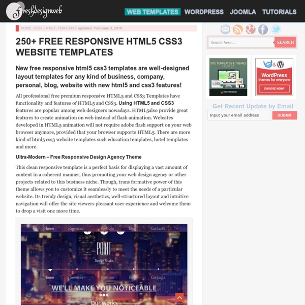
325+ Best Free Responsive HTML5 CSS3 Website Templates So we’re pretty bored with the current limits of the best “HTML CSS” and it’s clear that the “HTML5 CSS3” is the cure to let the creativity flow. We’re also going to implement a jQuery slider, so the lead image will be part of a rotation rather than just a static image. And Even if you don’t use these templates, you can get a doze of inspiration by having a look at these CSS/XHTML Web Templates. Here are 325+ best free premium HTML5 CSS3 website templates to help you get inspired and started. Trendy UI KIt Flat Responsive Free HTML5 Template Trendy UI Kit is a Plain and bold UI kit that includes lots of user interface elements. Art a Portfolio Singlepage Flat Responsive Free HTML5 Website Template Art a Flat Single Page Responsive web template is based on the Flat Design trend. Spike Shoes a Flat ECommerce Responsive Free HTML5 Website Template Bicycle a Product Based Flat Responsive Free HTML5 Website Template Bicycle is a clean, flat and product based Template for companies.
Inspiration For web apps, the vast majority of time and effort spent on the marketing side of the site is spent on the homepage, and on the features. Sadly, it’s all too easy to neglect the actual sign up page itself – but this is one of the most crucial pages on the site, and so many things affect how well it turns visitors into customers. The sign up page can literally make or break the success of your web app. To give you some inspiration around improving your sign up page, we’ve collected some examples of thoughtfully designed, creative and clever landing pages. Each of these sign up pages have been crafted with care and attention, and do a great job of leading the potential user into a fully fledged, signed up member of the site. Ballpark The signup page for Ballpark – a time tracking and invoicing service designed for freelancers and small businesses –uses an impossible-to-miss testimonial to help further entice prospective customers to sign up. Base Campaign Monitor
Unheap - A tidy repository of jQuery plugins 15 Best Free HTML5 Templates For Professionals To save your best time looking for free html5 templates that can work and good looking, we hand-picked some of the top professional looking templates for your own use. There are hundreds of thousands free website templates flying around the web. Some of them does not look so good or even can not function well. Here at MedleyWeb, our job is to looking for awesome stuff and share with you so you can directly start the design work. Those templates covered business site, portfolio, resume, gallery, fine arts, charity, real estate, food, etc. Hope they can save you some time and you can focus on how to tailor them to your special needs. Since you are here, you may also like: 1. Demo Download 2. Demo Download 3. Demo Download 4. Demo Download 5. Demo Download 6. Demo Download 7. Demo Download 8. Demo Download 9. Demo Download 10. Demo Download 11. Demo Download 12. Demo Download 13. Demo Download 14. Demo Download 15. Demo Download
Creative Ad Awards - The World's Most Creative & Sophisticated Advertising Tiny Circleslider: A lightweight circular carousel for jQuery What is it? Tinycircleslider is a circular slider / carousel. That was built to provide webdevelopers with a cool but subtle alternative to all those standard carousels. Tiny Circleslider can blend in on any wepage. It was built using the javascript jQuery library. Features IOS and Android support. Need support or custom features? Anything is possible! Examples $(document).ready(function(){ $('#circleslider1').tinycircleslider();}); Note: There is no lightbox natively in tiny circleslider for this example fancybox was used. To get a better understanding of how it all comes together I made a (corny) styled example. Constructor Properties Methods Events Usage The image below displays how you calculate the radius of your circleslider.
27 Templates HTML5/CSS3 Gratuits pour Sites d'Entreprise | Beaux Themes Voici une liste de superbes templates HTML5 et CSS3 gratuits qui vous aiderons à créer le site internet de votre business (entreprise) avant ce soir minuit. Voyez de vous même. Il y a quelques années, la création de sites internet était tout un casse-tête surtout pour les débutants en HTML et CSS. Mais aujourd’hui avec le grand avènement des templates, le temps et l’énergie requis pour concevoir un site web unique, fonctionnel et professionnel ont été considérablement réduis. Même les webmasters chevronnés s’en réjouissent. Si vous êtes sur cette page, c’est surement parce que vous désirez gagner du temps, de l’énergie et de l’argent lors de la création de vos sites internet. Et bien si c’est le cas, alors vous êtes au bon endroit. Cette liste de templates HTML5/CSS3 gratuits contient les meilleurs templates dont vous aurez besoin pour la création du site internet de votre compagnie. 1. Télécharger: Action (4287 téléchargements) 2. Télécharger: Bizz (3781 téléchargements) 3. 4. 5. 6. 7.