
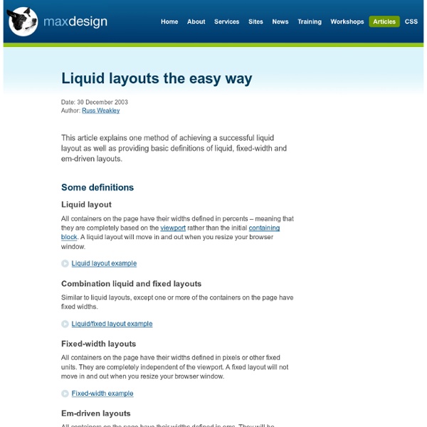
Tutorial 8 Tutorial 8 - Liquid two column layout - all steps combined Step 1 - Start with the semantically marked up code To lay out a page into two columns, you need to start with the basic page structure. In this case we will use some dummy content to create a two column template. The page has been grouped into five separate divs, and each of these div's has been been given a unique ID selector. The divs are labeled; "container" (wrapped around the entire page's content), "top" (for the top banner), "leftnav" (for the smaller, left column), "content" (for the main content) and "footer" (for the footer across the bottom of the page). Step 2 - Add width and margin to the container To get the content to sit in from the edge of the browser window (or viewport) we need to set width and margins on the main div that wraps around the content. In this case we will use a width of 90% so the CSS declaration used is: "width: 90%". To center the div in the viewport, we apply "auto" margins to left and right.
Quicklinks + Moveabletype Tutorial As promised, here’s a brief tutorial for MoveableType on combining regular weblog entries with quicklinks (basically, entries from two blogs each using a different template) into one column. (1/10/04 Update: I’ve also created a second tutorial that combines the entries in a different way, which I’m now using on this website) The assumption is that you have two weblogs set up in MT, one of which you use for short links. I’m also assuming that if you’re smart enough to try this, you know your way around MT Plugins, CSS, and inserting a chunk of text into page using PHP or SHTML, etc, so I won’t have to explain everything. Download and install the GlobalListings and MTCompare plugins. And there you have it. Like this: Like Loading... ShareThis
20+ Beautiful Resources That Complement Twitter Bootstrap Twitter Bootstrap is a beautiful "web design kit" for creating cross browser, consistent and good looking interfaces. With a flexible and well-thought HTML/CSS/Javascript structure, it offers many of the popular UI components, a grid system and JavaScript plugins for common scenarios. And, it seems to be rocking the web design community as there are lots of websites already built and being built with it (it is also the most watched/forked repository in GitHub). Twitter Bootstrap is already powerful enough to empower any web interface. These include Bootstrap themed vector UI images, WordPress themes, web-based Bootstrap customizers and more. jQuery UI Bootstrap This is an awesome resource for jQuery and Twitter Bootstrap users that combines the power of both. It is a jQuery UI theme that not only brings Bootstrap-themed widgets but also enables us to use (most) of Twitter Bootstrap side-by-wide without any components being broken visually. Bootstrap Image Gallery jQuery Mobile Bootstrap Theme
The Perfect 2 Column Liquid Layout (left menu): No CSS hacks. SEO friendly. iPhone compatible. Download this layout (20kb zip file). Percentage dimensions of the left menu layout All the dimensions are in percentage widths so the layout adjusts to any screen resolution. Vertical dimensions are not set so they stretch to the height of the content. Maximum column content widths To prevent wide content (like long URLs) from destroying the layout (long content can make the page scroll horizontally) the column content divs are set to overflow:hidden. 800 x 600 Left column: 162 pixels Main page: 550 pixels 1024 x 768 Left column: 210 pixels Main page: 709 pixels The nested div structure I've colour coded each div so it's easy to see: The header, colmask and footer divs are 100% wide and stacked vertically one after the other. No CSS hacks The CSS used for this layout is 100% valid and hack free. SEO friendly 2-1 column ordering Full length column background colours In this layout the background colours of each column will always stretch to the length of the longest column. No Images No JavaScript Mac
BitTorrent and RSS Create Disruptive Revolution Hewlett-Packard will apparently need close to two months to start fulfilling backorders for the (temporarily) revived TouchPad tablet. "It will take 6-8 weeks to build enough HP TouchPads to meet our current commitments, during which time your order will then ship from this stock with free ground shipping," read an email sent to customers and reprinted in a Sept. 7 posting on the Precentral.net blog. "You will receive a shipping notification with a tracking number once your order has shipped."That would place the new TouchPads in consumers' hands sometime in either late October or early November. Nicholas Kolakowski is a staff editor at eWEEK, covering Microsoft and other companies in the enterprise space, as well as evolving technology such as tablet PCs.
20 Awesome Resources for Twitter Bootstrap Lovers Generators Bootstrap Custom Build Before diving into great third party Bootstrap resources, it’s worth pointing out a great little tool right from Twitter that allows you to completely customize an impressive range of Boostrap features so that you can create a custom build that’s perfect for your project. If you haven’t checked out Bootstrap in a while, you should give this a look because it’s new with Twitter Bootstrap 2.0. Not only can you use it to take an overweight download and transform it into something lean, you can also save yourself a lot of CSS work by customizing colors, fonts etc. before you even initiate the download. StyleBootstrap.info As with Twitter’s own tool above, this tool allows you to use a simple interface to customize various aspects of Bootstrap. The app itself is also more visual than Twitter’s generator and allows you to see what your styles will look like before you hit that download button. Beautiful Buttons for Twitter Bootstrappers Theming BootstrapStyler
The Perfect 3 Column Liquid Layout: No CSS hacks. SEO friendly. iPhone compatible. Download this layout (25kb zip file). Percentage dimensions of the holy grail layout All the dimensions are in percentage widths so the layout adjusts to any screen resolution. Vertical dimensions are not set so they stretch to the height of the content. Maximum column content widths To prevent wide content (like long URLs) from destroying the layout (long content can make the page scroll horizontally) the column content divs are set to overflow:hidden. 800 x 600 Left & right columns: 162 pixels Center page: 357 pixels 1024 x 768 Left & right columns: 210 pixels Center page: 459 pixels The nested div structure I've colour coded each div so it's easy to see: The header, colmask and footer divs are 100% wide and stacked vertically one after the other. No CSS hacks The CSS used for this layout is 100% valid and hack free. SEO friendly 2-1-3 column ordering Full length column background colours In this layout the background colours of each column will always stretch to the length of the longest column.
Doing your whole site with MT Matt Haughey has a great article on how he uses Movable Type to do it all (apparently, Kottke does too... can't wait to see his article). Anyhow, I wanted to share a tidbit in that vein. I've just set this up recently, and I'm in the process of moving the rest of my static content to use it. What I did: Created a new Movable Type blog and named it "bradchoate.com: Static Content". So with this setup, instead of using your Index templates for your separate pages, they all become their own entry. You can do your individual file archive template any number of ways. Category defines directory (ie: "About/Something"), entry title is the full filename including extension (ie: "summer_vacation.html"): Produces: "about/something/summer_vacation.html": <$MTEntryCategory lower_case="1"$><MTIfNotEmpty var="EntryCategory">/</MTIfNotEmpty><$MTEntryTitle$> Entry title is the full path and filename (ie: "about/something/summer_vacation.php"). This benefits of all this are many. » Mmm!