
Responsive webdesign : adapter un site à toutes les résolutions[ Usaddict: Ressources sur l’ergonomie des interfaces (le blog Usabilis)] Le Responsive webdesign (conception adaptative ou réactive en français) représente un ensemble de méthodes et techniques permettant d’universaliser un site Web. Qu’il soit consulté sur ordinateur, tablette, e-reader ou mobile, le site ainsi conçu s’adapte automatiquement à la taille de l’écran. Cette évolution très séduisante du Web pose néanmoins certaines questions d’ergonomie et oblige à repenser la conception des sites. Nous abordons dans cet article les objectifs du responsive design, les critères qui doivent décider à le mettre en œuvre, les recommandations de conception et les considérations techniques. Objectifs du responsive webdesign Pour commencer, rien de tel qu’une démonstration. Entrons dans le vif du sujet. Les sites Web sont aujourd’hui consultés sur une multitude d’appareils ayant des résolutions différentes Proposer une seule version du site Web censée s’adapter à tous ces terminaux est utopique. Le site ifttt n’est pas adaptable. Responsive ou versions séparées ?
Supporting Multiple Screens Android runs on a variety of devices that offer different screen sizes and densities. For applications, the Android system provides a consistent development environment across devices and handles most of the work to adjust each application's user interface to the screen on which it is displayed. At the same time, the system provides APIs that allow you to control your application's UI for specific screen sizes and densities, in order to optimize your UI design for different screen configurations. Although the system performs scaling and resizing to make your application work on different screens, you should make the effort to optimize your application for different screen sizes and densities. By following the practices described in this document, you can create an application that displays properly and provides an optimized user experience on all supported screen configurations, using a single .apk file. Overview of Screens Support Terms and concepts Screen size Screen density Orientation
Less Framework 4 Every layout in Less Framework is based on a single grid, composed of 68 px columns with 24 px gutters. The only measures that change from layout to layout are the amount of columns and the width of the outer margins. The three sets of typography presets are aligned to a 24 px baseline grid; one is based on 16 px body text, one on 17 px, and one on 18 px. Both sets contain several harmonious type sizes calculated using the Golden Ratio. Technically The idea is to first code the Default Layout (992 px), and then use CSS3 media queries to code several child layouts: 768, 480, and 320 px. If you think of Mobile First as progressive enhancement, Less Framework will feel more like graceful degradation; old desktop and mobile browsers will only use the default 992 px layout. Philosophically The goal of Less Framework is to make building websites with multiple layouts efficient, and to make the layouts feel consistent. Less Framework is simple.
The Ui Toolkit Grab this awesome bundle of essential Ui design resources and speed up your design workflow for just $8. The toolkit is packed with well over 300 premium quality royalty free design elements created specifically with Ui developers and designers in mind. What you will get for $8 Ui Styles – 20 Photoshop Styles With so many Photoshop styles out there it can be a tricky and time consuming task picking the right one. That’s why we cut to the chase and only included 20 of the best premium Photoshop styles you are most likely to use in your ui projects. Ui Glyph Set – 94 Vector Glyphs Need a glyph for a button or menu? Clean Background Patterns – 40 Patterns Less is always more with ui design and this set of clean Photoshop background patterns is a must have for any ui designer. Ui Shadow Creator – Photoshop Action Set Make your user interface elements pop with this ultra handy shadow creation Photoshop action set. Ui Shape Set – 130 Custom Shapes Ui Ring Indicator Set – 10 Custom Shapes
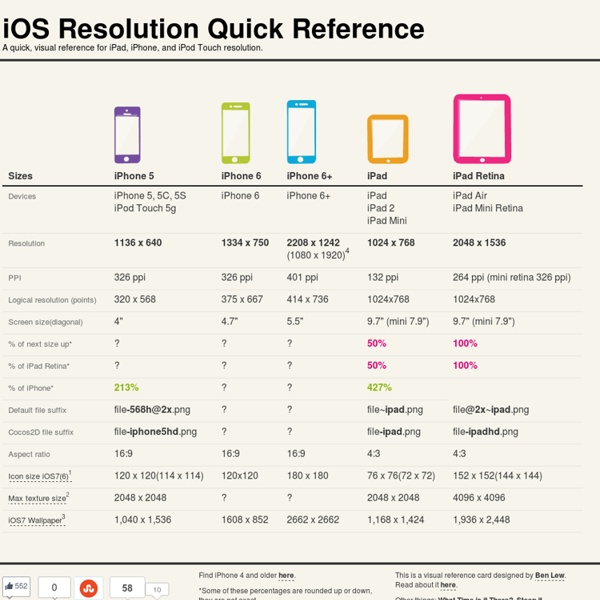
Les tailles d'écrans et le responsive design 175 millions de phablettes (smartphone de plus de 5,5 pouces) devraient s’écouler dans le monde cette année 2014 (+210% sur un an). Les ventes de grands smartphones devraient ainsi dépasser celles des tablettes dès 2015. Dès 2018, elles devraient prendre le dessus sur les smartphones. Aujourd’hui au laboratoire : Les différentes résolutions et écrans que les Internautes peuvent rencontrer. 320px : Petits téléphones d’écran de résolution 480x320 en mode portrait. 480px : Smartphones moyens, ou petits téléphones en orientation paysage. 600px : Tablettes en portrait, iPad, e-readers, téléphone de résolution 800x480 en orientation paysage. 801px : tablette, iPad en orientation paysage, laptops de basse résolution. 1025px : Grandes tablettes en orientation paysage, laptops et desktops courants. 1281px : laptops et desktops de haute résolution. Pour un travail avec une grille de 960 pixels de large :
Create a Flat Countdown Timer in Photoshop - iOS 7 Inspired In this tutorial I am going to show you how to create a simple countdown timer, iOS 7 inspired! Flat design is dominating the web and I’m sure you all know that Apple created a new look and feel for their OS. I’m really happy seeing the minimal look of the user interface and I know Apple fans are eagerly waiting to test iOS7 this fall. So, while we’re waiting I’m going to show you some great wallpapers and we’ll create a countdown timer in Photoshop. The look and the colour scheme will be based on the iOS 7 wallpapers that have been released. Video Tutorial And in case you prefer to do it the rough way, here’s a text and screenshot combo tutorial for you! Step 1 Create a new document in Photoshop 730px by 410px and then let’s create guidelines by just dragging some guides from the Ruler Tool and placing them at the center of the canvas horizontally and vertically. Step 2 Using the Ellipse Tool (U) create a 120px by 120px shape and place it in the center. Step 3 Step 4 Step 5 Step 6 Step 7 Step 8
Circular Progress Bar - jQuery plugin jQuery circular progress bar demo create destroy play stop reset speed 10 speed 23.89 speed 50 speed 100 PI Step 0.05 PI Step 0.10 PI Step 0.15 show percents hide percents limit 20 limit 50 limit 100 limit 120 go to 20 go to 50 go to 100 skin #1 skin #2 skin #3 Skin design by Orman Clark, Coded by Artur Tomaszewski download documentation By default progressbar is located in the center of target element. Functions TODO & Changelog License Plugin is distributed undet MIT license.