Stepto & Son Graphic Design and Website Development Agency
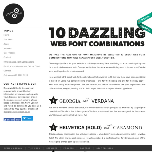
We take the pain out of font matching by selecting 10 great web font combinations that will always work well together. Choosing a typeface for your website is not always an easy task, and fixing on a successful pairing can be a particularly arduous task. One general rule of thumb when combining fonts is to use a serif and a sans serif together, to create contrast. Here we look at 10 great web font combinations that never fail to fit; the way they have been combined is based on using two complementing typefaces – one for the heading and one for the body copy – with both being interchangeable. Georgia & VerdanaFor those who stick to web standards, this combination is always going to be a winner. Please copy and paste the code above. Below you can find three examples of great typographical brand identities.
dafont.com
Daily Drop Cap
Type Glossary - Typography Deconstructed
Ampersand A stylized character of the Latin et used to represent the word and. Definition: The typographic symbol used to designate the word and (& ) is the Latin symbol for et which means and. The name, ampersand , is believed to be derived from the phrase “and per se and.” Aperture The partially enclosed, somewhat rounded negative space in some characters. Apex A point at the top of a character where two strokes meet. Arc of Stem A curved stroke that is continuous with a straight stem. Arm A horizontal or upward, sloping stroke that does not connect to a stroke or stem on one or both ends. Ascender An upward vertical stroke found on the part of lowercase letters that extends above the typeface’s x-height. Ascender Line The invisible line marking the height of ascenders in a font. Ascent Line The invisible line marking the farthest distance between the baseline and the top of the glyph. Axis An imaginary line drawn from top to bottom of a glyph bisecting the upper and lower strokes is the axis.
Related:
Related: