
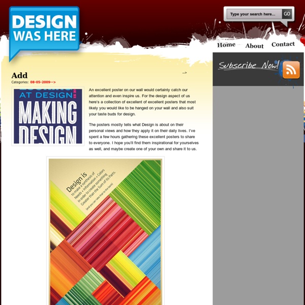
The Basics of Typography Typography is a central component of design. It gives us an understanding of the heritage behind our craft. It’s one of the primary ways we, as a society, pass on information to others. Imagine a website, a magazine or even TV without text. Typography is a subject that raises passions and it can become a consuming obsession. What Is Typography? From a descriptive and simplistic point-of-view, typography is the arrangement of type. For me, how typography is used in a design is deeply rooted in its overall theme, tone and message. Your choice of typefaces and your technique of setting type give your composition its character, pace and style. A simple illustration of how influential typography can be is to look at the same text with different typefaces. It’s this level of integration with a design theme that makes typography one of the most powerful tools in the designer’s toolbox. Next, let’s go through a few basic typography terms and concepts. Lines Here are the five lines: Leading Tracking
Adobe Illustrator 101: 10 Things You Should Know About Ai Adobe Illustrator is one of my absolute favorite applications. For vector work, Illustrator simply can’t be beat and you should really set your reservations aside and give it a shot. Even if you’re commonly creating raster graphics for the web, there are a number of things that Illustrator simply does better than Photoshop so getting to know both apps and their strengths/weaknesses is a must. Today’s article is for the extreme Illustrator newbies. You have the Adobe Creative Suite installed on your computer and have seen Illustrator sitting there quietly begging to be played with but you’ve never jumped in. A Photoshop-Centric Discussion In writing this article, one of the major assumptions that I’m making is that you’re fairly familiar with Photoshop. As I go through the tips below, a lot of the explanation will be based on how working in Illustrator is different than Photoshop. Vector Graphics Are Magic But You Already Knew That What’s All This Crap on My Screen? The Bounding Box Zooming
CUPtopia | a portable manifesto… 30 Exceptional CSS Navigation Techniques We’ve seen innovative ways in which designers and developers have used CSS to innovate upon its shortcomings. Here, you’ll find some of the best ways to use CSS for your website navigation. You’ll find a variety of techniques that truly showcase the capabilities of CSS. In this article, you will find a collection of excellent navigation techniques that use the CSS to provide users with an impressive interface. 1. This another great CSS menu Stu Nicholls that’s unique – hovering over a menu item reveals a submenu. 2. View Demo In this CSS technique, you’ll learn to create a vertically-oriented CSS hover menu that reveals a submenu when a menu item is hovered on. 3. View Demo Matte is a simple CSS menu with rounded corners using two small images only from 13styles. 4. View Demo This CSS technique shows you a method from creating a menu that blurs sibling menu items when you hover over an item. 5. View Demo 6. View Demo 7. View Demo This stylish navigation menu technique uses a CSS sprite. 8. 9.
50 Stylish Navigation Menus for Design Inspiration Six Revisions Skip site navigation 50 Stylish Navigation Menus for Design Inspiration Apr 10 2009 by Jacob Gube | 39 Comments A site’s navigation menu is one of the most prominent things that users see when they first visit. There are many ways to design a navigation menu – and since almost all websites have some form of navigation – designers have to push their creative limits to build one that’s remarkable and outstanding. In this article, you’ll find a showcase of beautiful, creative, and stylish navigation menus for your inspiration. 1. netdreams.co.uk 2. 3. 4. 5. 6. 7. 8. 9. 10. 11. 12. 13. 15. 16. rzepak.pure.pl 17. 18. 19. 20. 21. 22. 23. 24. 25. 26. 27. 28. 29. 30. 31. 32. 33. 34. 35. csharpdesign.co.uk 36. 37. okb 38. 39. 40. 41. 42. 43. 44. toby-powell.co.uk 45. 46. 47. 48. 49. 50. Related content 39 Comments Alex April 10th, 2009 Here is another one: (top navigation) Kayla April 10th, 2009 Very cool menus. Jamiel Sharief April 10th, 2009 Nice collection. David Caroline
Signs of Art Graphis, the pioneering Swiss design magazine founded by Walter Herdeg (1908-1995), published hundreds of the finest covers of any design magazine. Designers, illustrators and artists of all kinds were given a relative free hand under the watchful eyes of Herr Herdeg. It is difficult to describe the joy I, for one, felt when a new bimonthly issue came through the mail in the familiar cardboard box. Most cover images were independent of any text, although most were done by someone featured inside the magazine. These were usually the most difficult. (Cover artists from top to bottom: George Giusti (1955), Lee Mason (1974), Ronald Searle (1967), Walter Greider (1966)Bertram A.
The Medium Is The Message Advertisement Since the early days of communication, humanity has been captivated by the methods it uses to convey and preserve information. How we communicate with each other defines who we are and constitutes so much of what makes a culture and an individual unique. Over the centuries, we have seen media evolve across a wide array of channels, from print to radio to television to the Internet. Each one of these channels, or media, has its own unique characteristics, much like the people who use them. The medium through which we choose to communicate matters. When it comes to understanding these various media, one of the best to learn from is Marshall McLuhan. “The medium is the message” as a phrase sums up a much deeper communication theory, which is that the medium through which we choose to communicate holds as much, if not more, value than the message itself. On The Surface McLuhan’s theory has certainly not been neglected or forgotten. Perception of a medium plays a vital role. (al)
Why designers should seek chaos and complexity first - Activeside of design verybody seem to agree on the fact that the World is complex and is getting even more complex everyday. I wouldn't discuss that, it's probably true. It seems that everyone also agrees on the fact that Simple is better than Complex and that we need simplicity in the products (material or immaterial) and services we use everyday. Probably also true. Now, when the subject touches to Design, everyone seems to have a strong opinion too on how to obtain Simplicity: just by avoiding Complexity, right? "Ideas are cheap and plentiful" Linus Paulin (1901-1994), awarded Nobel Prizes in Chemistry and Peace and one of the greatest scientists of the 20th century, used to say that "the best way to get a good idea is to get a lot of ideas". "Ideas are cheap and plentiful. In the field of Design, ideas is the raw material you play with before you start working seriously. From low to high resolution From order emerges chaos… First, the automata rule #30 develops itself as follow: Simplicity needs complexity
Magazine columns and their layout options | Magazine Designing Columns are essential tools to standardize your layout. They will help you in getting order and structure of your magazine, but do resist to imprison your thinking into standard format because rigidity dulls the creativity. To avoid that trap you can play with column width and shapes. In this article we will talk more about columns as a design element and in another separated article we will talk about the width of the columns and the number of characters that would be ideal for such columns. But let’s go back to columns as design element and take a look at several typical column sizes. The unwritten rule is to design more important stories on fewer columns. Less important stories like news sections can be laid out in 4 or more columns. Depending on your design of various parts of the magazine your columns can vary in width. One column Used very rarely. You can make it more elegant and interesting if you make outer margin much wider, thus making column much narrower. Two columns