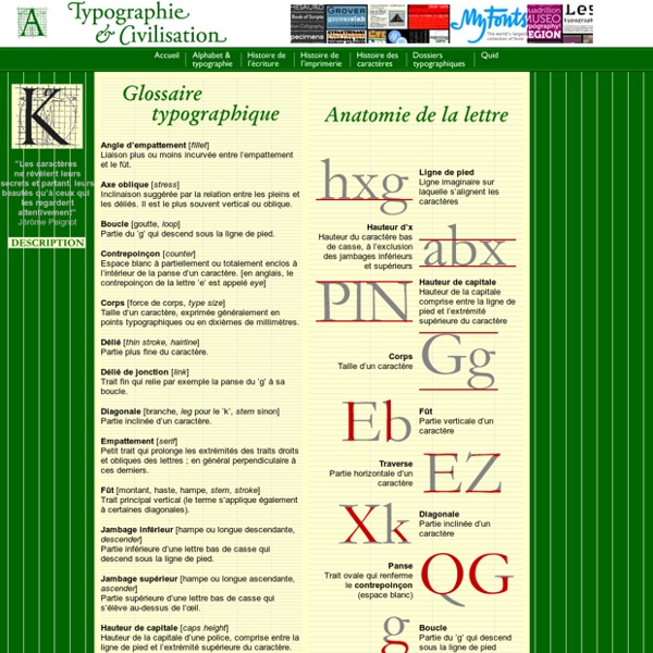
dafont.com
Code typo
• La typo de A à Z Quelques mots ou expressions souvent rencontrés dans la profession réunis ici sous forme d’abécédaire. Choisissez votre rubrique par ordre alphabétique : • Les erreurs les plus fréquentes Doit-on accentuer les capitales ? • Les règles typo Au fur et à mesure de leur rédaction, nous vous proposons les règles typographiques les plus courantes.
House Industries
Spencerian 2 fonts, Drop Shadow, $75 Worthe Numerals 2 fonts, Numerals, Drop Shadow, $49 Smidgen 2 fonts, Regular & Drop Shadow, Bold yet Friendly, only $75 Eames 26 fonts, 18-style family, special figures, frames, ornaments Neutraface Slab 14 fonts, Neutraface goes Egyptian, $249 Neutraface 38 fonts, Based on Richard Neutra's timeless style, $275 Neutraface 2 19 fonts, Classic style, $275 Studio Lettering 6 fonts, extensive OpenType features, $160 Girard 17 fonts, extensive OpenType features, $249 Showcard Stunt 1 font, OpenType character substitution, $50 Blaktur One font, historical forms, $50 Burbank 20 fonts, OpenType features, starting at $199 United 105 fonts, 3 styles, 7 weights, 5 widths, starting at $160 Luxury 6 fonts, advanced OpenType features, starting at $149 Ed Benguiat 5 fonts, special interlocking font, $160 Paperback 15 fonts, 3 size masters, starting at $150 Chalet 27 fonts, ingeniously versatile, starting at $100 Las Vegas 4 fonts, multi-level patterns, special soundtrack, $140 Holiday Movements Simian
Special Characters | reference chart of ampersand symbols
Path // → → SPECIAL CHARACTERS There is a huge list of extra characters and symbols in existence that couldn’t be crammed onto a keyboard, so HTML allows you to use them through a series of special codes commonly known as “ampersand characters” or “character entities.” You can create these characters by starting with an ampersand (&), followed by a few letters, and ending with a semicolon (;). For instance, the entity © creates a copyright symbol ©. This page was last updated on 2012-08-21 Character Sets Every document you create should have a character set specified for it. Most pages that are written in any form of English will use a character set called iso-8859-1. This means you’ll be able to use any character that’s in UTF-8 by simply typing it into the document. Markup-related Symbols You’ll probably find the characters >, < and & on your keyboard, but if you’re using them as part of your page’s text you should always encode them as their entity counterparts. Pretty Punctuation
Comic Sans Criminal
TYPOLOVER & RGB-MIX PLAYGROUND // Typography
Typolover is a website by the french photo / graphic designer Michael Levy 1994 - 2009 all rights reserved © +++ TYPOGRAPHY Section +++ "Si l'on peut parler de fond & de forme d'un texte, comme on parle d'âme et/ou beauté d'une femme, la typographie en est la petite robe noire qui se doit d'être parfaite". "Les caractères ne révèlent leurs secrets & leur beautés qu'à ceux qui les regardent attentivement". idpure N°4V2.4 Ceci est un roadbook typographique, un collage d'idées, de mots, de lettres, sans queue ni tête, sans tambour ni trompette. Petit Prince acheté à des religieuses orthodoxes, dans les montagnes géorgiennes, près d'une source sacrée dans laquelle vont se bénir les nouveaux mariés. 2006. Collage New-York / Chicago. Je ne sais plus quel jour de 1997 je me trouva nez à nez avec mon idole : Mr Robert Smith himself. Mur mémorial à Moscou Mur mémorial à NYC Signature de Faso, mon ancien prof de typographie, devenu ami indispensable. Signature de MASSIN Signature de WIM CROUWEL
72 Creative And Smart Typographic Logo Inspiration | Graphic and
If we are starting to go crazy in typography style, then let’s continue with typographic and smart logo designs, shall we? Here you’ll find 72 beautiful logos created by talented designers. This showcase just proves the point how much can one/two words, icons tell using correctly white, negative, positive spacing, colors, accents creating interesting associations. Explore and get creative as I did! 1. Who killed letter i? 2. Really smart logo! 3. Typeface: word-play: face from the type and letter T. 4. Just loving this logo, great stylization! 5. Very popular logo already, but thought I still share it in typography section. Author’s comment: “Logo was made for a bold creative team consisting of two people. 6. Just smart logo, which rings the bell! 7. Author’s comment: “Gizzy bear is how a little kid might say grizzly bear. Just genius! 8. Simple, artistic and very clever – all in one place! 9. Very good logo – yes, sticky! 10. Oh, snap – logo with very clear message. 11. 12. 13. 14. 15. 16. 17.
FontSpace
FontShop | Find, Try, Download Fonts
â Systems for pagesâ - Blog - John D. Berry dot com
Books are digital. This is not, strictly speaking, true; but it’s about to be, with a few honorable exceptions. Already today, pretty much all commercial books are produced digitally, although the end product is a physical one: ink printed on paper, then bound and marketed and sold. Already, the selling may be done as often online as in a bookstore. But that will change. So what’s needed? Last question first. But e-books present a challenge that printed books do not: the page isn’t fixed and final. For a real system of flexible layout in e-books and e-periodicals that might be viewed on any number of different screens at different times, what’s needed is a rules-based system of adaptive layout. The requirements for this are easy to describe – maybe not so easy to implement. A constraints-based system of adaptive layout The interesting problems always come when you have two requirements that can’t both be met at the same time. OpenType layout support. Grid-based layout. Media query.
Free Font Lists - Befonts - Download free fonts
La typographie dans le graphisme. sur Geekeries.fr | Découvrir W
La typographie, qui commença en 1450 avec l’invention de Gutenberg, nous permet de nos jours à communiquer plus facilement et plus esthétiquement. Nous devons soigner les différents aspects et mettre en valeur les informations essentielles de nos sites/blog ou encore pour nos documents imprimés. Mais, tout le monde ne connaît pas les règles de bases de la typographie, et nous voyons des fois, pour ne pas dire tout le temps, des coquilles très perturbante, que ce soit chez les professionnels (même si cela ce fait de plus en plus rare) ou les novices. Cet article a pour but, d’aider bien évidemment les novices ou toutes personnes intéressées par la typographie générale. - La romain ou « régular » sur les ordinateurs, est la première typographie utilisée en 1450. - Les capitales sont les premières lettres conçus par les romains. - Les bas de casse sont les caractères appelés « minuscules ». - Les graisses sont les épaisseurs ajoutées aux caractères (gras).