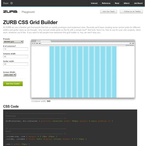
CSS Grid Builder - ZURB Playground - ZURB.com
CSS Code Product Design Training from the Experts at ZURB This is a default modal in all its glory, but any of the styles here can easily be changed in the CSS. This is just a simple modal with the default styles, but any type of content can live in here. Your ZURB ID explained You’ll use your ZURB ID to log in to all of ZURB’s properties — University, Products and Foundation. University Product design resources, courses and training. Design Apps Prototype, iterate and collect feedback on your products. Foundation The most advanced front-end framework in the world.
css Zen Garden: The Beauty in CSS Design
regular expressions for efficient web development
Validate an URL Is a particular url valid? The following regexp will let you know. /^(https?:\/\/)?([\da-z\.-]+)\. Source: Validate US phone number This regexp will verify that a US phone number is valid. /^(\+\d)*\s*(\(\d{3}\)\s*)*\d{3}(-{0,1}|\s{0,1})\d{2}(-{0,1}|\s{0,1})\d{2}$/ Source: Test if a password is strong Weak passwords are one of the quickest ways to get hacked. Passwords will contain at least (1) upper case letterPasswords will contain at least (1) lower case letterPasswords will contain at least (1) number or special characterPasswords will contain at least (8) characters in lengthPassword maximum length should not be arbitrarily limited (? Source: Get code within <? If for some reason you need to grab all the code contained within the <? <\? Source: Match tel: urls Validate US zip code \s(?
WORDOID - Creative Naming Service
Common Queries Tree
Common MySQL Queries Basic aggregation Last updated 05 Jan 2013 Aggregate across columns Last updated 09 Sep 2009 Aggregates across multiple joins Given a parent table and two child tables, a query which sums values in both child tables, grouping on a parent table column, returns sums that are exactly twice as large as they should be. CREATE TABLE packageCredit ( packageCreditID INT, packageCreditItemID INT, Last updated 22 Feb 2013 Aggregates excluding leaders You have a table of grouped ranks ... Last updated 21 May 2009 Aggregates of specified size Find the values of a table column c1 for which there are a specified number of listed values in another column c2. All X for which all Y are Z You have an election database with tables for candidates, parties and districts. CREATE TABLE districts ( district char(10) DEFAULT NULL ) ENGINE=MyISAM DEFAULT CHARSET=latin1; INSERT INTO districts VALUES ('Essex'),('Malton'),('Riverdale'),('Guelph'),('Halton'); All X meeting multi-row conditions 1. 2. Median
A Smarter Planet
Create Ringtone Online, Convert YouTube To Mp3, Free Ringtones, Cut Mp3 - Edit Music Online!
PS3Cluster Guide: By The Cluster Workshop
Kiosk of Piracy
Vintage Ad Browser
Video Galleries : Zero Punctuation
Zero Punctuation is The Escapist's groundbreaking video review series starring Ben "Yahtzee" Croshaw. Every Wednesday Zero Punctuation picks apart the games so you don't have to. Called "hilariously cutting ... first legitimate breakout hit from the gaming community in recent memory" by Boing Boing, see why gamers love it and developers fear it. South Park: The Stick of Truth - Yes, There Really Were Crying Koalas
Related:
Related:
