
When Data Tell Stories Last April, the International Consortium of Investigative Journalists (ICIJ) revealed one of the greatest data leaks obtained and analysed to date by any media outlet. “Offshore Leaks” is a vast multimedia report that exposes the networks of businesses, politicians, fundraisers and celebrities from all over the world that use companies and trusts in offshore tax havens. Through the use of maps, videos and infographics, readers are able to understand the web of connections and their millionaire money transactions over the course of the years. However, to be able to present this macro-project that exposes the tax havens, the ICIJ had 86 journalists from 46 countries working for a year and a half, managing a total of 260 gigabytes of data. Network of contacts in the world of offshore tax havens. What is data journalism? Taking the world by storm A chance to dive into data The CCCB will be the venue for the first of the events. The text of this article is licensed under
Stefanie Posavec “On the Map” *notcot in design , 23:52 NOTCOT Note: Here is another post continuing on Justine’s (aka RUGenius’) adventures in Sheffield, it took a bit of researching, but she’s come back to me with some MIND BLOWING infographics from Stephanie Posavec, you definitely need to click on the images after the jump to see them in full resolution where you can see what every curve and color represents. I kid you not, you will not see Kerouac’s On The Road the same again… During my recent trip up to Sheffield, I was fortunate enough to be staying next door to the Millennium Galleries, who hosted a portion of the citywide Art Sheffield event. Among the exhibits, was one called “On the Map” (more info here as well), which uses craft and design to understand the symbolic and representative nature of maps. However, the works that caught my eyes was that of Stefanie Posavec. High-res images below not to be missed! Here are pics in book context: Tags: art - books - travel
List of genealogy databases This is a list of genealogy databases and online resources that are not specifically restricted to a particular place, family set, or time period in their content. Comparison of notable databases for uploading family trees[edit] Some of these also have social networking features. References[edit] Données publiques sur les réseaux sociaux Données publiques sur les réseaux sociaux Les données sont précieuses. L’accès aux données a le pouvoir d’apporter des réponses et de provoquer des réactions. Néanmoins, la mauvaise gestion des données peut emprisonner les faits dans une structure opaque qui ne communique rien. Des données qui ne permettent pas d’alimenter le débat ou d’offrir une meilleure compréhension du contexte ne présentent qu’un intérêt limité pour le public. Le Nigéria a rétabli un régime démocratique en 1999 après des années de dictature militaire. L'application BudgIT cut (BudgIT Nigeria) Pour bien communiquer avec nos utilisateurs, nous devons comprendre ce qu’ils veulent. Quand vous voulez visualiser des données, il est important de comprendre le niveau de qualification de vos utilisateurs. Les jauges montrant l'engagement des utilisateurs sur l'application BudgIT cut (BudgIT Nigeria) Utilisateurs occasionnels Utilisateurs actifs Consommateurs de données Rester local
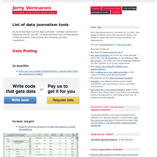
Matière Primaire Free Public Records | Search the Original Directory Worldwide Une expérience de data journalisme est lancée à Bordeaux Une expérimentation de data journalisme, ou journalisme de données, vient d’être lancée au sein de l’ Institut de journalisme de Bordeaux Aquitaine . L’opération, conçue et coordonnée par l’IJBA et AEC, doit durer trois mois. Elle est baptisée « Data Journalisme Lab ». L’idée, créer un laboratoire de recherche et développement autour d’une forme très innovante de traitement et de diffusion de l’information : la data-visualisation, ou visualisation de données. Le journalisme de données, discipline ambitieuse et très innovante, requiert une bonne dose de rigueur, un peu de temps devant soi mais, surtout, de multiples compétences. Le « Data Journalisme Lab » que viennent de lancer l’ IJBA et AEC à Bordeaux, associe aux côtés des 36 étudiants journalistes en Master 1, dans une dynamique de travail collaboratif, 4 étudiants graphistes et 6 étudiants développeurs. L’expérimentation fait l’objet d’un Work in progress : Du data journalisme à la data visualisation
David McCandless TaskForces/CommunityProjects/LinkingOpenData/DataSets - W3C Wiki SWEO Community Project: Linking Open Data on the Semantic Web This page collects RDF data sets that are part of the emerging Web of Linked Data. Please note: This page is outdated For keeping the LOD cloud diagram up to date, the Linking Open Data community effort has started to collect meta-information about Linked datasets on CKAN, a registry of open data and content packages provided by the Open Knowledge Foundation. The meta-information from CKAN (and not from this page) is used to draw the LOD cloud diagram and to maintain statistics about the size of the Web of Linked Data. The list of Linked Dataset for which we have already collected meta-information on CKAN is found here: CKAN LOD Group Basic statistics about these datasets are provided at: A guide on how to describe your dataset on CKAN is found here: LOD CKAN Guidlines Thus, if you are publishing a Linked Dataset, please add meta-information about your dataset to CKAN. Historic Version of this Page How big is this Web of Linked Data?
Pourquoi le data-journalisme, c’est l’avenir en marche | Nouvelle formule Elle s’appelle Caroline Goulard, elle est encore étudiante (en 5e année, tout de même), elle est en passe de devenir LA spécialiste française du journalisme de bases de données, le databeyyyse djournaliseume en bon franglais, qui commence à faire florès ailleurs, entendre aux Etats-Unis et en Grande Bretagne, comme d’habitude, mais pas chez nous. Son blog est une mine de renseignements – et de (plaisants) fantasmes éditoriaux - pour ceux qui, comme Sophie Gohier, mon éditrice préférée, ou votre dévoué serviteur pensent que l’info en ligne, c’est pas seulement (surtout pas?) du batonnage de dépêches, des Web reportages et de la sous-télévision. Caroline Goulard a deux actualités: - Un article limpide sur le database journalism, confié à Owni. Nos ambitions, donc. Ca fait quelques mois, voire quelques années, qu’on y pense, aux bases de données. Alors, on cherche la martingale, comme dirait Baroin, la recette miracle. Parmi les ingrédients, il y a aura Pierre Falga, j’aimerais bien.
Most influential tweets 2012-05 #dataviz . Récap mensuel des tweets les plus influents sur le domaine de la data visualization : En Mai 4 296 tweets mentionnant dataviz ont été publiés sur Twitter (en légère progression par rapport au mois d'Avril +7%). . Les cinq tweets les plus influents du mois d'avril sur le hashtag #dataviz ont été publiés par les comptes Twitter : @GOOD, @avinash, @fastcompany, @visually et @WSJGraphics (récupérés avec topsy analytics) @Good - Association of individuals, businesses, and nonprofits powering what works.Tweet: What can America learn from the world’s most successful #education systems? @avinash : Author, Web Analytics 2.0 & Web AnalyticsTweet: I'm going overboard but this is the single greatest representation of data ever! @fastcompany - Official Twitter feed for the Fast Company business media brandTweet: Explore The Galaxy Using The Actual ‘Minority Report’ Interface Amazing #dataviz via @FastCoDesign .