We strengthen our rights by exercising them. – Stephen's Lighthouse
OK, here we are at the start of another academic year and September – and sadly at the intersection of the anniversary of 9/11, a small number of people advocating burning the Qur’an/Koran and ALA’s banned books week focused on the freedom to read. I usually avoid politics on this blog and I am still doing that. This isn’t politics. This is basic human rights. We enjoy many rights and privileges in North America.
PT디자인 Tips(2)
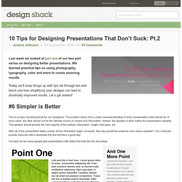
Powerpoint has produced more bad design in its day that perhaps any other digital tool in history with the possible exception of Microsoft paint. In this post we’re going to address the epidemic of bad presentation design with ten super practical tips for designer better looking and more professional presentations. Along the way we’ll see a number of awesome slide designs from Note & Point along with some custom examples built by yours truly.
A Detailed Look into Popular Styles in Web Design
Just as there are a variety of designers out there, there are respectfully just as many web design styles. Some are good, some are bad - many are just experimental. However, there are those few styles in web design that we see all the time. They are the design styles that work, and that we've grown to know best. Sometimes popular web design styles can deter us since we love to create something original. As designers we like to see variety, but of course, our clients like to mimic and see consistency.
Brochure
Business marketing is one of the most tedious yet rewarding investments that every business owner would be willing to go for. As long as you can easily see the results of your campaign, you should not worry about the effort and budget that you’ll be placing on promotions. All you have to do is find out what materials to use and how to effectively design these like brochures. Brochures have been used for the past several years to help people share their message and convince buyers to try out the products or services being offered.
The Next 5 Years in Social Media
In honor of Mashable's five-year anniversary, this series is supported by IDG. Matt Yorke, President of IDG's Strategic Marketing Services explains why now is the time for marketers to conduct social experiments. Read more here. Over the last five years, social media has evolved from a handful of communities that existed solely in a web browser to a multi-billion dollar industry that’s quickly expanding to mobile devices, driving major changes in content consumption habits and providing users with an identity and social graph that follows them across the web. With that framework in place, the next five years are going to see even more dramatic change.
12 Rules for New Administrators - Run Your Campus
By Michael J. Bugeja During the summer, two of my best friends and former colleagues asked me for guidance about making the transition from professor to administrator.
Drexel Freshmen Get Help From 'Personal Librarians' - Wired Campus
With students spending more research time in front of the screen and less in the stacks, librarians at Drexel University are trying a fresh approach to helping new freshmen navigate their resources: “personal librarians.” The Personal Librarian Program assigns each of the university’s 2,750 entering freshmen to a librarian. The librarians get in touch with their students before they arrive via snail mail—sending a signed letter and business card—and later meet with students in person for a crash course on the library’s offerings. Each of the approximately 20 librarians trained for the program will also work with their students throughout the semester to encourage them to use the resources and help them figure out how to do so. “Our role is to help coach our students and help them learn the tools and skills needed to become very savvy,” said Danuta A.
Use the 80-20 Rule to Increase Your Website’s Effectiveness
By Oleg Mokhov Want to increase your website’s conversion rate? Want more subscribers, opt-ins, members, customers? How about doing less work while you’re at it?
10 Usability Tips Based on Research Studies
We hear plenty usability tips and techniques from an incalculable number of sources. Many of the ones we take seriously have sound logic, but it’s even more validating when we find actual data and reports to back up their theories and conjectures. This article discusses usability findings of research results such as eye-tracking studies, reports, analytics, and usability surveys pertaining to website usability and improvements. You’ll discover that many of these usability tips will be common sense but are further supported with numbers; however, some might surprise you and change your outlook on your current design processes. 1.
Texas Attorney General Investigating Google & Antitrust Issues
Texas Attorney General Greg Abbott is conducting an investigation into Google’s business practices as they relate to search listings, in particular whether Google is manipulating its paid and editorial results in a way that violates antitrust laws. We received a tip about the investigation this week, and Google confirmed today that an investigation started in July. The company plans to post to its blog later today about the matter. According to Google, the Texas Attorney General’s office is seeking more information about allegations that have been levied against Google by: UK-based FoundemNew York-based SourceTool & TradeCometOhio-based myTriggers