
Responsive Web Design just got Easier with the Responsive Grid System Golden Grid System GGS was my next step after Less Framework. Instead of a fixed-width grid, it used a fully fluid-width one, without even a maximum width. The resources it was published with are still available on GitHub. The idea was to take a 18-column grid, use the outermost columns as margins, and use the remaining 16 to lay elements out. While the grid's columns were fluid — proportional to the screen's width — the gutters (spaces between the columns) were proportional to the font-size being used. GGS also contained a set of typographic presets, strictly to a baseline grid. Correctly setting all of these measurements is difficult, of course. When published, GGS gained a lot of attention, as the web design community was searching ways to work with fluid-width grids, which have always been troublesome, running counter to many graphic design principles. Many people trying to use GGS were also confused by the lack of predefined code for working with the grid.
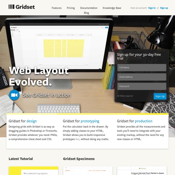
Columnal | A responsive CSS grid system helping desktop and mobile browsers play nicely together. The State Of Responsive Web Design Skeleton: Beautiful Boilerplate for Responsive, Mobile-Friendly Development 12 Helpful Tools for Responsive Web Design Creating a responsive web design goes way beyond arranging things in a way that won’t compromise the look of your website in different screen sizes. Even tough we talk a lot about responsive web design, we are all figuring out the best way to go about developing a responsive site. One of the best ways to approach the issue is checking out tools that may help you with the task. However, there are a lot of tools out there, and it can be difficult to sort through them all. Responsive Web Design Sketch Sheets Adobe Edge Inspect Foundation RWD Calculator Responsive Layouts, Responsively Wireframed Adaptive Images Bootstrap Retina Images SimpleGrid The 1140px CSS Grid resizeMyBrowser The Responsinator The Responsinator helps website makers quickly get an indication of how their responsive site will look on the most popular devices. Some books on responsive web design: About the Author Henry Jones is a web developer, designer, and entrepreneur with over 14 years of experience. Related Posts 846 shares
Frameless Responsive Web Design: 50 Examples and Best Practices Source: Responsive web design term is related to the concept of developing a website design in a manner that helps the lay out to get changed according to the user’s computer screen resolution. More precisely, the concept allows for an advanced 4 column layout 1292 pixels wide, on a 1025 pixel width screen, that auto-simplifies into 2 columns. Also, it suitably fixes on the smartphone and computer tablet screen. This particular designing technique we call “responsive design”. Now you can test your website using the Responsive Design Tool. Responsive web designing is an entirely different designing version than traditional web designing, and developers (especially fresher) must know about the pros and cons of responsive web designing. Pages that include data tables pose a special challenge to the responsive web designer. Images in responsive web designs are called context-aware. Designmodo Designmodo has a very clean and clear design with a perfect responsive design interface. Simon Collison
Which Is Right for Me? 22 Responsive CSS Frameworks and Boilerplates Explained CSS frameworks have been around for years now, but the arrival of responsive design practices has rendered many of our old favorites useless. Fortunately, lots of really talented developers have jumped in to fill the gap with the next generation of CSS frameworks and boilerplates. There’s already a ton of these things floating around. Everyone has a list, but no one really walks you through how each framework and boilerplate differs from the next so that you can make an informed decision. Gumby The Gumby framework takes the 960 grid that we all cut our teeth on years ago and brings it into the modern age of web design with a responsive touch. The Semantic Grid System If you hate grid systems and their bloated, non-semantic markup, this one is for you. Gridless Gridless is a powerful boilerplate that uses mobile first responsive web design to adapt itself to the device’s width. Frameless Proportional Grids The Goldilocks Approach Twitter Bootstrap Twitter Bootstrap needs no introduction. Wirefy