
Vitsœ | Good design Back in the early 1980s, Dieter Rams was becoming increasingly concerned by the state of the world around him – “an impenetrable confusion of forms, colours and noises.” Aware that he was a significant contributor to that world, he asked himself an important question: is my design good design? As good design cannot be measured in a finite way he set about expressing the ten most important principles for what he considered was good design. (Sometimes they are referred as the ‘Ten commandments’.) Here they are. Good design is innovative The possibilities for innovation are not, by any means, exhausted. Good design makes a product useful A product is bought to be used. Good design is aesthetic The aesthetic quality of a product is integral to its usefulness because products we use every day affect our person and our well-being. Good design makes a product understandable It clarifies the product’s structure. Good design is unobtrusive Products fulfilling a purpose are like tools.
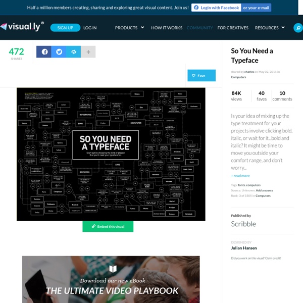
Typography in 7 Minutes: A PBS Micro-Documentary by Maria Popova Visibility, invisibility, and what the spirit of letters has to do with the meaning of text. On Monday, we featured 10 essential books on typography. Today, we turn to this fantastic short documentary on, you guessed it, typography from the excellent Off Book series by PBS Arts. In just 7 minutes, the film explores type — ubiquitous yet often unnoticed and misunderstood — through the work of some of today’s most iconic type designers and freshest voices, from Brain Pickings favorite Paula Scher to our friends at Hyperakt, masters of the infographic form, as well as legendary duo Jonathan Hoefler and Tobias Frere-Jones, and Pentagram prodigy Eddie Opara. Words have meaning and type has spirit, and the combination is spectacular.” ~ Paula Scher The most challenging part of working on an infographic is taking all the available data and deciding what is the most important bit of information that we need to communicate. Share on Tumblr
Matt Cutts et le remplacement des polices de caractères (Cufon, SIFR ou FLIR) Abondance > Actualités > Matt Cutts et le remplacement des polices de caractères (Cufon, SIFR ou FLIR) Matt Cutts répond dans une nouvelle vidéo (1'51", tee-shirt gris) à une question sur les systèmes de remplacement des polices de caractères sur le Web : Cufon, SIFR ou FLIR. La réponse est que Google n'a pas de problème majeur avec ce type de système. A partir du moment où le même contenu textuel est proposé à l'internaute et à Googlebot (et que la méthode utilisée ne sert pas à spammer le moteur en cachant du texte de mauvaise qualité), peu importe ensuite la forme qui est donnée à ce contenu et la méthode utilisée. Mais Matt indique également que le plus simple reste d'utiliser des polices de caractères largement utilisées par tous les internautes afin de ne pas avoir à utiliser des méthodes sophistiquées pour afficher vos textes...
25 Fantastic and Funny Photos Celebrate Photoshop's 25th Birthday Happy Birthday, Photoshop! Twenty-five years ago, this week, a little graphics editing program named Photoshop was born. Fast forward a few decades and now we're living in a world where surreal-looking images are all around us. "These 25 game changers will be from all parts of the world, and their art will represent their diverse cultures, life experiences, points of view and dreams…all brought to life with the help of Photoshop. You can read more about how to become one of their top 25, here. We're doing our own bit of celebrating over here by opening up our archives and pulling out some of the most fantastic and funny photos that were made using Photoshop. Here's a related article by the Washington Post: How 25 years of Photoshop changed the way we see reality. Above: Rosie Hardy Mario S. Catrin Welz-Stein Norvz Austria Rachel Hulin Gyyp Miguel P (PSHoudini) Michelle Karpman Sarolta Bán Heru Suryoko Erik Johansson Martín De Pasquale Caras Ionut Patrick Thorendahl Jason Lee Ulric Collette Yago Partal
Liste de couleurs Cet article peut contenir un travail inédit ou des déclarations non vérifiées (avril 2013). Vous pouvez aider en ajoutant des références ou en supprimant le contenu inédit. Si vous ne connaissez pas le sujet, laissez ce bandeau (vous pouvez alors contacter les auteurs).Si vous supprimez le contenu mis en cause (vous pouvez préalablement contacter les auteurs), argumentez précisément cette suppression dans la page de discussion (un manque de référence n'est pas un argument ; une recherche réelle de référence doit avoir été effectuée, être formellement documentée). Voir la page de discussion pour plus de détails. Cet article propose une liste de noms de couleur ayant leur article sur Wikipédia, avec le code informatique d'un exemple de la nuance correspondante. La couleur associée à un nom ou adjectif de couleur varie, parfois dans des proportions considérables. Inversement, une même couleur peut toujours se désigner par plusieurs noms différents. Rappels
20 Stunning Photoshop Tutorials Every Designer Needs Photoshop tutorials are everywhere, but good Photoshop tutorials can be hard to find. Designers often have trouble finding enough time to design the many projects that come across their desks, which means they are usually short on the time needed to search for excellent tutorials to improve their skills. The goal of the following collection is to provide a shortcut to twenty tutorials that are worth your time. Keep exploring, though, and let me know about others that you have enjoyed! This roundup starts with the beautiful interesting stuff. If the first tutorials are over your head, however, skip down to number sixteen for some basic photo editing techniques that should be in anyone’s bag of tricks. My first reaction to any image that I admire is: “I can’t make that.” The image-in-smoke effect is another effect that was out of my league. Why is such a simple effect put down as number three? I’ll be honest. Simple to do, impressive to look at. Grunge. Graffiti is art. This looks good.
Cultural Connectives: Understanding Arab Culture Through Typography by Maria Popova What typography has to do with cross-cultural understanding and linguistic minimalism. I’m obsessed with language, such a crucial key to both how we understand the world and how the world understands us. In today’s political and media climate, we frequently encounter the Middle East in the course of our daily media diets, but these portrayals tend to be limited, one-note and reductionist. We know precious little about Arab culture, with all its rich and layered multiplicity, and even less about its language. Both minimalist and illuminating, the book’s stunning pages map the rules of Arabic writing, grammar and pronunciation to English, using this typographic harmony as the vehicle for better understanding this ancient culture from a Western standpoint. The book jacket unfolds into a beautiful poster of a timeless quote by Gibran Khalil Gibran, rendered in Arabic: We shall never understand one another until we reduce the language to seven words.” ~ Gibran Khalil Gibran
PCB Circuit Wall Do you have lots of old electronic stuff and don't know what to do? Make a Circuit Wall. This is my first instructable, hope you like it. I had a storage room almost full with non working old computers, fax machines, monitors, TV's, photocopiers, printers, cellphones, cash registers, calculators, electronic typewriters, and all sort of electronic appliances from diferent years. Sometimes I salvage some the parts for my projects, but it was a lot. One option was to sell them all for $50 USD and get back my storage room for other purposes, but I couldn't just let go this precious stuff. So I decided to make a mural, with only PCB's from all this devices. Many of the PCB's have LED's so why not give them some power? Materials list: Lots of PCB's of various sizes with components 1/8" MDF boards (I used 36" x 24") Thin Copper wire AWG 22 Insulated copper wire Wall screws (Type of screw will depend on the type of wall to be mounted) 5V power supply (Cellphone charger, USB) Power switch (Optional) Tools:
15 Famous And Successful Logo Redesigns - What Has Been Improved? As we realize that we are now living in the Brand Era, where everything is branded and labelled we are more concern to companies we believe can help us, shops where we can get our supplies, or websites we trust to keep our data or information securely. This is how a company’s logo appeal as the first thing costumer will consider to trust or not. Among thousands of logos out there, some of them may look cheesy and cheap, and some visually give us confident. In order to grab our attention and get our trust, many companies even consider to re-brand/redesign their logo. As might be expected, the company will have to take the risk and be prepared of the pros and cons of this act. Below is a list, in no particular order of what I think to be famous and successful logo redesign from their old logo to the latest with explanations of what has been improved. 1. Old Logo History: New Logo – What has been improved: The iconic package and shield originally designed in 1961 by Paul Rand. 3. 5. 6. 7. 8.
10 Essential Books on Typography by Maria Popova What Arab culture has to do with industrial ideals, midcentury design and Victorian hand-lettering. Whether you’re a professional designer, recreational type-nerd, or casual lover of the fine letterform, typography is one of design’s most delightful frontiers, an odd medley of timeless traditions and timely evolution in the face of technological progress. In 1967, iconic typography pioneer Emil Ruder penned Typographie: A Manual of Design — a bold deviation from the conventions of his discipline and a visionary guide to the rules of his new typography. Images via Display In an age when we frequently encounter the Middle East in the course of our daily media diets, our true knowledge of the region remains impoverished amidst these often limited, one-note and reductionist portrayals. The book jacket unfolds into a beautiful poster of a timeless quote by Gibran Khalil Gibran, rendered in Arabic: Our full review, with more images, here. Did I love this book? Donating = Loving
47 (More) Brilliant Advertisements [High Quality Photos Last week we gave you 35 Brilliant Advertisements and the story blew up on the web. Hundreds of Repins on Pinterest, 78K shares on StumbleUpon, great action on Facebook & Twitter. All in all it was an awesome story so we decided to pull together 47 more brilliant advertisements for you to enjoy. From The Web Leave a comment comments Tags: brilliant ads
What if famous brands had regular fonts? RegulaBrands - Pixelonomics Jan62012 EmailEmail What if famous brands had regular fonts? Last week, I was having a skype call with a friend in Italy, who also happens to be a communication designer. Call it coincidence, fate or a mutual observation, we both have been asked the same question time and again, by our clients. The common ones are “all my office computers have Arial. “I thought logos are always Times New Roman” “My daughter loves Comic Sans!” To sum up all the versions of this typical query and deliver it into a simple sentence, it would be, “why can’t we use a standard font for our logo?” This is where I decided to do a simple exercise to recreate famous brands using regular fonts, to “RegulaBrands”. Please be honest and have a look at these 12 recreated brands. IBM recreated using Rockwell Bold Puma recreated using Helvetica Neue Condensed Black Vogue recreated using Times New Roman Coca-Cola recreated using Mistral Blackberry recreated using Arial Bold Italic Heineken recreated using Rockwell Bold
More Brilliant and Clever Advertisements Published on: Nov 06 2012 by Inspiration Here is a series of brilliant and clever advertisements … Clever Ads Billboard Powerful and Creative Ads Creative and Clever Billboard Ads More Creative Billboard Ads Brilliant Minimalist Print Ads Voici une série de publicités créatives et puissantes …