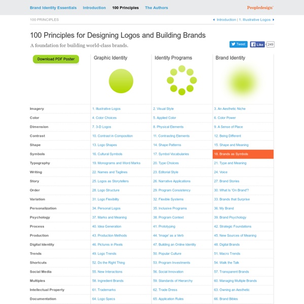


http://brand-identity-essentials.com/100-principles/
Related: Design • Tuto + InfosNinjawards – Print Design Trends 2014 Print Design Trends 2014 – Rad, Bad, and The Next Fad Past Ninjawards: Branding | Web | App Behold the power of print, and all the good it has done for the world. Don’t believe me? Designer's guide to DPI DPI or Dots Per Inch is a measure of spatial dot density initially used in print. It's the number of ink drops your printer can put in an inch . A smaller DPI yields a less-detailed image.
The Ultimate Logo Mock Up and Design Kit - only $24! If you're looking for a little logo inspiration, this Mighty Deal has your name on it! The ultimate Logo Mockup & Design Kit includes 70 retro logo templates, as well as 50+ photo-realistic logo mockups. These high-quality vector files, from Cruizine Design, are fully customizable and a snap to use. In no time at all, you can change up the color, size, shape or details and have yourself a professional logo, banner, sign or promotional piece for your latest project! And speaking of promotions, act now and you can save more than 75% off the regular price!
Adapting logos for small screens The logo in the header of this site is a raster PNG file (portable network graphics). I’m unsure if it’s worth changing it to a different file format, but it was interesting to read Jeremy Frank’s mini-series about using vector SVG instead (scalable vector graphics). Detail reduction from the Argento style guide (PDF) “SVGs are a perfect fit for resolution-independent logos. Combined with CSS media queries, a touch of JavaScript, and SVG injection, you have a robust solution for implementing responsive logos.” 33 Trendy Retro Vintage Insignias Bundle Volume 3 33 Trendy Retro Vintage Insignias Bundle Volume 3 This bundle includes: Trendy Retro Vintage Insignias Volume 7Trendy Retro Vintage Insignias Volume 8Trendy Retro Vintage Insignias Volume 9 A set of 33 Trendy Retro Vintage Insignias which can be used as your logos, labels, badges, watermark and other identity and branding materials. Use these insignias as your latest project identity and graphics – it’ll bring out strong branding presence and weathered impression of your brand and products. Features 33 premium retro vintage insignias in PSD 100% PSD vector shape.
6 Free High Resolution Colored Background Textures Subtle textures are always handy when you’re looking to add some detail to your design projects or to just produce a cool background for your mockups. This free set of textures features 6 high resolution files, each with subtle markings and a muted colour overlay to quickly and easily add a touch of grunge to your work. This free pack contains 6 2000x2400px 300ppi image files each made with a mix of fabric and paper textures and finished with a subtle colour overlay to produce a soft grunge background for your projects and mockups. Download the free colored textures pack 20mb Join the mailing list to have every new post hand delivered to your email inbox. Every subscriber gets a FREE bundle of 40+ icons, vectors, brushes & textures!
Comical Toilet Paper Stands Mr.T This toilet paper stand uses two rolls of bathroom rolls to complete its toy-like figure. Using a toilet paper roll’s shape, product and furniture design firm sooda-e have transformed them into barbells held up by the stout mr. T. Stephen Kroninger - HOW TO CREATE CARTOONS (complete) “According to Georges Sadoul, Frank Tashlin is a second-rank director has never done a remake of You Can’t Take It With You or The Awful Truth. According to me, my colleague errs in mistaking a closed door for an open one. In fifteen years’ time, people will realize that The Girl Can’t Help It served then — that is, today – as a fountain of youth from which the cinema now — that is, in the future — has drawn fresh inspiration ….To sum up, Frank Tashlin has not renovated the Hollywood comedy. He has done better.
50 Amazing Brochure Design Examples to Get Your Inspiration Out I’d like to come back to the basics of web design, I mean printing products. Do you know that printed brochures is an old and classic way to represent different information about a company and its products in order to attract more people. A business brochure is a key component of a marketing pack of any company. 50 Cool Text Logo Designs Advertisement A Logo is a very important graphical element that helps a trademark or commercial brand to be easily recognizable. Logos in the similar markets are mostly quite different from each other — they are different in their shapes, colors, fonts, and images. This makes them unique and stand out from the rest. 100 Artworks From the Top Digital Artists in the USA & Canada Last time we scoured South America (and, strangely, Mexico!) for the best Photoshop talent going around. This week we're turning to the USA and Canada to uncover 20 of the top digital artists on the continent.
40 Free Resources Every Designer Should Know Ever wondered where designers get their resources to help them succeed with a project? Here is a list of great resources including sites, PSD. files, actions, UI elements, mock ups et cetera and best of all, they are totally free and available for you to download. Just click on the title or image and it will bring you to the resource. Bookmark this post so that you can always look back at this great list that can help you succeed.