CSS3 Multi Column Layout Generator
Dignissim tristique a, auctor massa in nascetur lundium, nascetur mid integer dis et egestas rhoncus ac aliquet turpis integer velit, est dolor porttitor auctor, elementum porta sit tristique urna ac proin odio, habitasse ridiculus, non nunc nisi ac integer ultricies vel ac, phasellus ac? Scelerisque, ac sagittis sociis vel dictumst! Ac odio, dis placerat mus platea odio a in arcu! Urna et aliquam, a! Proin. Dolor lacus dolor adipiscing eros, et tincidunt, lundium aliquet tincidunt, porta, placerat urna nec!
Web development tutorials for HTML, XHTML, CSS, Javascript, PHP, and Java
Box-shadow, one of CSS3′s best new features
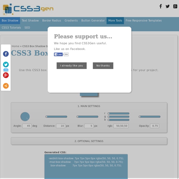
Home / CSS3 Previews / Box-shadow, one of CSS3’s best new features The box-shadow property allows designers to easily implement multiple drop shadows (outer or inner) on box elements, specifying values for color, size, blur and offset. Browser support is growing of late with Mozilla (Firefox), Webkit (Safari/Chrome/Konqueror), Opera and the IE9 Platform Preview all offering a decent implementation of the spec, although Mozilla and Webkit still require their respective -moz- and -webkit- prefixes (note Mozilla Firefox 4.0+ no longer requires the -moz- prefix). Here’s a basic example: Firefox, Safari/Chrome, Opera and IE9 users should see a grey fading shadow under this box. In theory, the code for this is straightforward: But for the moment, as with many other ‘experimental’ CSS3 properties, you’ll need to use the following prefixes to support Mozilla and Webkit: How it Works The Syntax: box-shadow: none | [ , ]* = inset? Examples: Creating a basic drop shadow Layering multiple shadows Example:
CSS3 Facebook Buttons
Buttons To create the default "button" add a class of uibutton to any appropriate element. To create the blue variant include an additional class confirm. <a class="uibutton" href="#">Button</a><button class="uibutton" type="submit">Button</button><input class="uibutton" type="submit" value="Button"> Larger buttons To create larger buttons inclue an additional class of large. Grouped buttons To created grouped buttons wrap them in an element, or use a list, given the class uibutton-group. <div class="uibutton-group"><a class="uibutton" href="#">Dashboard</a><a class="uibutton" href="#">Inbox</a><a class="uibutton" href="#">Account</a><a class="uibutton" href="#">Logout</a></div><ul class="uibutton-group"><li><a class="uibutton" href="#">Dashboard</a></li><li><a class="uibutton" href="#">Inbox</a></li><li><a class="uibutton" href="#">Account</a></li><li><a class="uibutton" href="#">Logout</a></li></ul> Mixed groups Buttons with icons <a class="uibutton icon add" href="#">New message</a>
Jquery Lightbox - jQuery Lightbox
Google+ Adds Content Recommendations For Mobile Websites
Website owners with a Google+ page will soon be able to add content recommendations to the user experience on their mobile websites. Google just announced the new feature today, which blends both Google+ activity (such as +1s and shares) and search authorship to determine the best related content to show to users as they browse mobile website content. Readers will see recommendations whether they’re signed in to a Google account or not. If they are signed in, though, they’ll see more personalized recommendations that involve content that was +1′s or shared by their people in their Google+ circles. The feature works for iOS and Android, for the Android browser, Chrome and Safari. There’s a video on that Google blog post that shows best how it works, but that video is inexplicably not on YouTube and doesn’t appear to be easily embeddable. You can see it in action now by reading any Forbes.com article on your mobile device; and here’s a screenshot showing the recommendation in action:
untitled
960 Grid System
