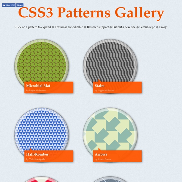
CSS3 Patterns Gallery
Browser support The patterns themselves should work on Firefox 3.6+, Chrome, Safari 5.1, Opera 11.10+ and IE10+. However, implementation limitations might cause some of them to not be displayed correctly even on those browsers (for example at the time of writing, Gecko is quite buggy with radial gradients). Also, this gallery won’t work in Firefox 3.6 and IE10, even though they support gradients, due to a JavaScript limitation. Submission guidelines If you have a new pattern to submit, please send a pull request. Does it present a new technique?
http://lea.verou.me/css3patterns/#
Related: Web 2.0
Background Pattern Designs And Resources For Websites
Patterns are a useful resource for website design. Filling the background with a full-blown image is no longer a useful solution today as the variety of devices and screen resolutions in the market make it difficult to adapt to them all, although it is true that the latest plugins and scripts offer solutions such as automatic image resizing. Patterns are similar to those images that are indefinitely repeated either horizontally or vertically. That makes a lot more sense today where usability is concerned, especially in responsive design.
Designing a Mobile App? Don't Make These 10 Mistakes
So you've already learned how to navigate the tricky world of cross-platform app design and worked through all of the common pitfalls of developing your app. You have a vision, some inspiration and maybe even a name that you know will be perfect. So ... now what? It's time to get down to the nitty-gritty and begin designing the structure, flow and features that will combine to form your finished mobile app. But actually performing these tasks isn't easy — there are tons of moving parts and project management aspects to keep in mind during development. Developing a functioning and enjoyable mobile app requires discipline and practicality.
Using PHP/MySQL with Google Maps - API de Google Maps
Ben Appleton, Google Geo TeamWith contributions from Lary Stucker, Maps API DeveloperApril 2007 This tutorial is intended for developers who are familiar with PHP/MySQL, and want to learn how to use Google Maps with a MySQL database. After completing this tutorial, you will have a Google Map based off a database of places. The map will differentiate between two types of places—restaurants and bars—by giving their markers distinguishing icons.
Aplicacion Movil: como crear botones en Web APP
Redirección 301: La Guía Definitiva
Una redirección 301 es un recurso imprescindible para mover, eliminar y consolidar páginas. Es por ello que a menudo se menciona como solución a problemas de SEO. Te dicen: “haz un redireccionamiento 301 y arreglado”, pero…
Multi-regional and multilingual sites - Webmaster Tools Help
If your site offers different content to users in different languages, countries, or regions, you can optimize Google Search results for your site. Background: A multilingual website is any website that offers content in more than one language. For example, a Canadian business with English and French versions of its site. Google Search tries to find pages that match the language of the searcher.
Instafeed.js - a simple Instagram javascript plugin
What is it? Instafeed.js is a dead-simple way to add Instagram photos to your website. No jQuery required, just plain 'ol javascript. (see ↑ there?)
Preparación para certificación en video - Google P...
Este examen abarca los conceptos básicos y avanzados de YouTube y la Red de Display de Google, lo que incluye temas como los formatos de anuncio, la segmentación y la generación de informes. 13:00 Mexico - Colombia / 15:00 Argentina / 20:00 España Martes 2 de Junio Diapositivas Material de estudio Fecha límite para obtener la certificación: martes 23 de junio del 2015
BBC Mundo - Noticias - ¿Qué hacer si alguien lo difama en internet?
Expertos le recomiendan a una víctima de difamación que guarde la evidencia que apoye su caso. Un comentario difamatorio que se publique en internet puede perjudicar seriamente a una persona o hacer colapsar un negocio. Para millones de personas, la web es una selva en la que reina la anarquía.
sortea ganadores de concursos, competencias, rifas, regalos.
Cómo funciona: Cuando Usted necesita sortear a los ganadores de su competencia o sorteo, solo falta importar a los participantes y el sistema elegirá de forma aleatoria el numero de ganadores requeridos y les asigna los premios. Es sencillo, no necesita instalar ningún programa a su computadora. Al final Usted recibe un resultado y un enlace con el cual puede demonstrar que se ha realizado correctamente y de forma fiable. No se necesita un escribano, RandomPicker es un servicio que garantiza un sorteo legítimo. Sorteo de ganadores
Facebook Help Center
Related:
